North Roots
A community garden in North Philadelphia on a mission to fight food insecurity
branding, copy, layout, illustration, web design, concept project
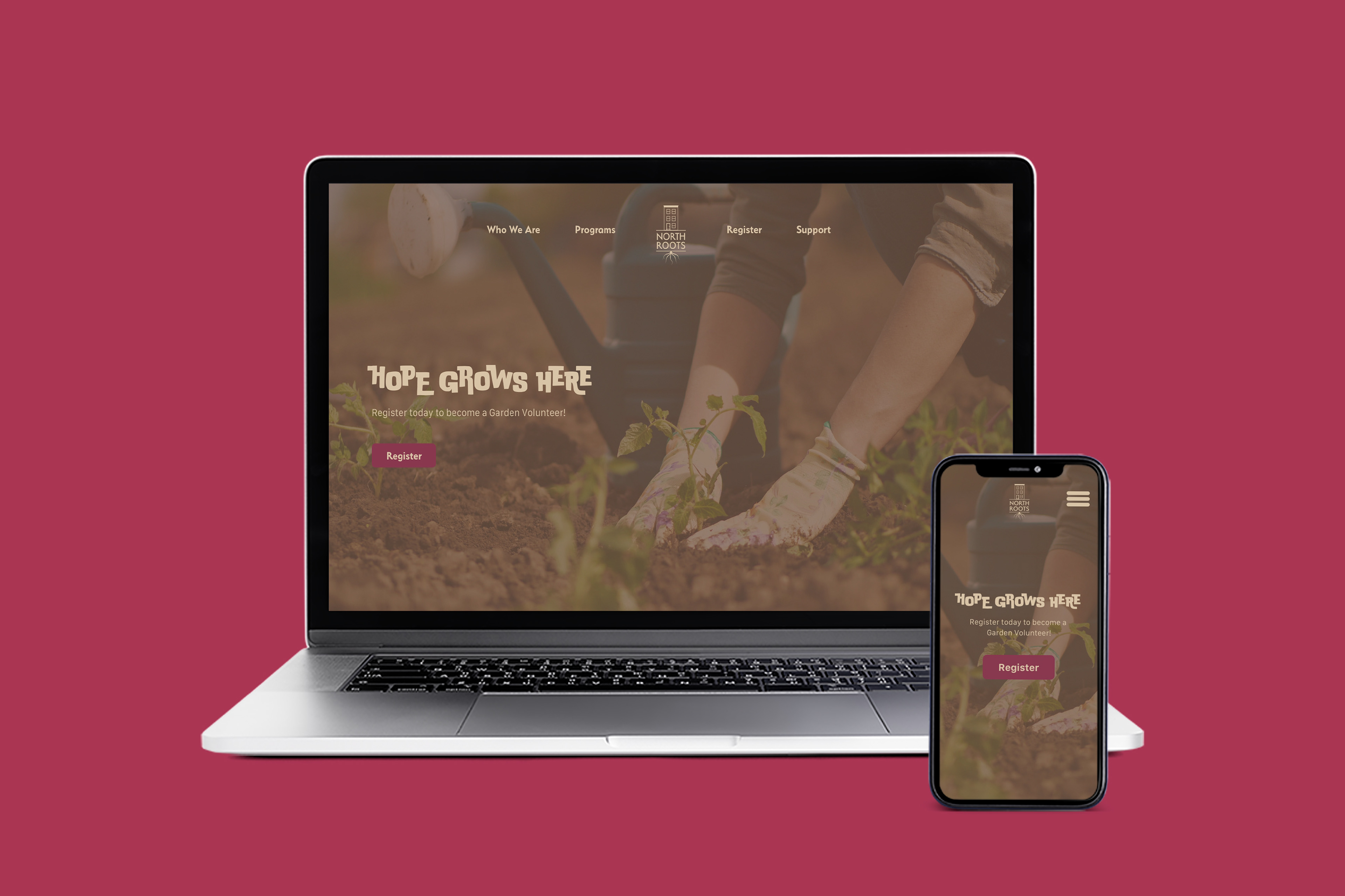
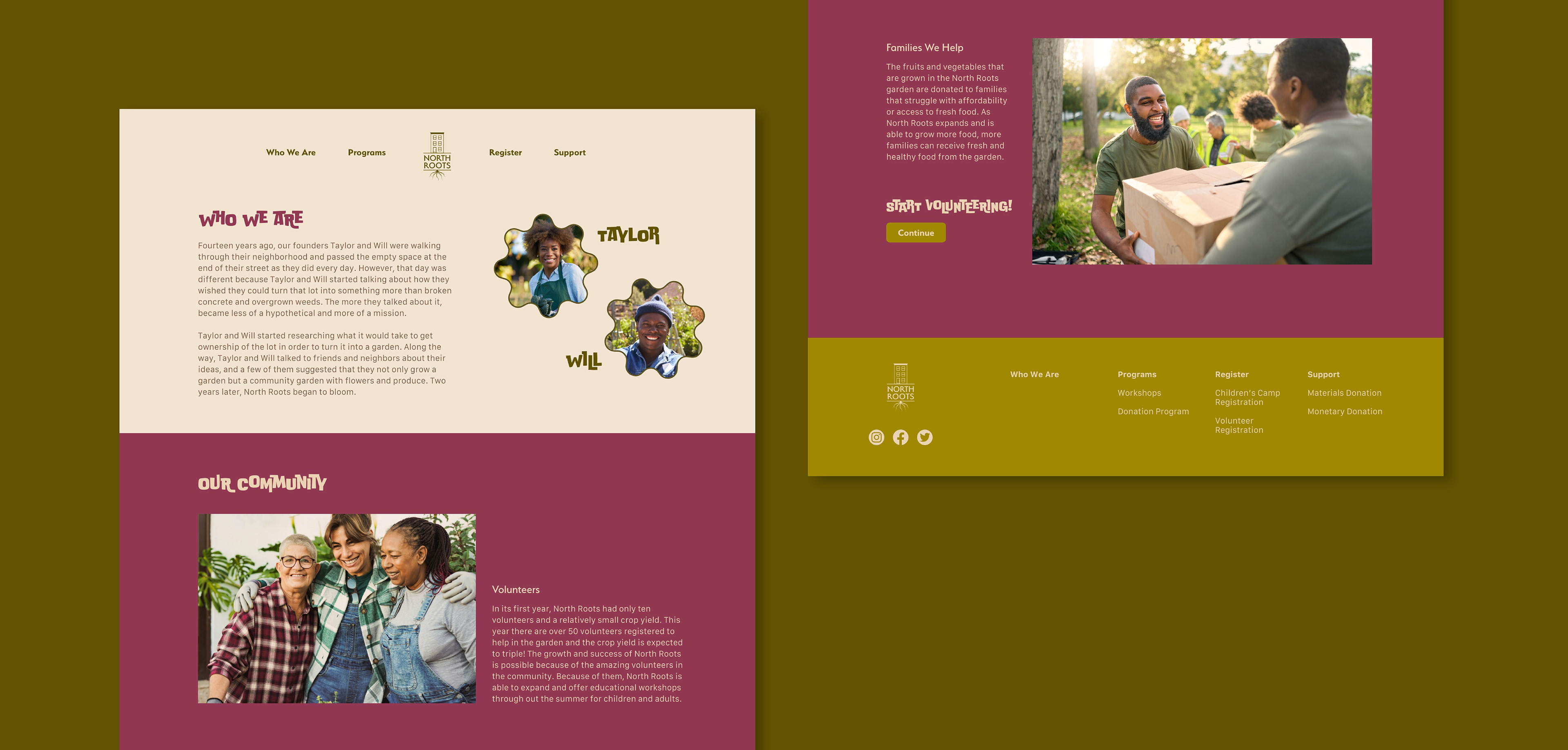
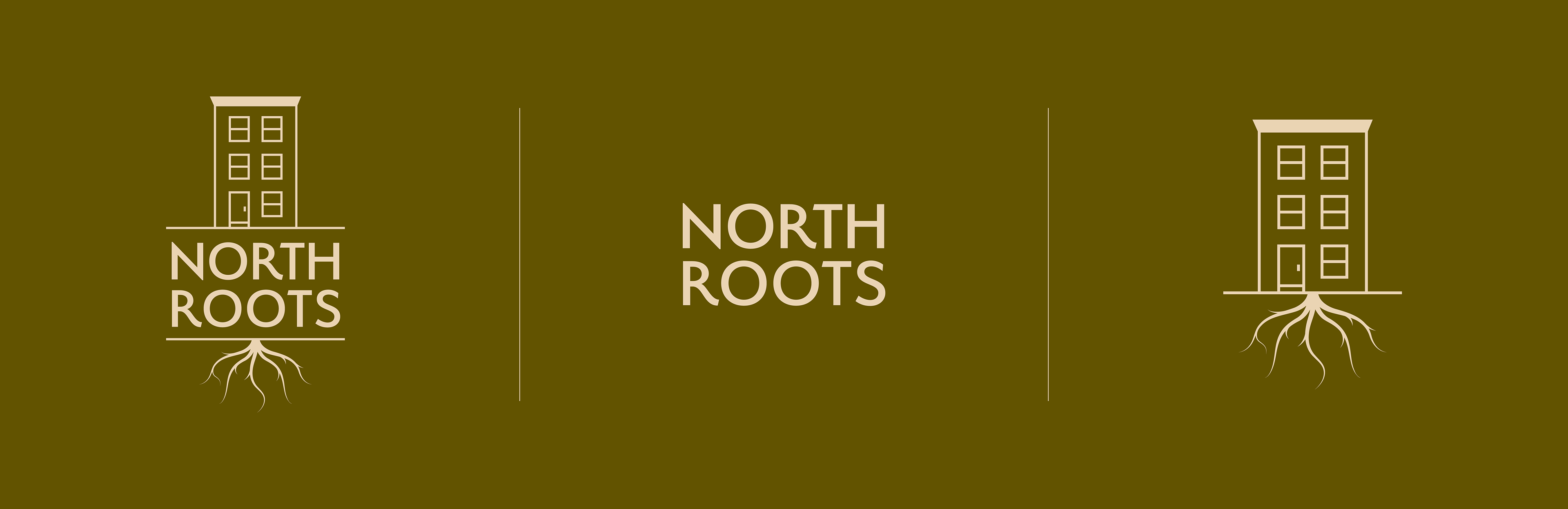
My brand strategy was defined by place. Much of North Philadelphia is a food desert, and the brand needed to speak directly to the people who would benefit most from a program like this. The visuals and voice were designed to feel local and familiar, signaling that North Roots is a program by the community, for the community. The row home logo was a deliberate nod to the neighborhood's architectural identity, something any North Philly resident would immediately recognize as their own. The name, photography, and overall tone were all chosen with the same intention: to make sure locals felt confident and welcomed in taking advantage of everything North Roots has to offer.
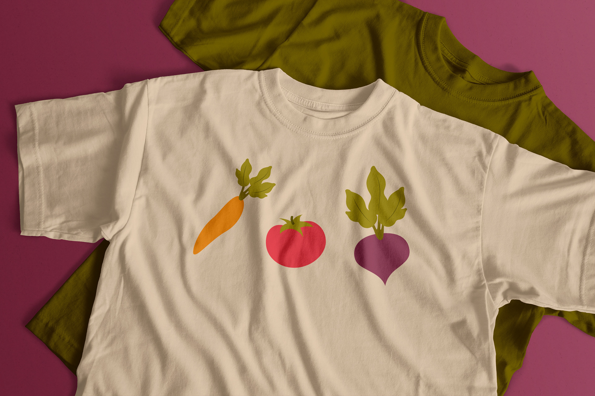
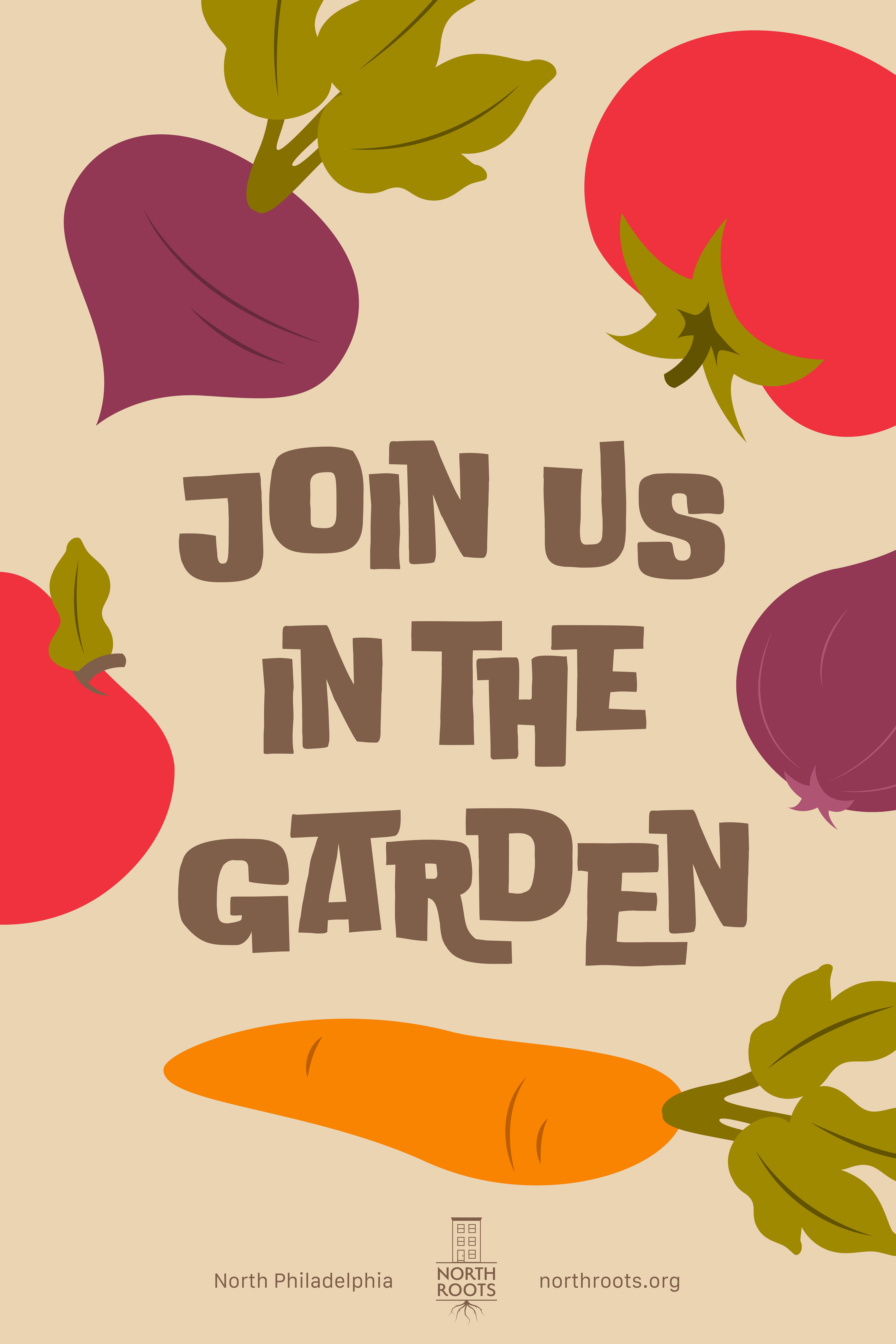
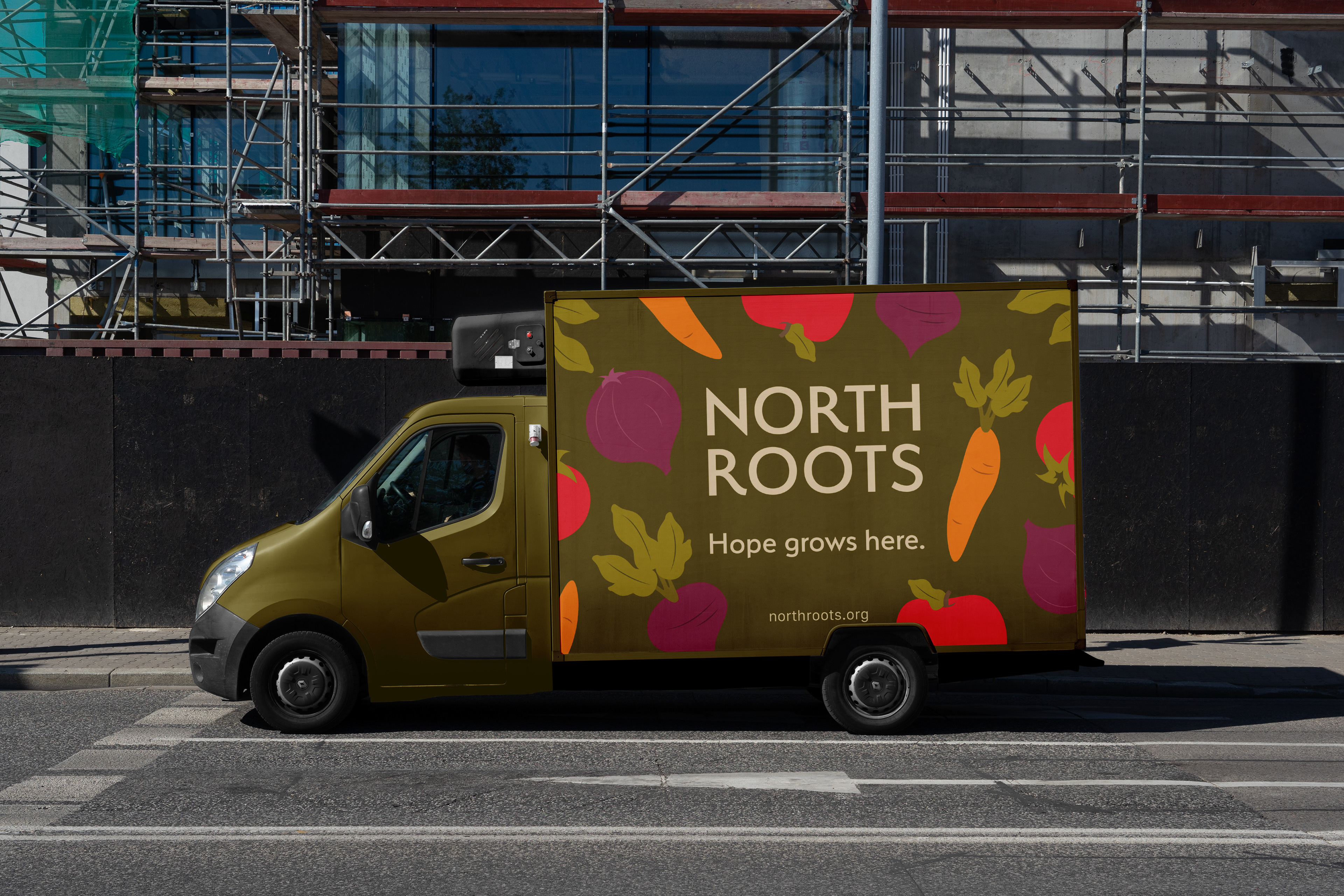
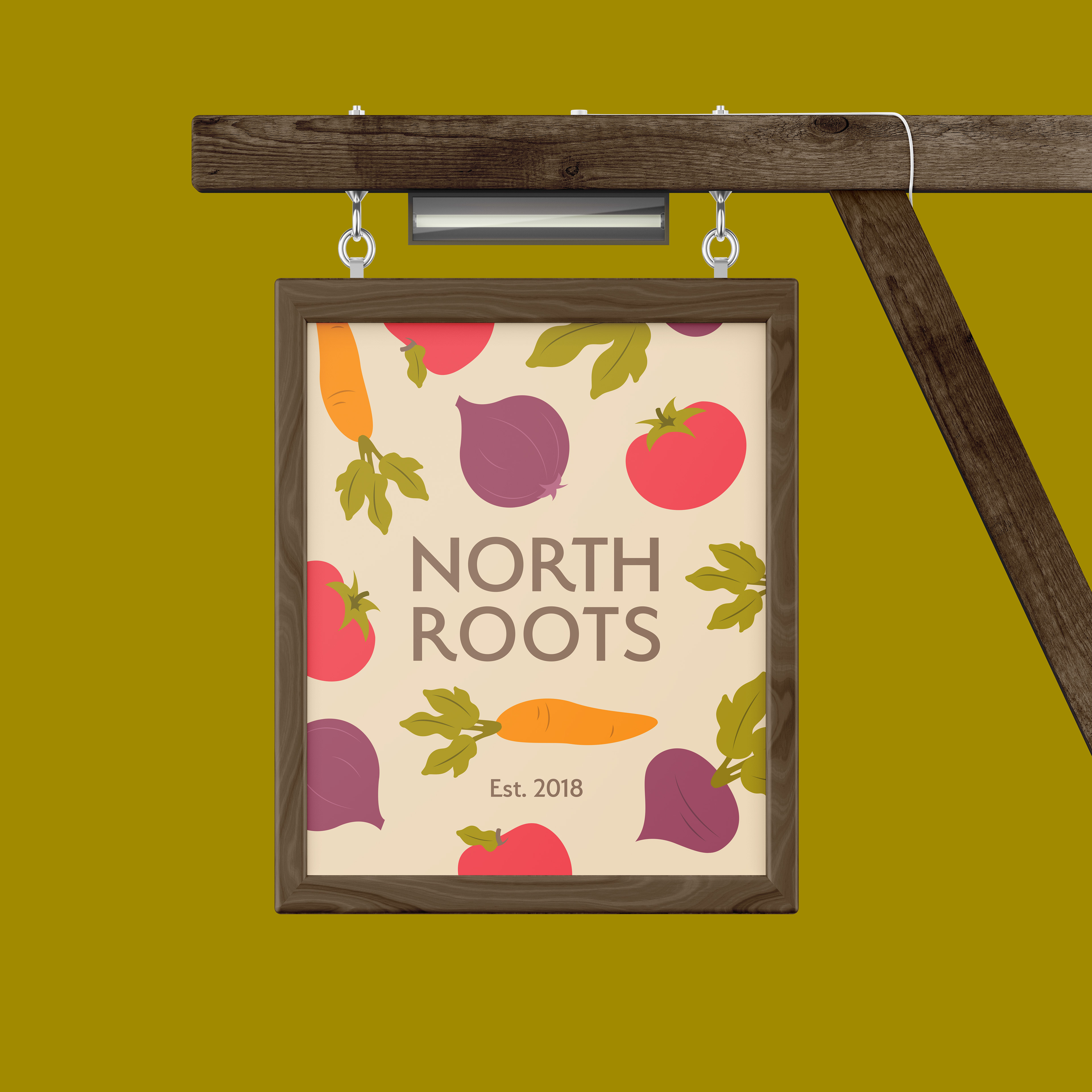
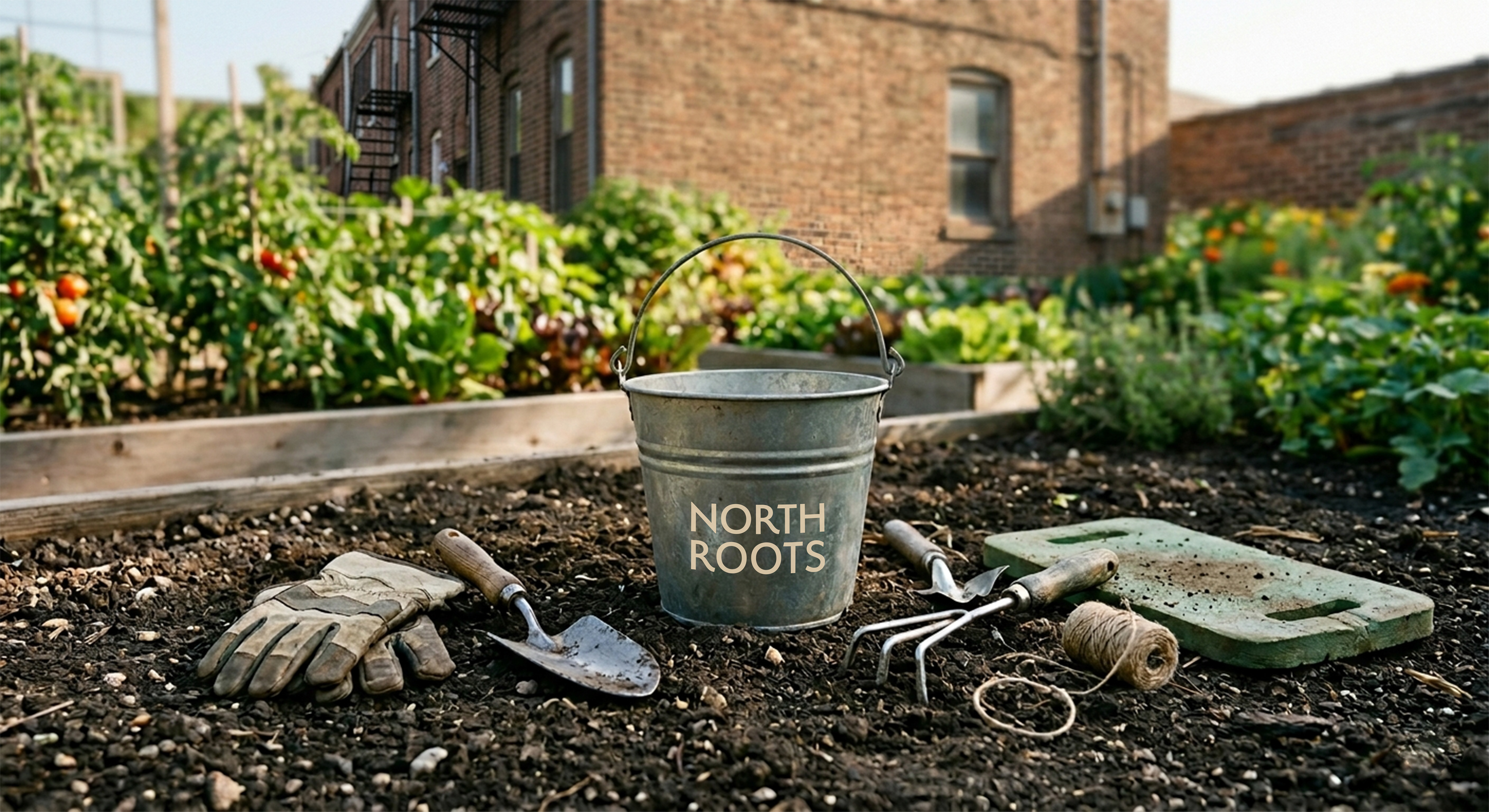
From there, the brand was built out across a full suite of deliverables, including logo design, brand identity, shirts, signage, garden supplies, business cards, printed outreach materials, social media graphics, environmental advertising, and UI for a website. Each touchpoint was an opportunity to reinforce the same message: that North Roots belongs to the neighborhood.

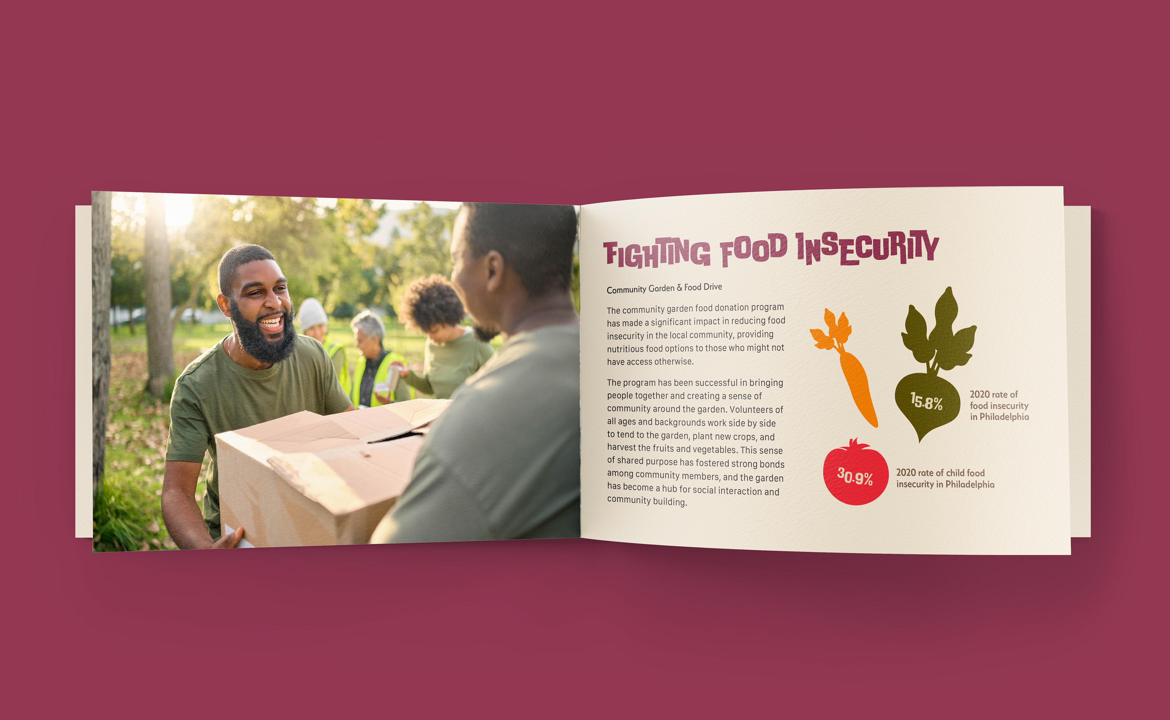
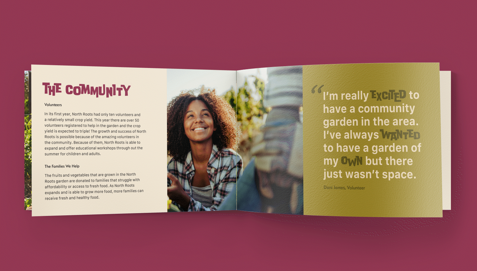
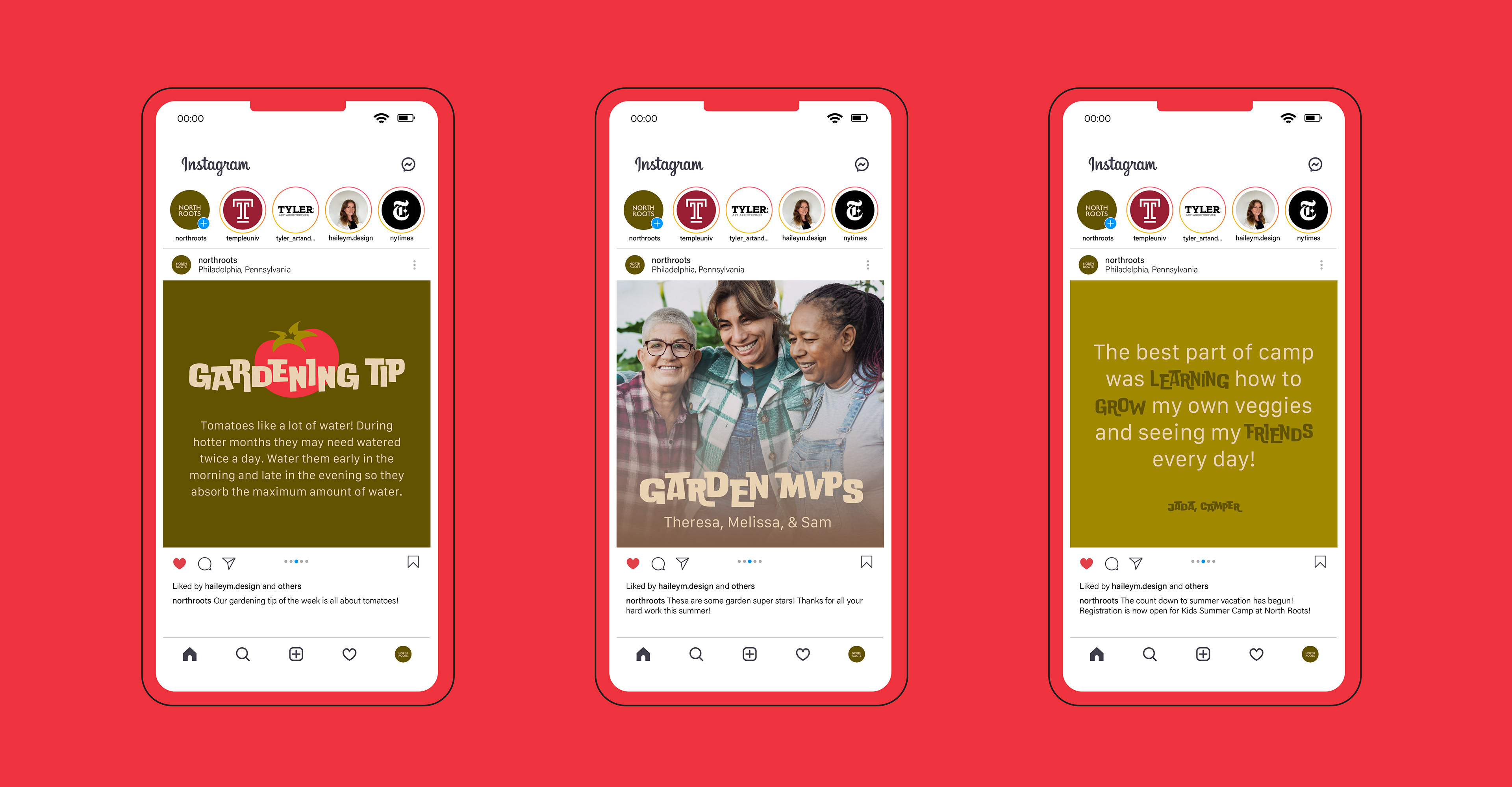
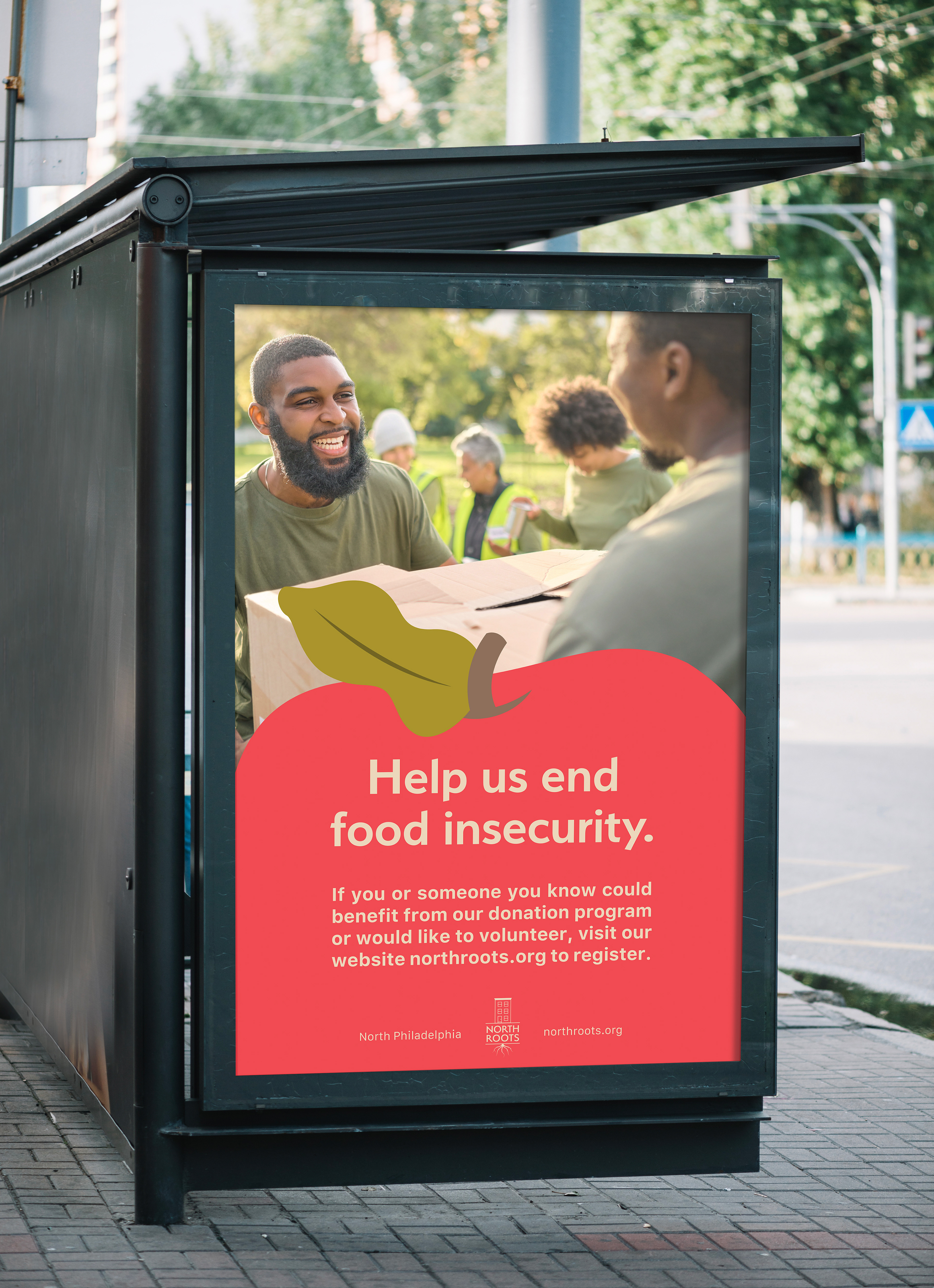
Community outreach is an important part of promoting North Roots. All marketing materials for the brand show members working in the garden and highlight the programs North Roots has to offer. Whether it's a booklet highlighting the history and mission of the garden, or social media posts sharing member quotes and gardening tips, every deliverable was created with consideration of how it can promote and support the community.
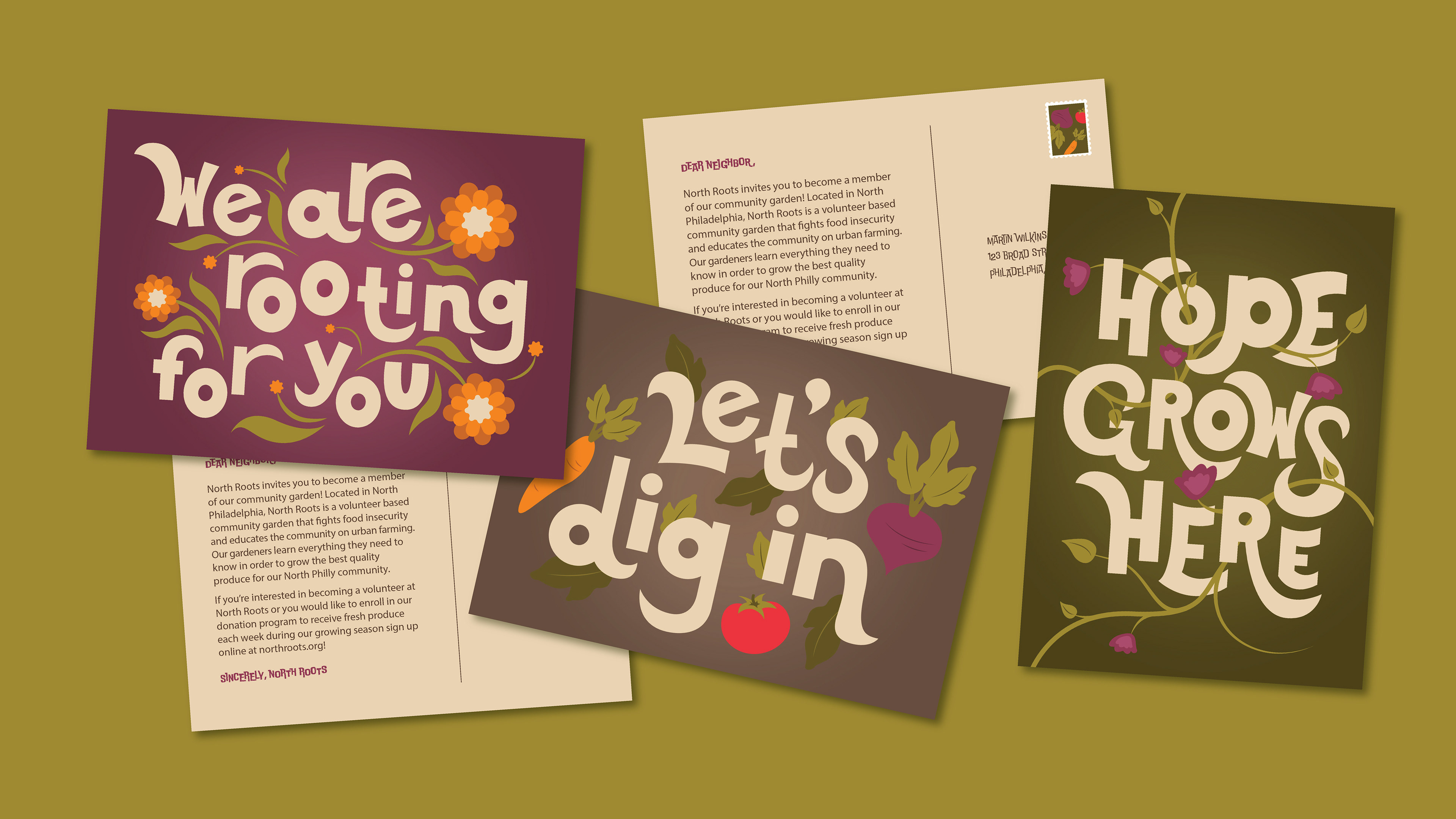
I illustrated a series of postcards to be used as a recruitment method. They blend the brand colors and illustrations with a custom, hand-drawn typographic design that feels fresh for the brand without feeling too removed from other brand materials.

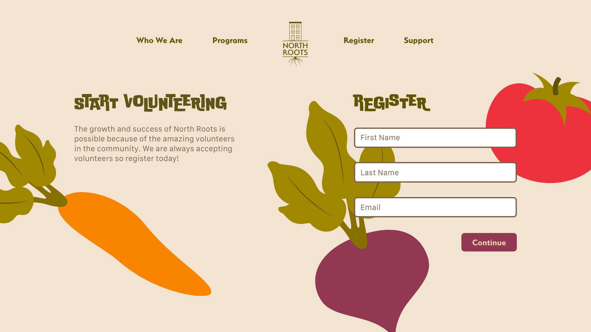
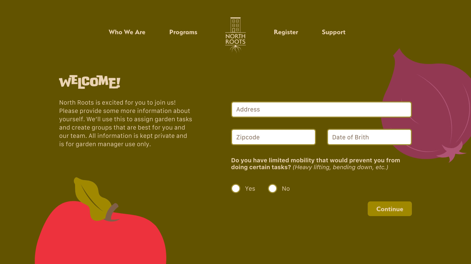
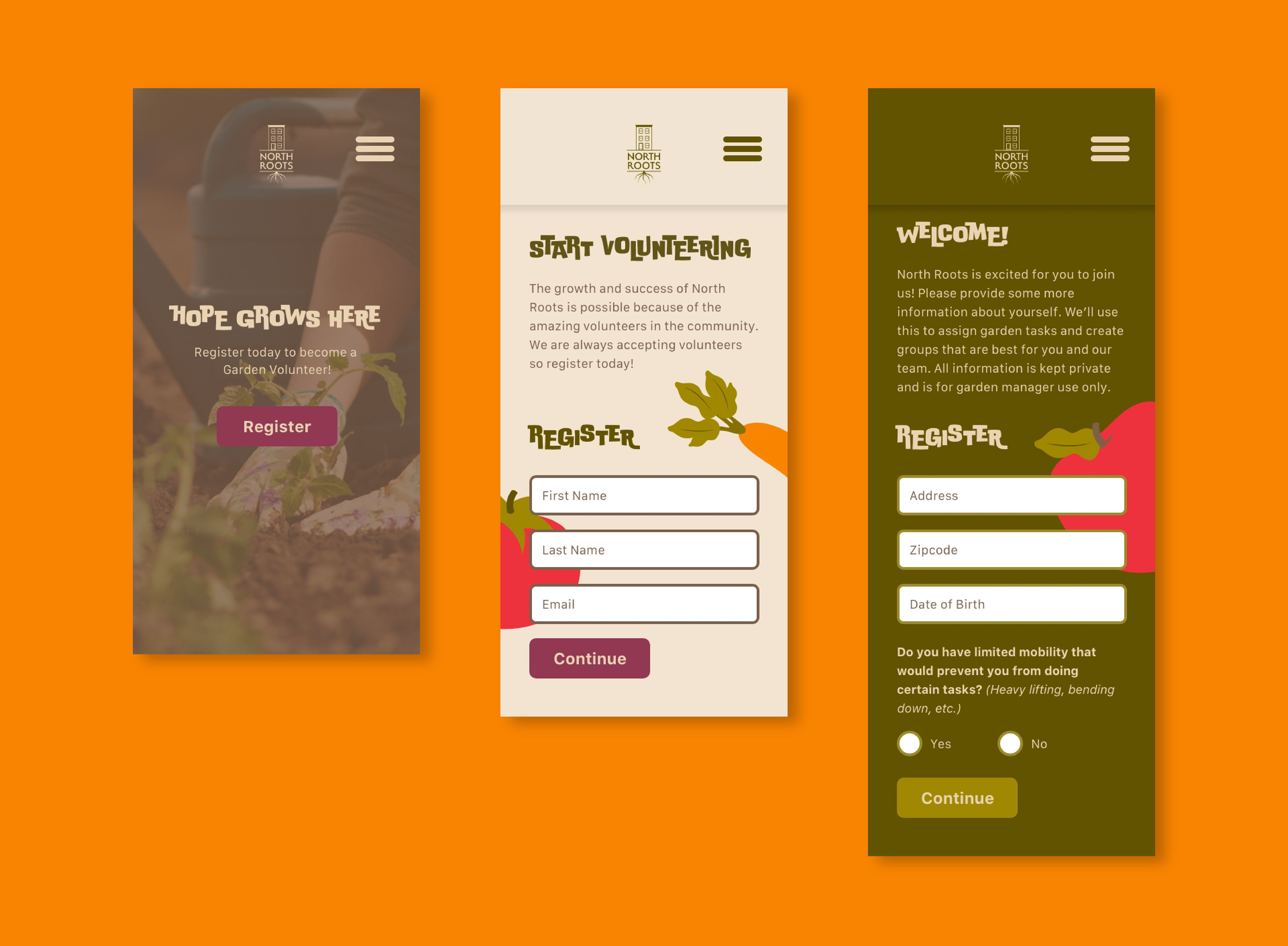
The North Roots website is an informational hub for those wanting to learn more about the garden and potentially enroll in or support a program. The site is designed to be responsive and carries all the same bright and energetic visuals throughout the different subpages.