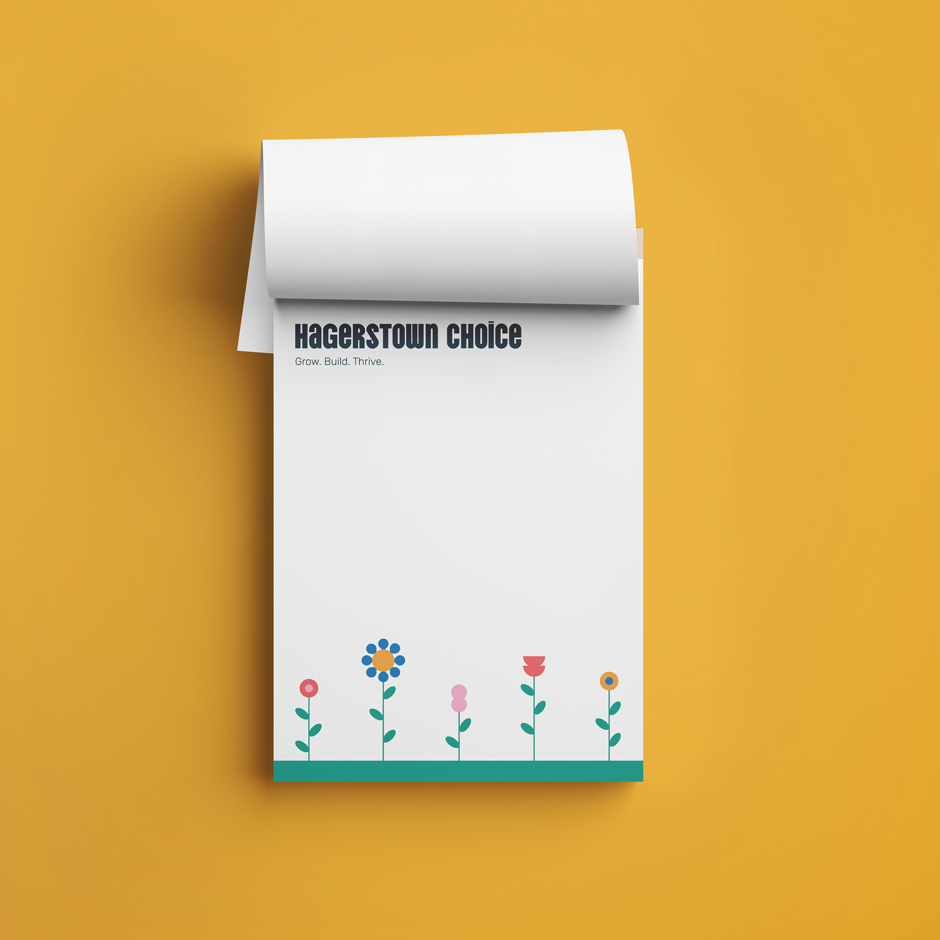
Hagerstown Choice
A community-driven planning process for the future redevelopment of three housing sites in Hagerstown, Maryland
visual identity, layout, storytelling, community engagement, art direction
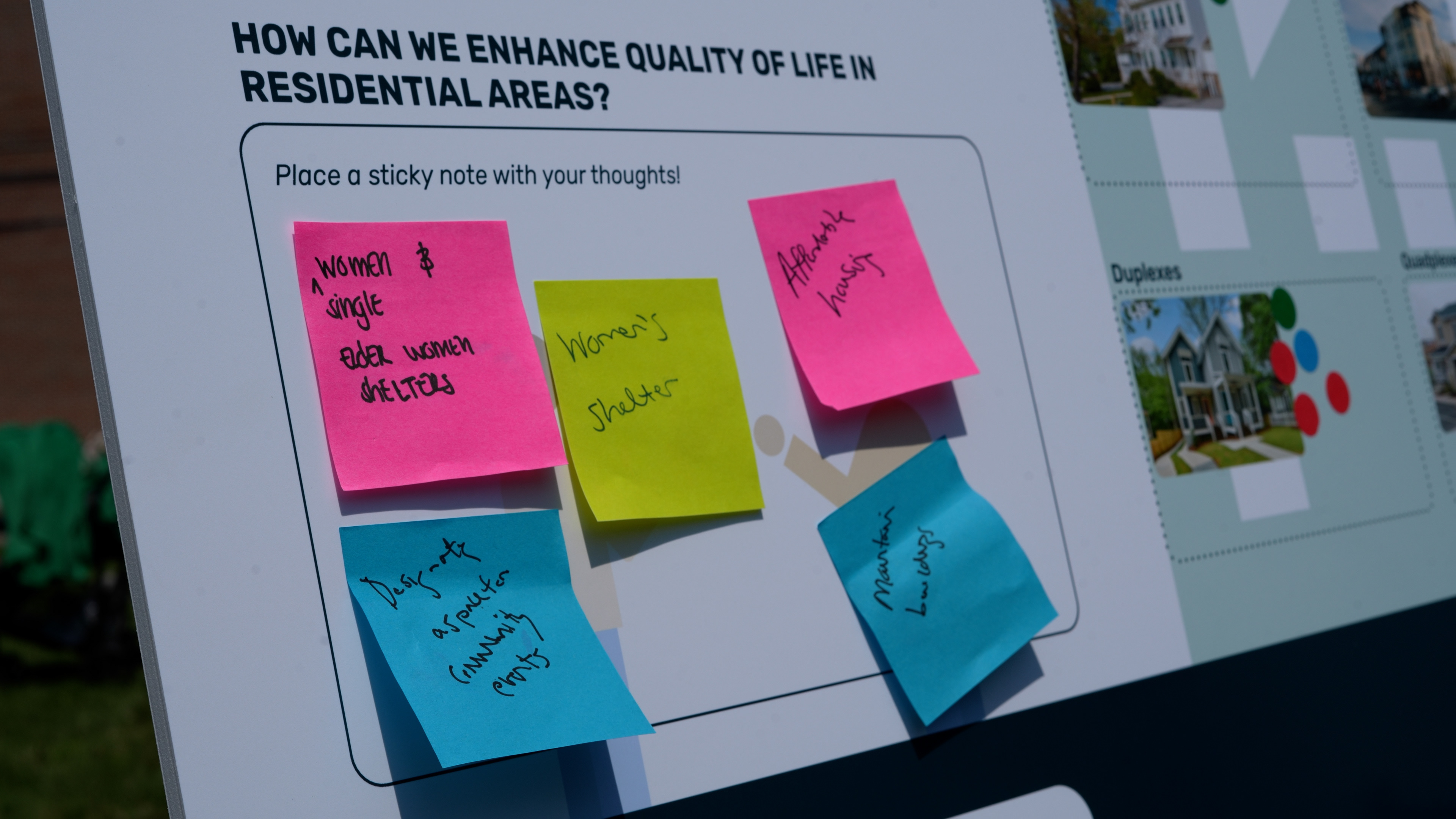
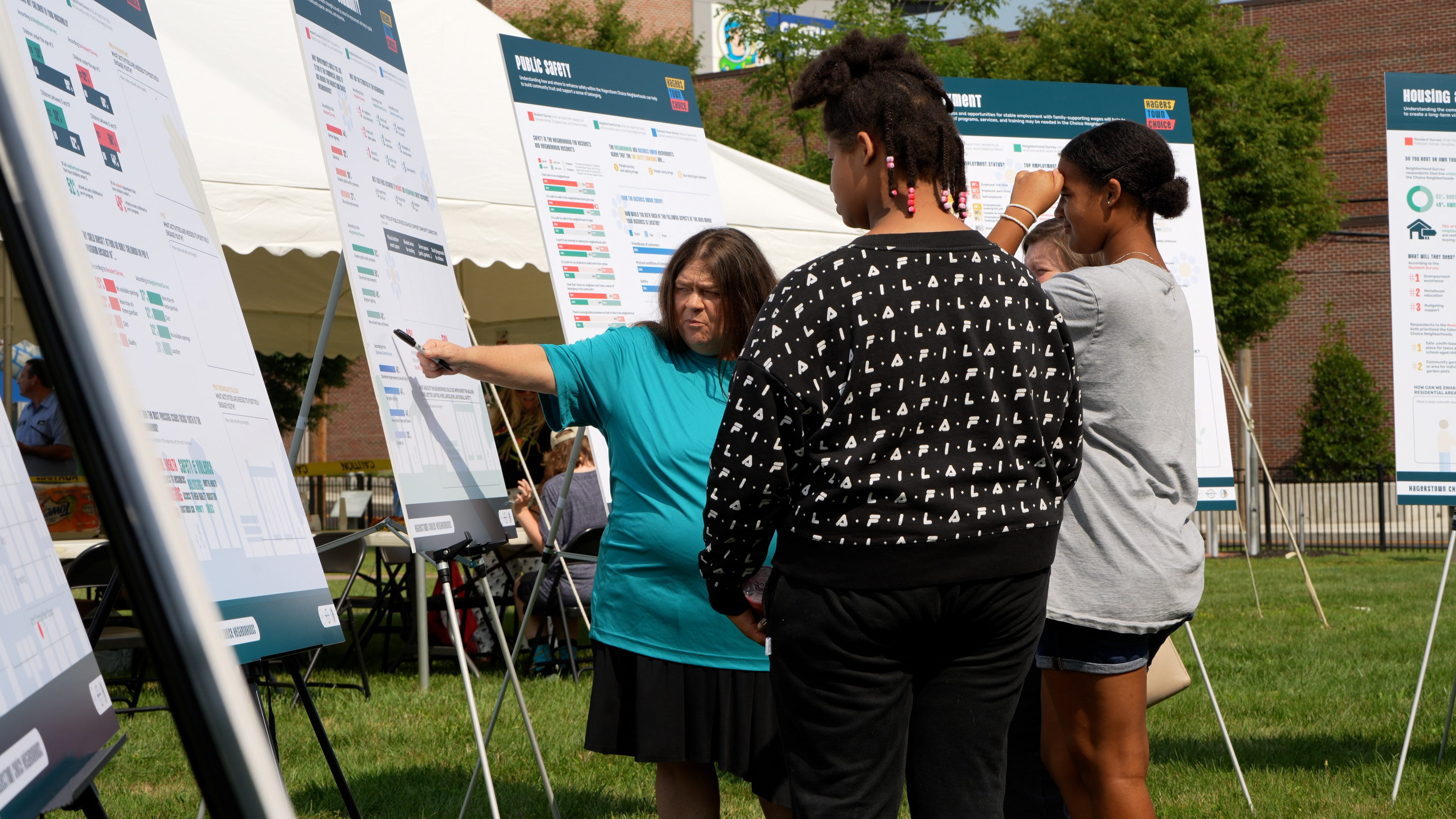
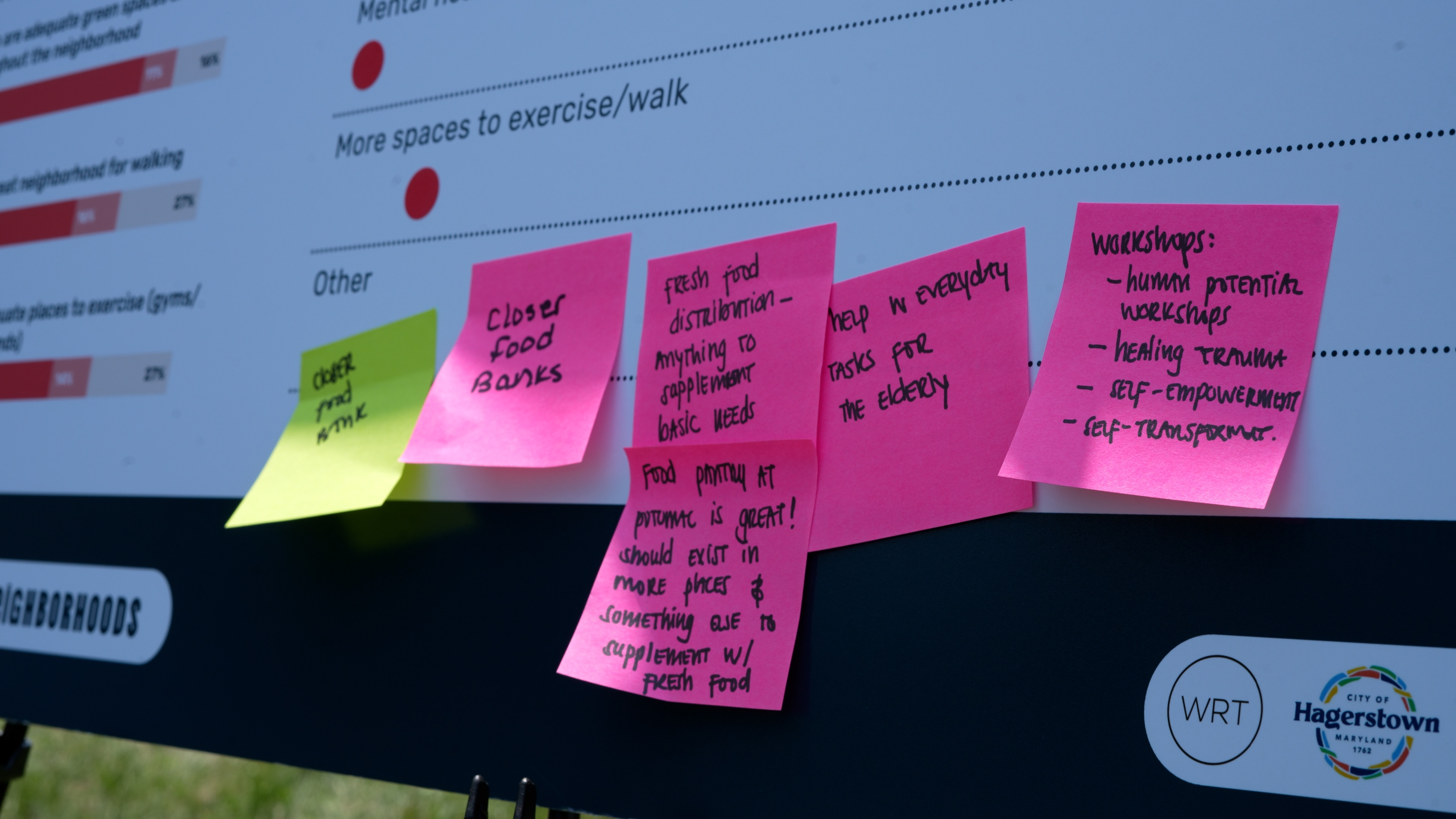
Community-driven planning only works if the community actually shows up. The Hagerstown Choice Neighborhoods Plan was built around public input, but getting residents in underinvested neighborhoods to engage with a government-led planning process is easier said than done. People needed to understand what the process was, why it mattered to them personally, and feel genuinely invited to participate rather than talked at.
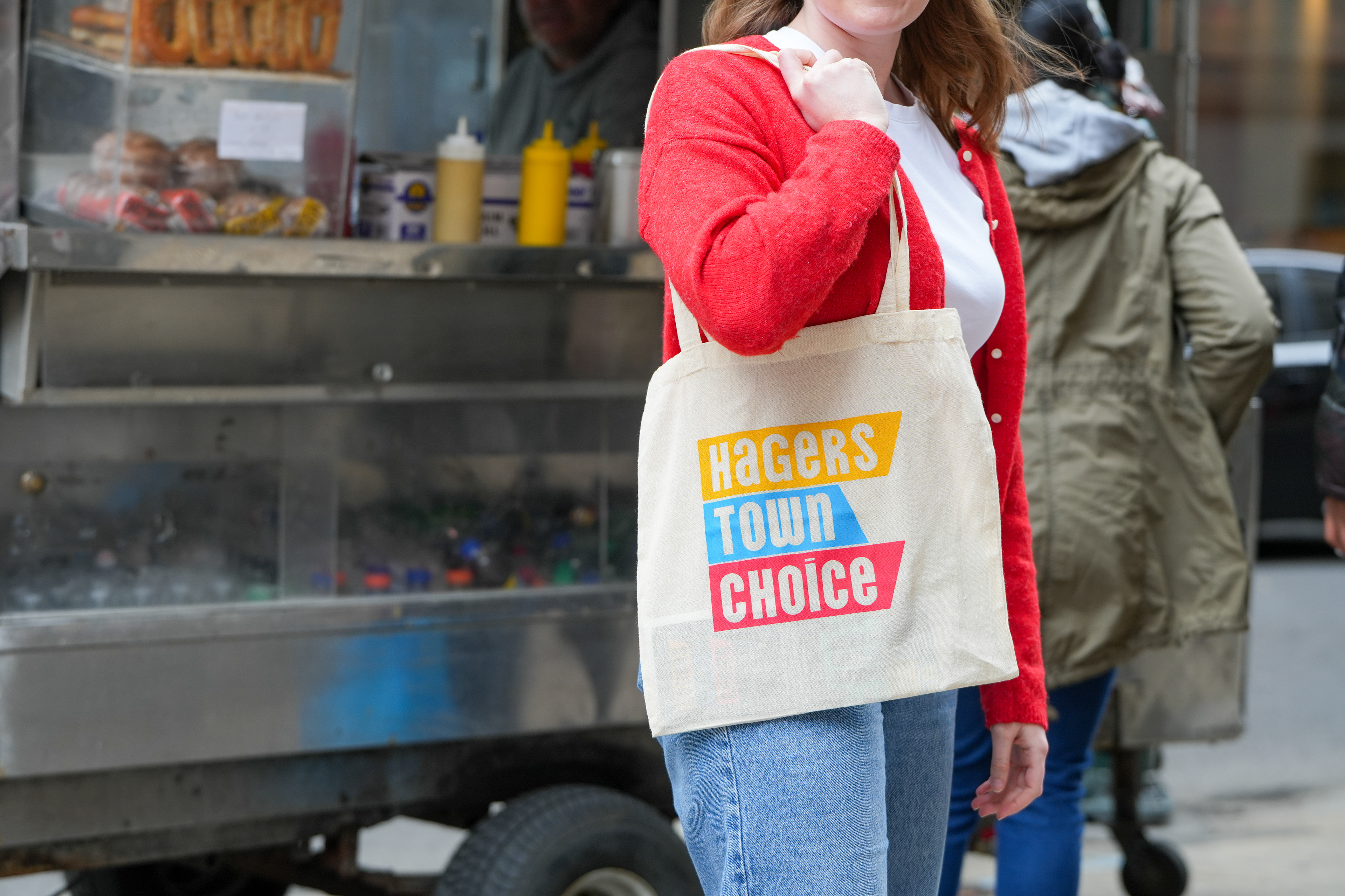
My role was to build a brand and a suite of materials that could support that process from the ground up. That meant designing for a wide range of formats and touchpoints, from large-scale charrette boards and a photo backdrop for community events, to t-shirts, comment cards, and a community care package delivered directly to residents' doors filled with branded goodies like stickers, a mug, a tote, and even a logo cookie. Every piece was an opportunity to signal that this process was worth their time and that their neighborhood was worth investing in.
Community Care Package
I designed a "Choice Community Care Package" that was hand-delivered to residents. Receiving something thoughtful and curated feels personal in a way that a flyer never does, and that was the whole point: to signal to residents that their input was genuinely valued before asking anything of them.
The package encouraged participation in the Needs Assessment Survey, an important tool for understanding current conditions in the neighborhood before planning began. Every item, from the sticker sheet to the brochure, was visually cohesive and on-brand, reinforcing a sense of care and credibility. With the help of the care package, we exceeded our survey target and gathered valuable insights from the community.


Engaging with the Community
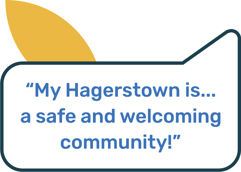
The biggest challenge was making the brand feel like it belonged to the community, not to a government agency. The bold color palette, playful typography, and graphic shapes were all chosen by residents in a community brand workshop. They gravitated towards elements that were bright and bold because they made residents "happy and hopeful for the future". By engaging closely with the community, we crafted the kind of identity that residents would actually want to engage with and take home.
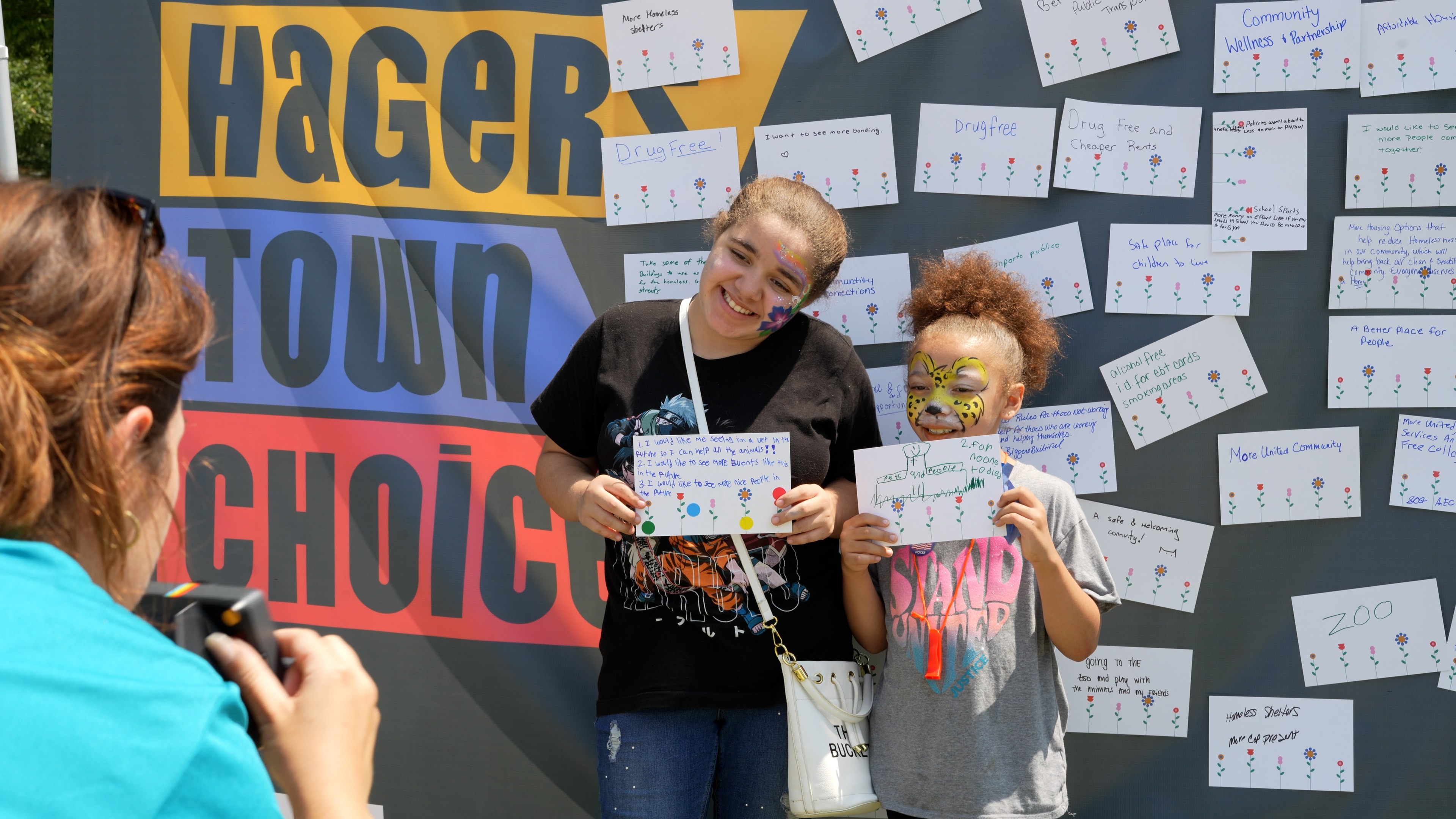
Seeing the photo backdrop show up in real community fair photos, with kids holding up their vision cards in front of the logo, made it clear the brand was doing its job.

Grow, Build, Thrive.
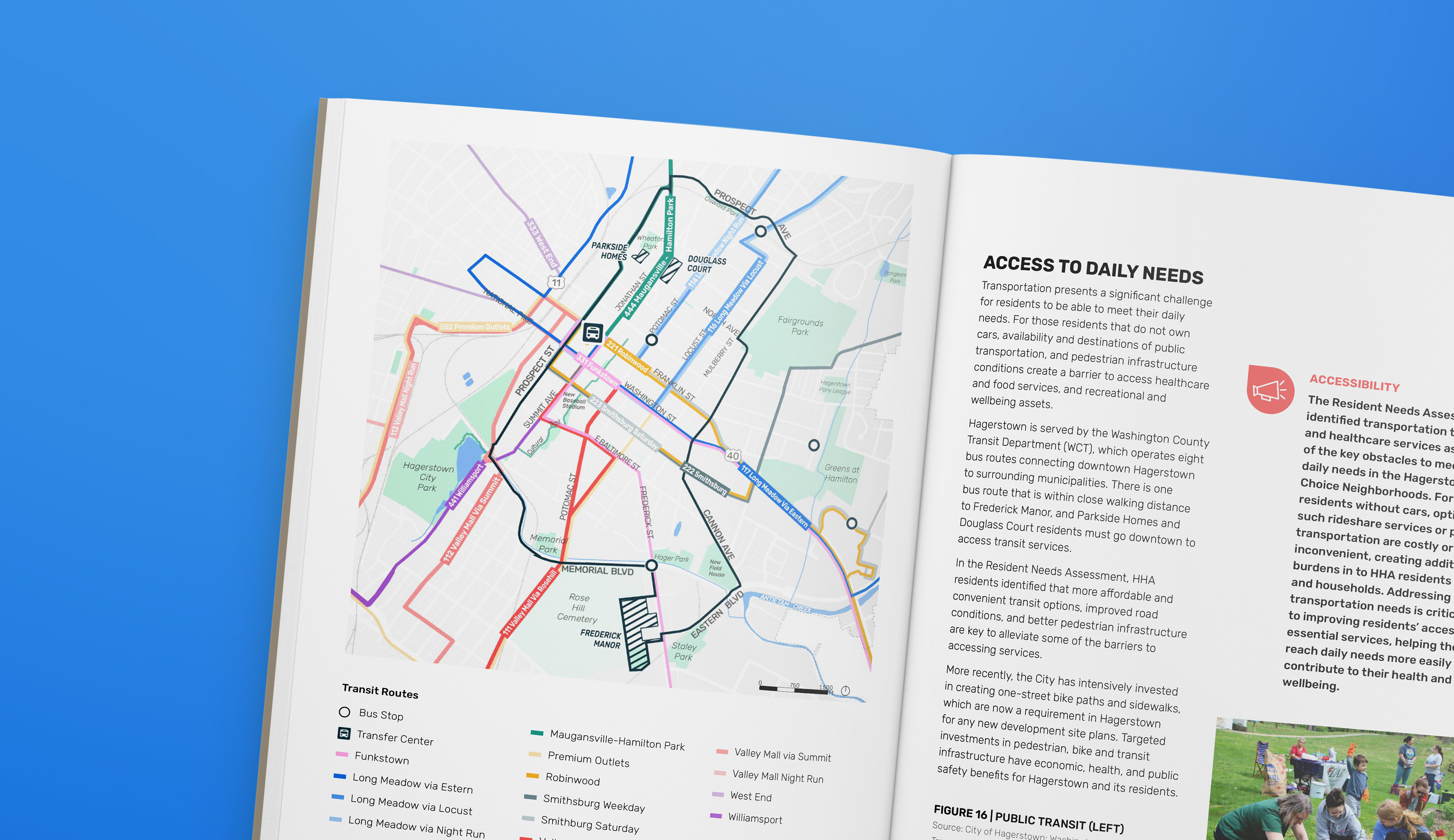
The final plan document is where the brand really came to life. Across more than 200 pages, the bold color palette, playful typography, and graphic shapes established in the identity system had to work across a huge range of content, from data-heavy infographic spreads and transit maps to Community Ambassador profiles and resident quote pages.
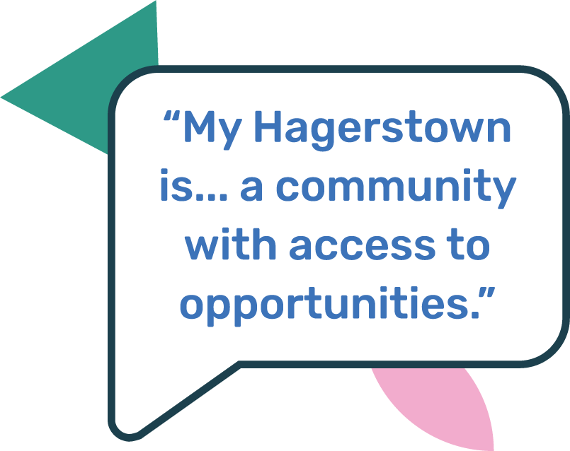
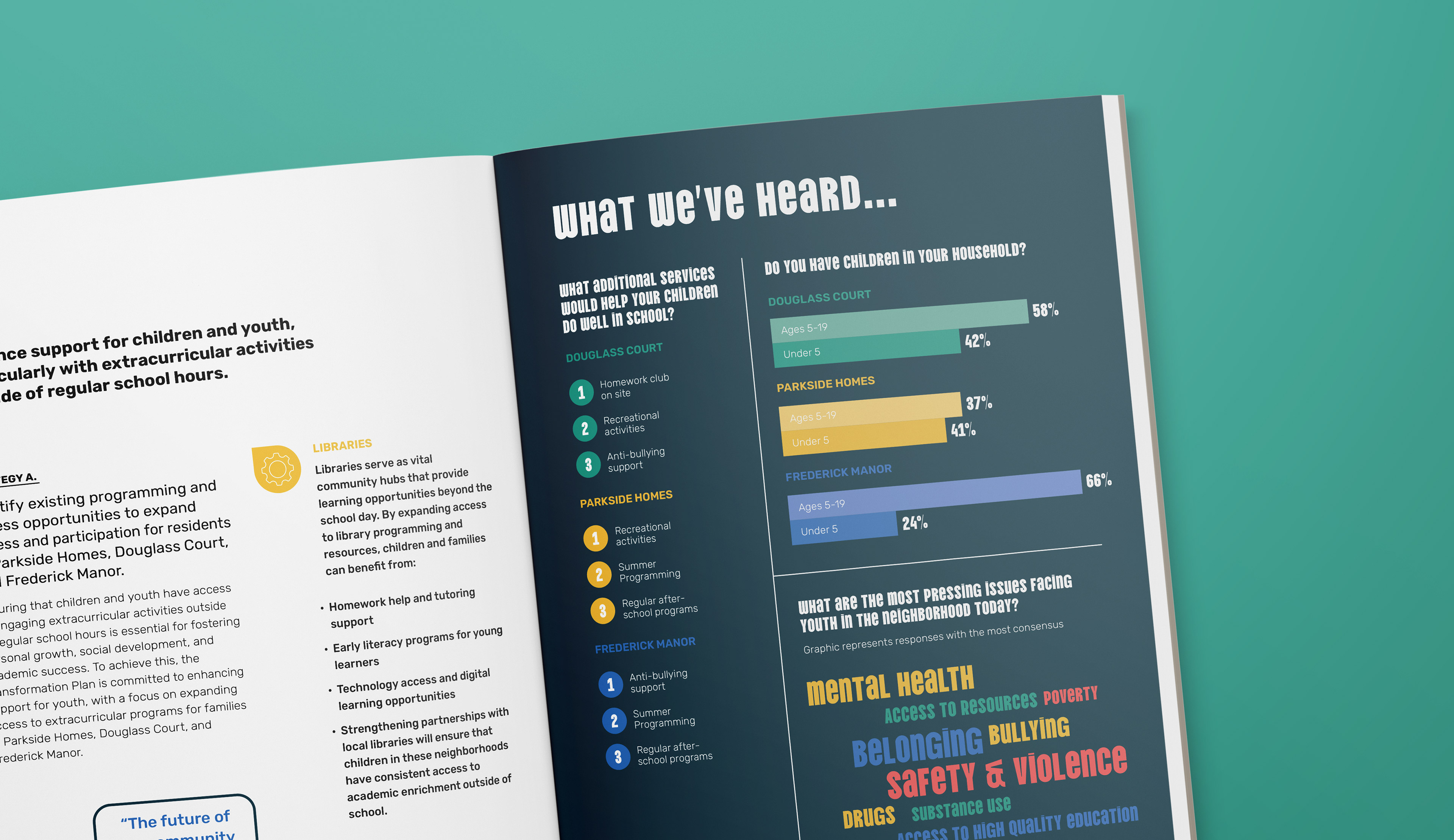
Pages that would have been dense with data sets came to life with bold, colorful infographics, and sections like "Meet Our Community Ambassadors!" were designed to make sure community voices felt just as prominent as the planning data. The result is a document that reads less like a report and more like a book about the people who live in the Hagerstown Choice Neighborhood.

The Plan contains a variety of content types, and each one requires a different approach. Some pages were designed for planners and city officials scanning data, while others, like the Ambassador profiles and quote cards, were really for the residents themselves. Designing a document that could speak to both audiences without losing its personality was one of the more interesting challenges of the project.

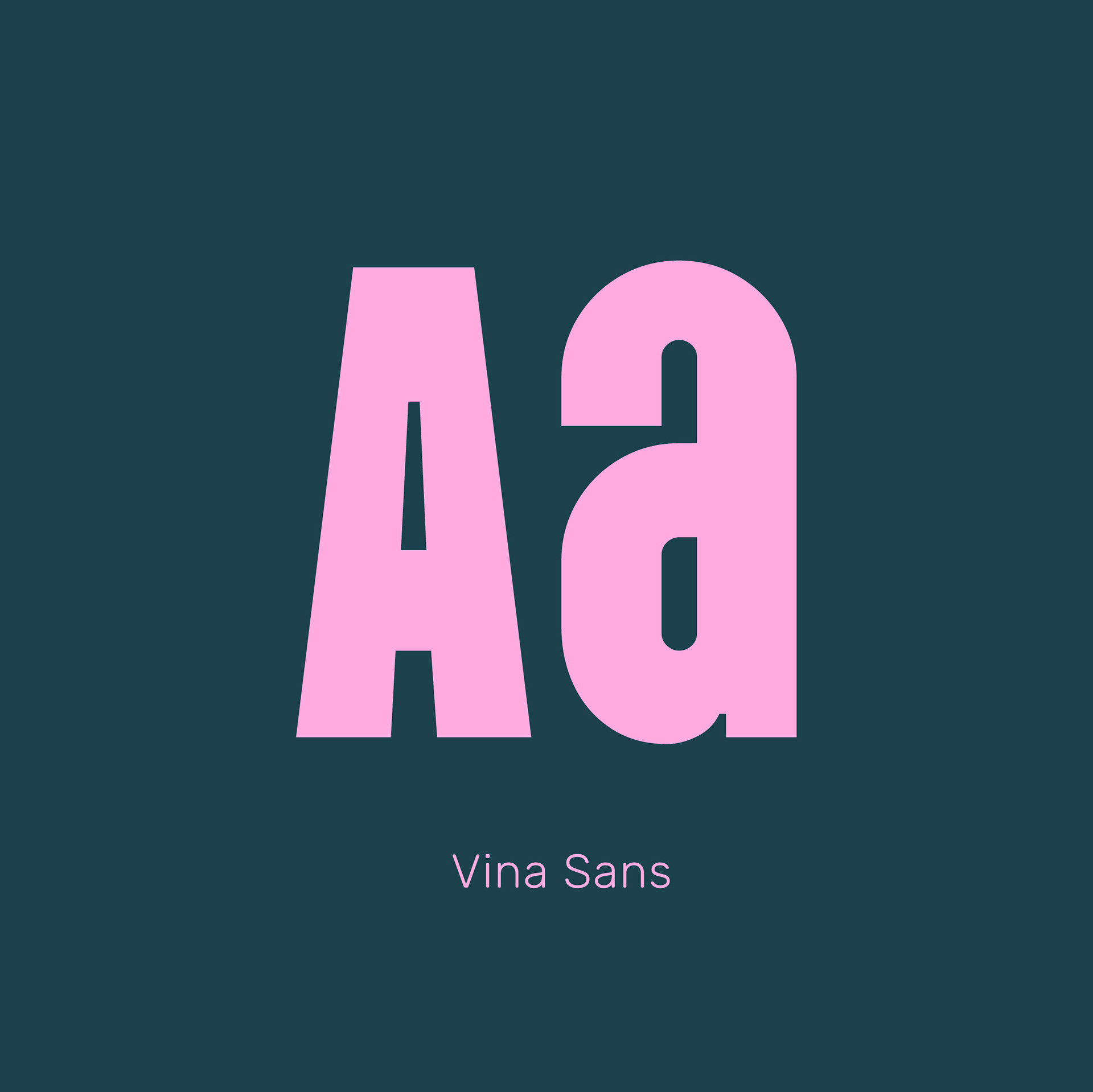
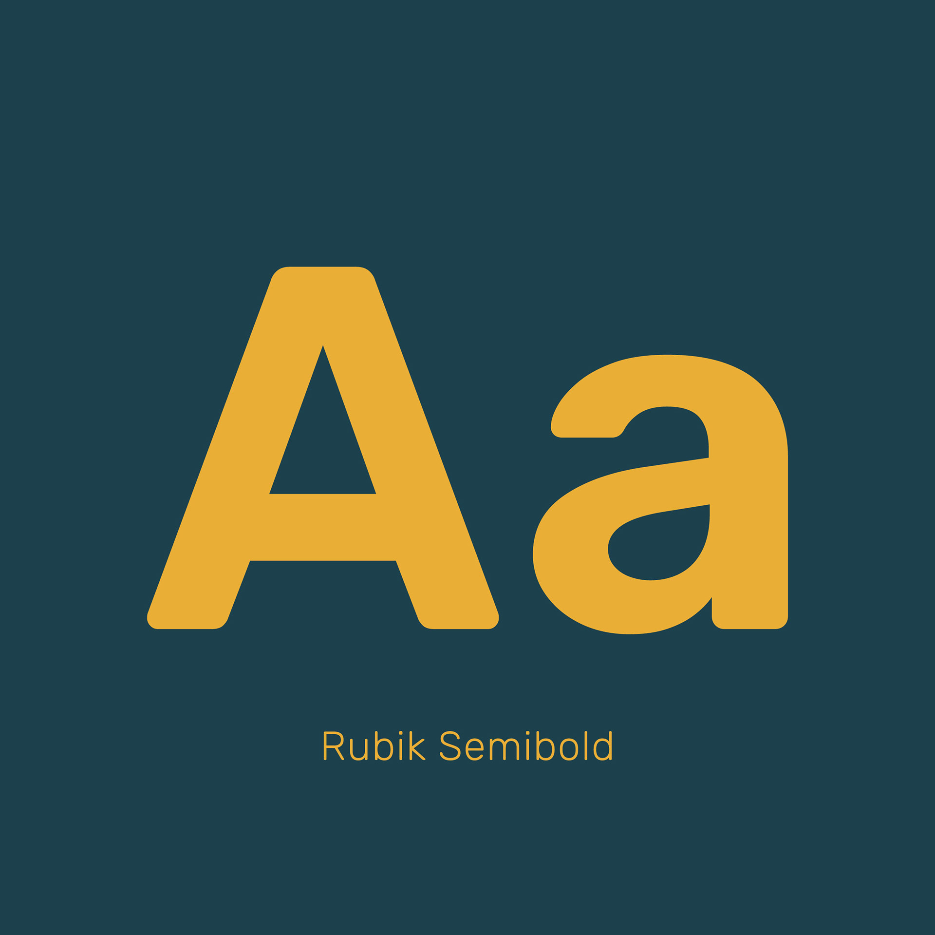
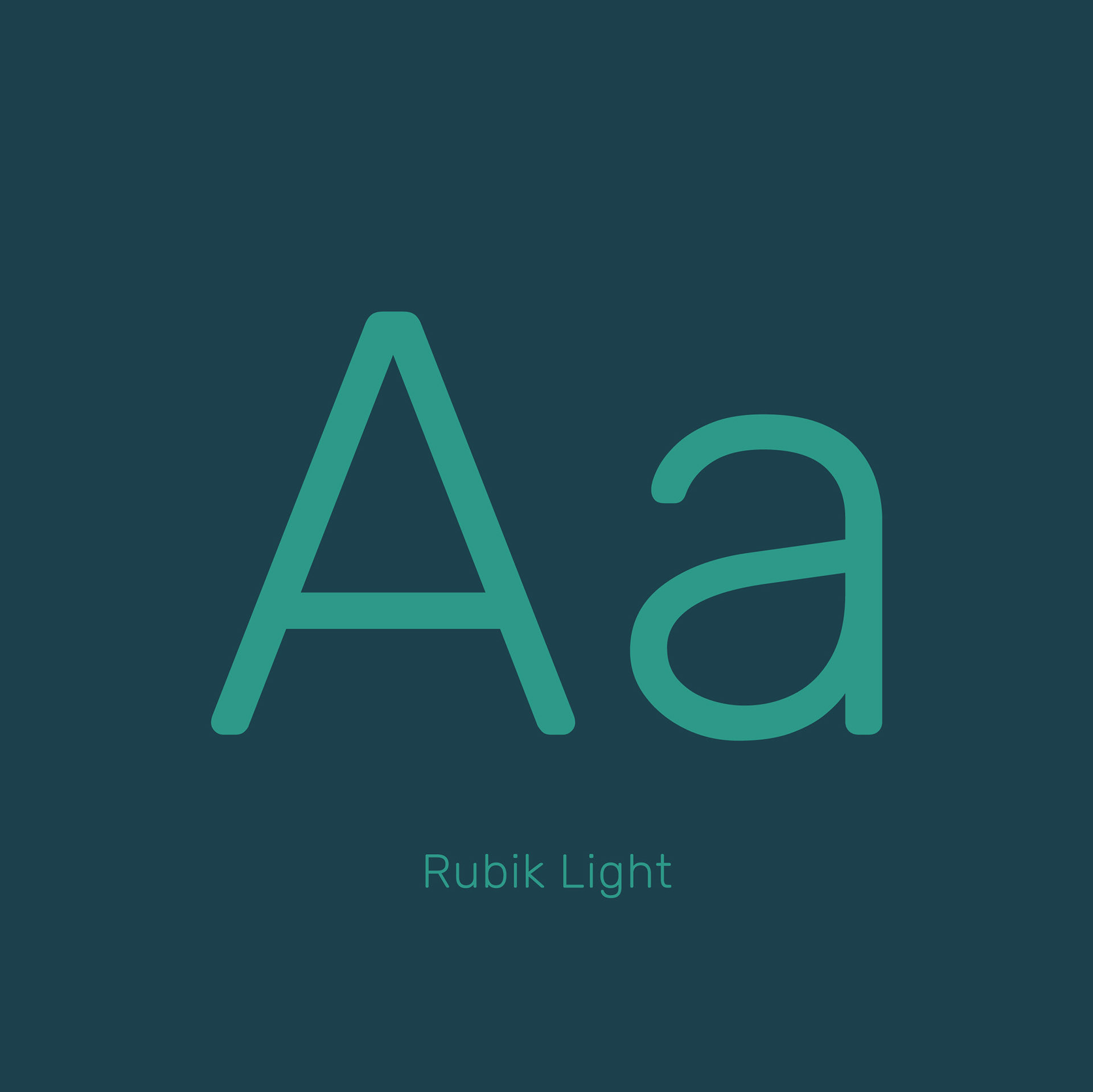
With three typefaces and multiple type styles in play, maintaining a clear hierarchy throughout the document required constant attention. Keeping the document feeling clean meant being intentional about when to let the typography be expressive and when to pull back and let the content speak for itself. The result is a document that feels dynamic and full of personality without ever becoming hard to read or visually overwhelming.