City of Lancaster Rebrand
A modern take on a historical city
brand identity, merchandise design, social media, concept project
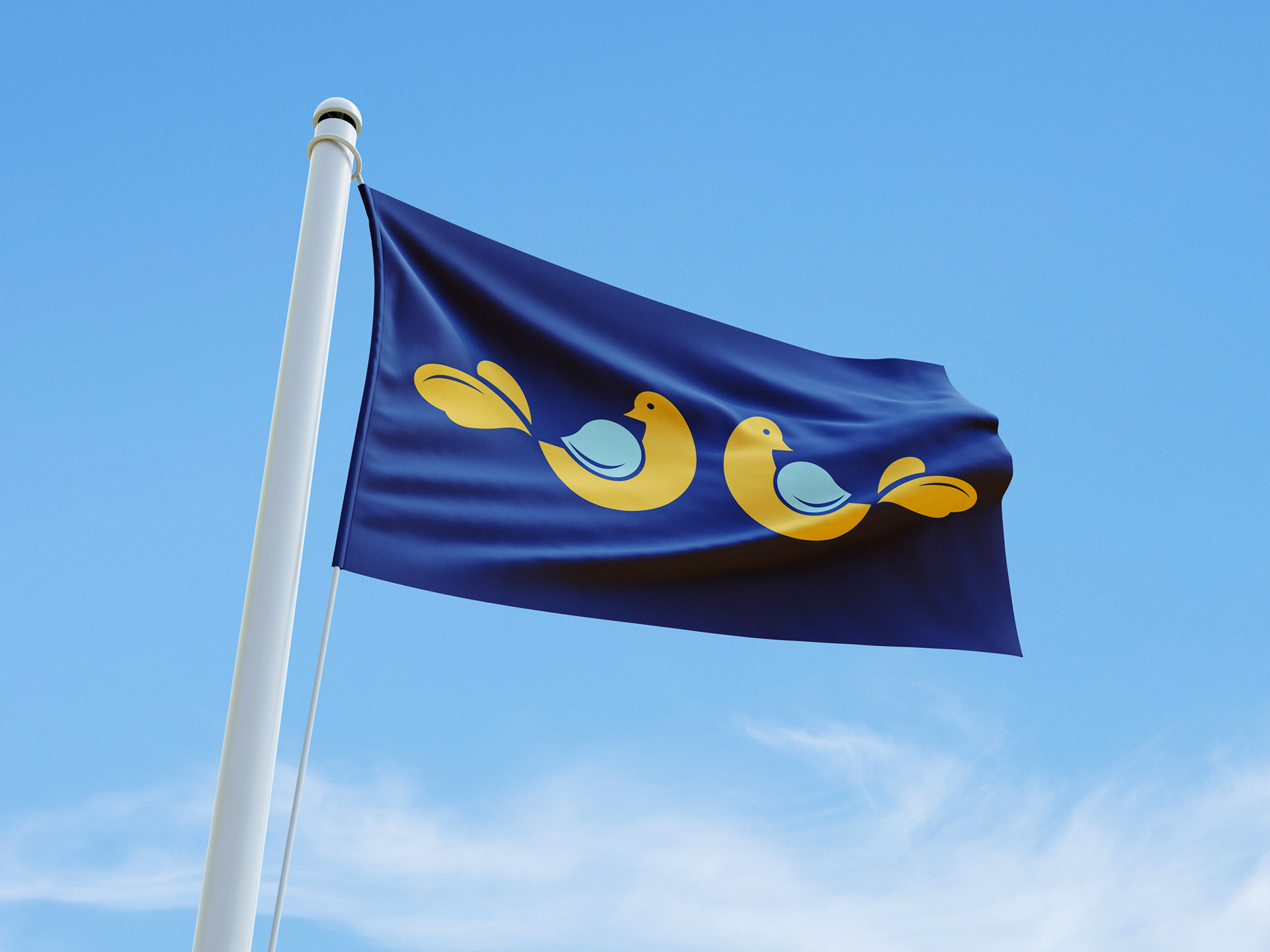
Like most U.S. cities, Lancaster, Pennsylvania did not have a particularly well-designed city flag. The brief started there, but the project quickly revealed a bigger opportunity: a full rebrand that could give the city a cohesive, modern identity worthy of its rich cultural history. The challenge was modernizing without erasing, creating something that felt fresh and contemporary while remaining deeply rooted in what makes Lancaster distinct.
The answer was found in the city’s Pennsylvania Dutch heritage. The bird motif drawn from traditional hex signs gave the brand an identity that was genuinely local, visually strong, and flexible enough to carry a full system from a city flag all the way through to merchandise and stationery

A Brand That Soars
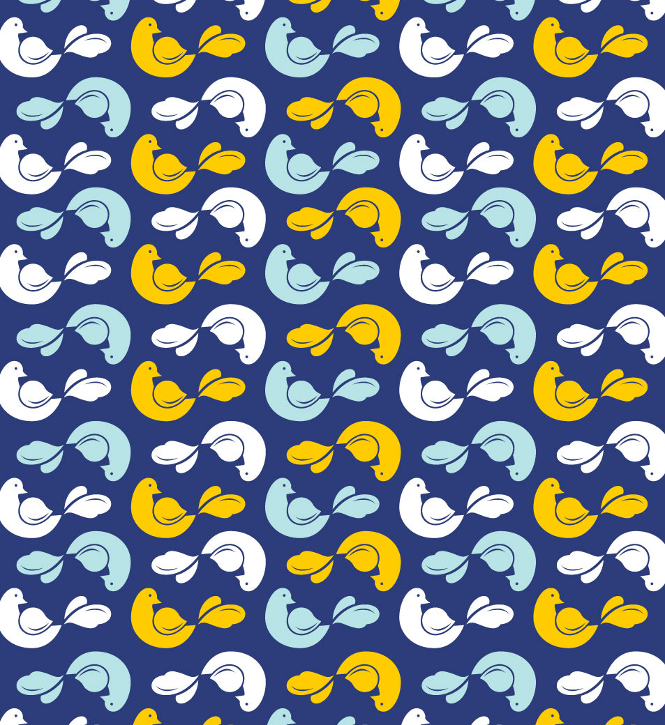
The centerpiece of the identity is a bird illustration drawn from the bird motifs found in traditional hex signs, the decorative folk art symbols painted on barns throughout Lancaster County. While hex signs are more commonly associated with the rural county, they remain deeply tied to the region's identity and feel like the right foundation for a brand that needed to feel both rooted and fresh.
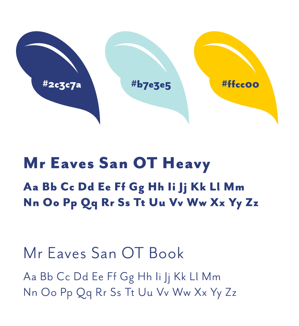
The navy and gold palette keeps the identity feeling civic and confident, while the rounded, folk-inspired quality of the bird illustration stops it from ever feeling stiff or bureaucratic.

A Brand That Adapts
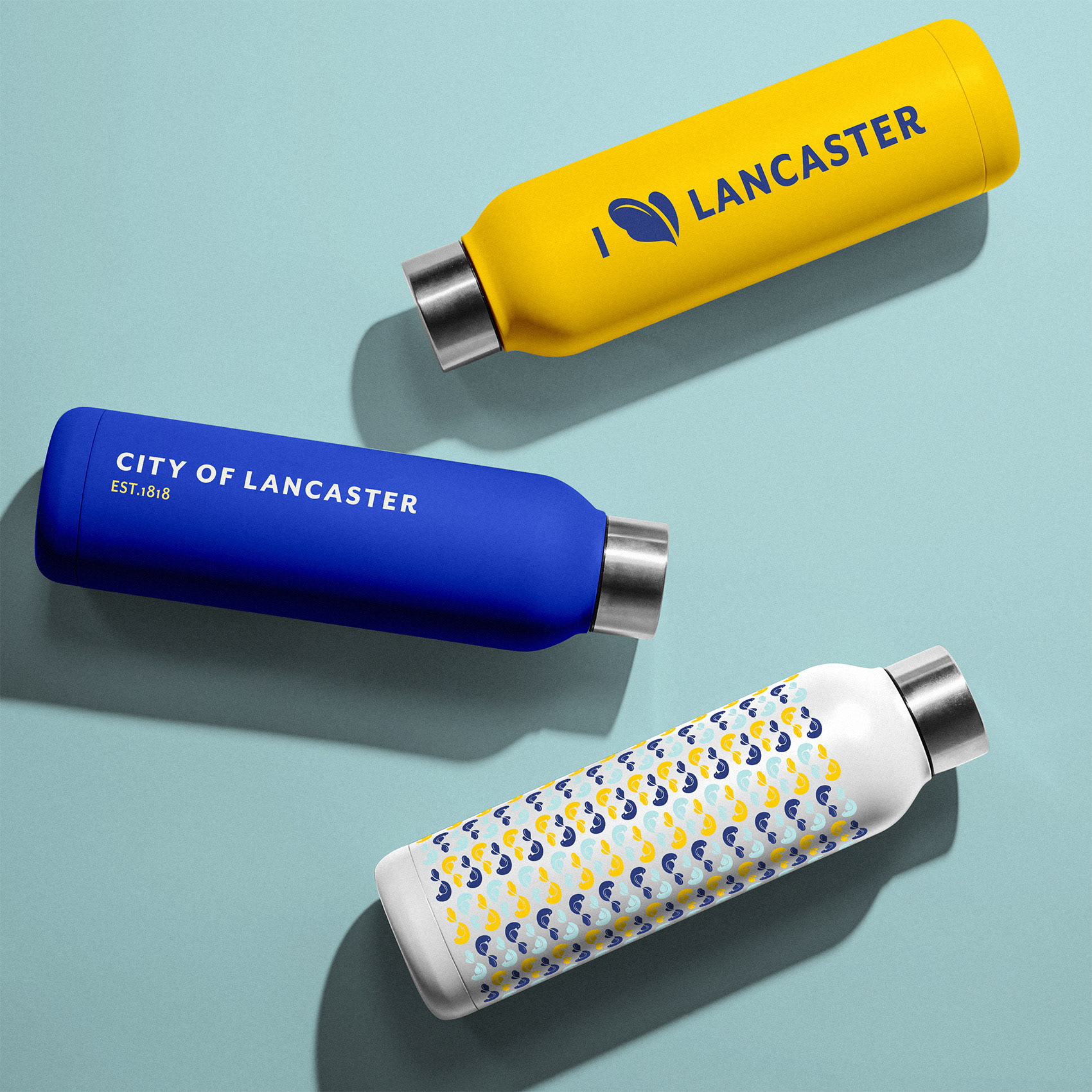
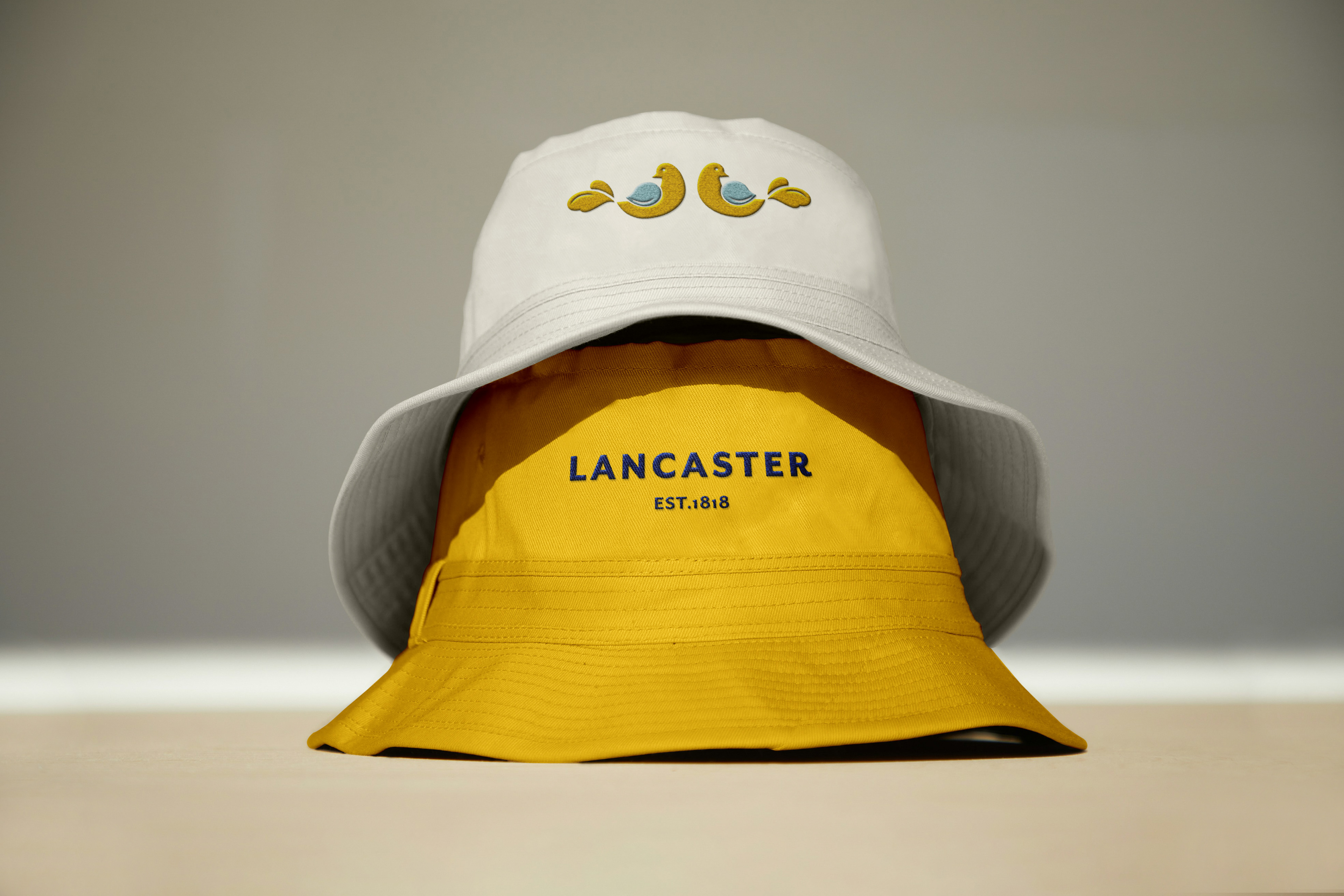
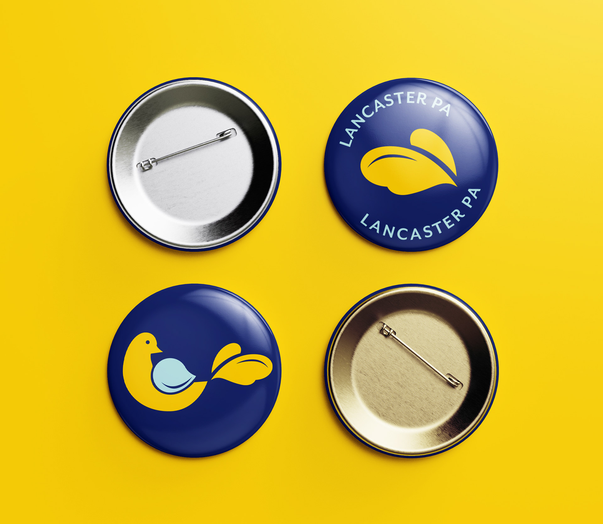
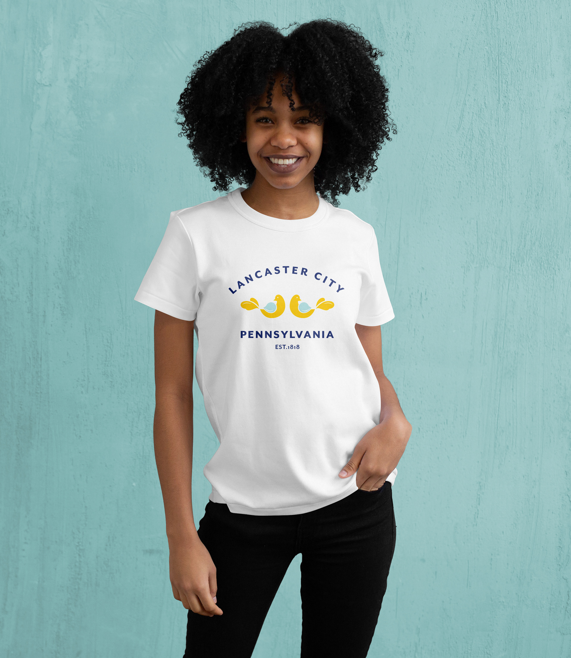
The bird was designed to function as a fully responsive logo system, and the merchandise is a good demonstration of that flexibility in action. The two-bird lockup works centered on a tote or t-shirt, while the single bird fits naturally on a patch, button, or sticker. Even the tail feathers hold up as a simplified mark, and their resemblance to a heart makes them perfect for a playful "I (heart) Lancaster" design.
The repeating pattern extends the system further, wrapping a water bottle effortlessly and feeling more like a textile print than a logo application. Each piece feels like something you'd actually want to own.
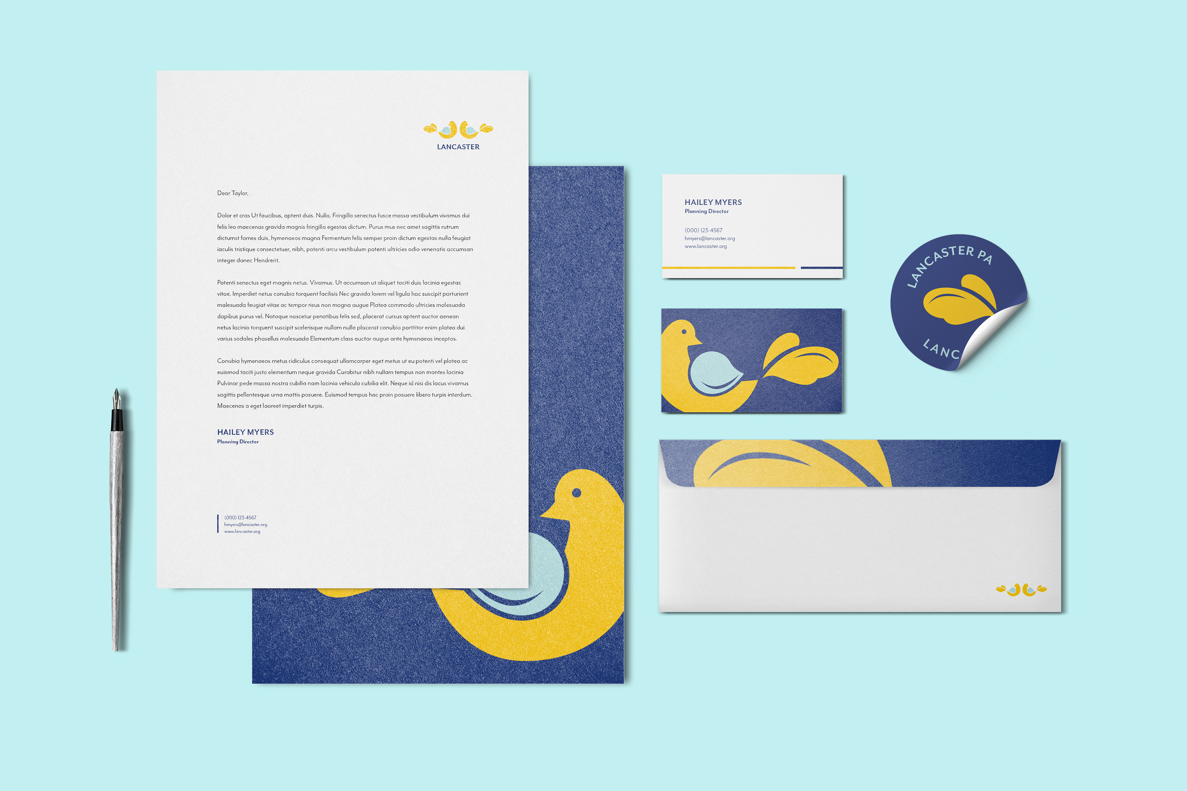
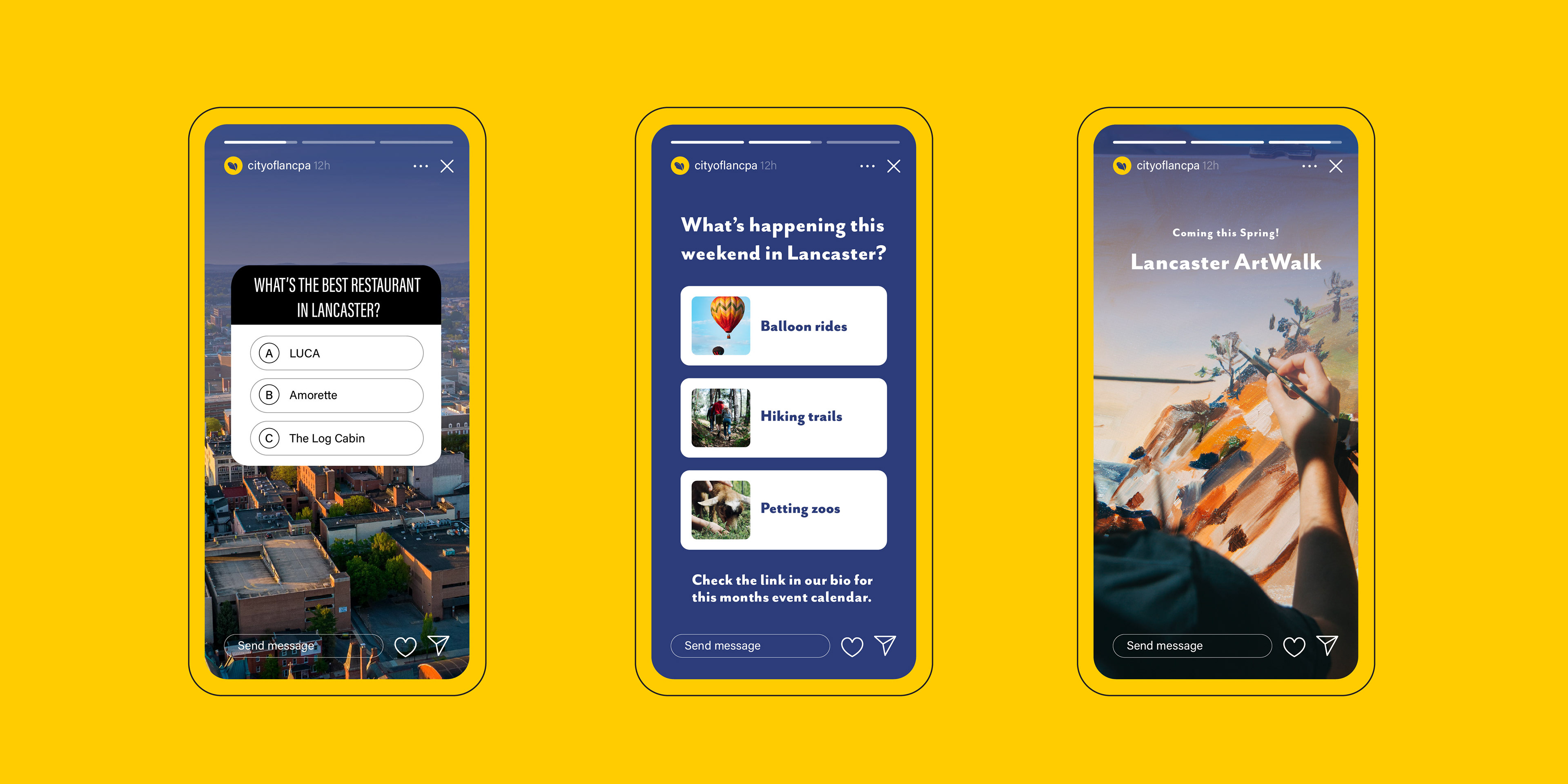
A Brand That Speaks
A city brand has to work on two levels: professional enough for official use, approachable enough that residents actually connect with it. The stationery suite feels polished and credible without being cold, using the bird illustration and brand colors in a way that's warmer and more characterful than typical government materials.
The same is true for the social media templates, where the navy and gold palette stays consistent while leaving room for photography and content to take center stage. The overall feel is one of a city that takes itself seriously but still knows how to talk to its people.