Moove
A new non-dairy milk for people always on the go
branding, packaging, copy, concept project
Busy commuters don’t have time to deliberate at the refrigerator case. Moove is a non-dairy milk brand designed specifically for people on the go, and the packaging needed to work as hard as its audience. The challenge was creating something visually enticing that could communicate flavor, quality, and brand personality in the few seconds a shopper has before reaching for a bottle and heading out the door.
The solution was a bold, color-coded label system that makes each flavor instantly identifiable at a glance. No searching, no squinting at fine print. Just grab your color and go.
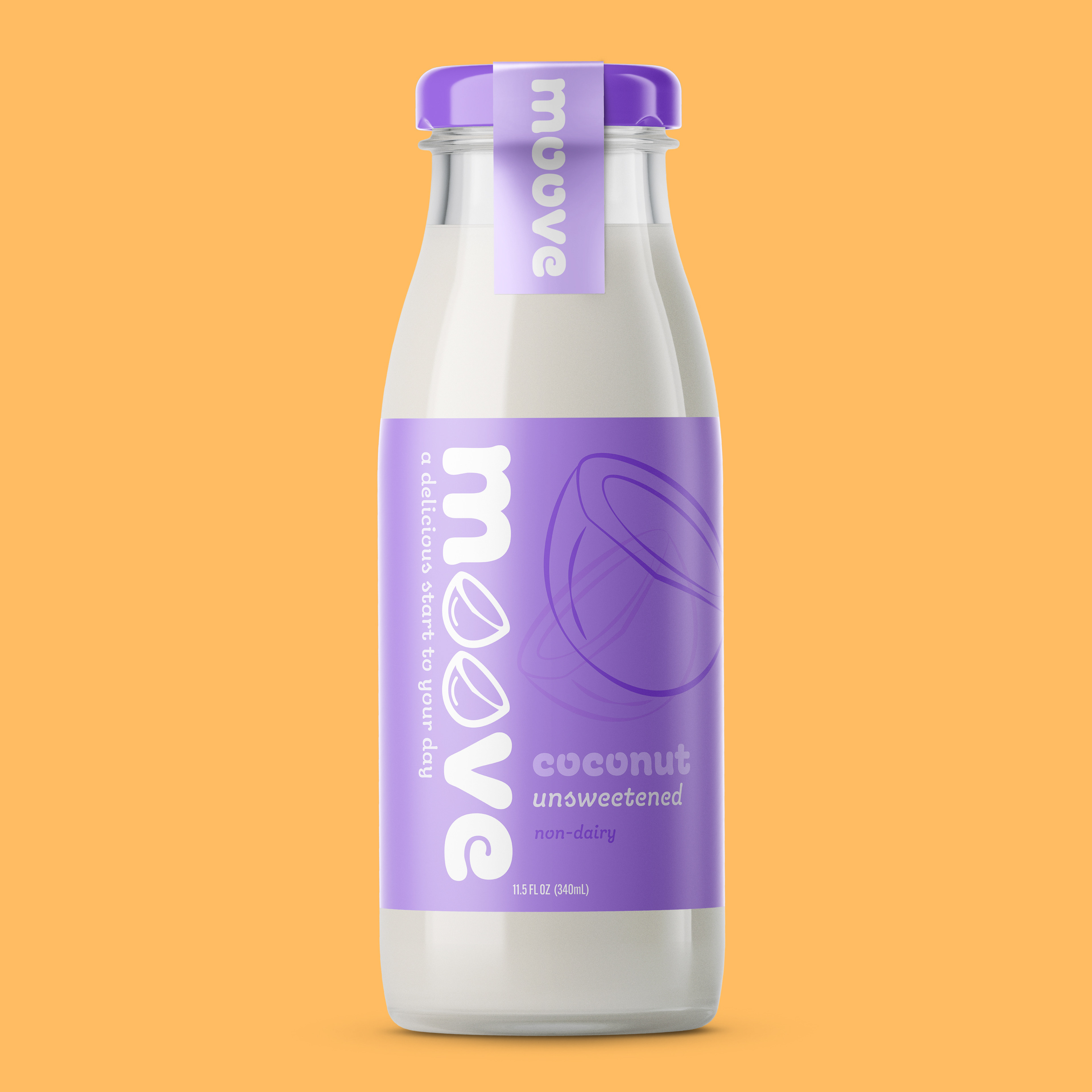
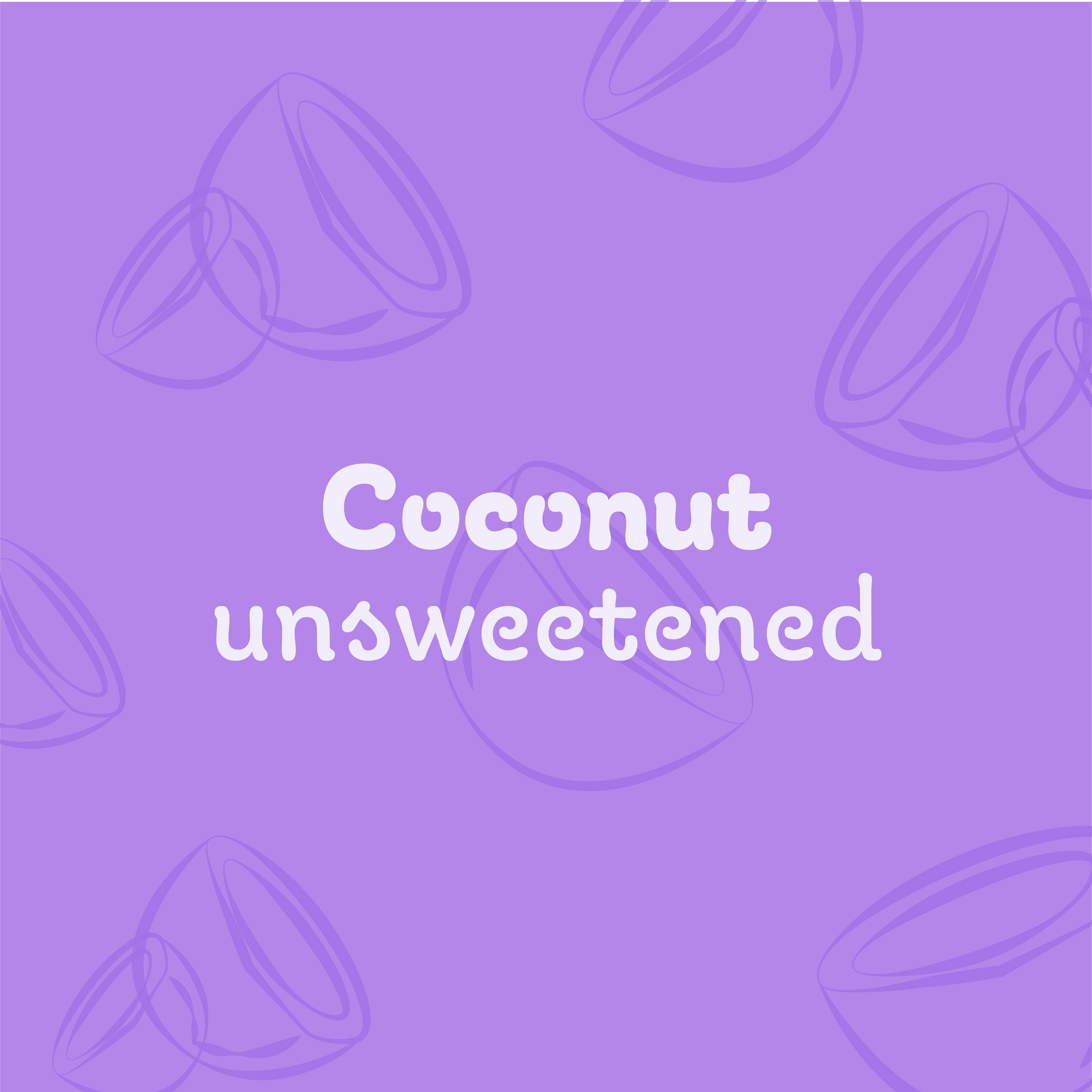
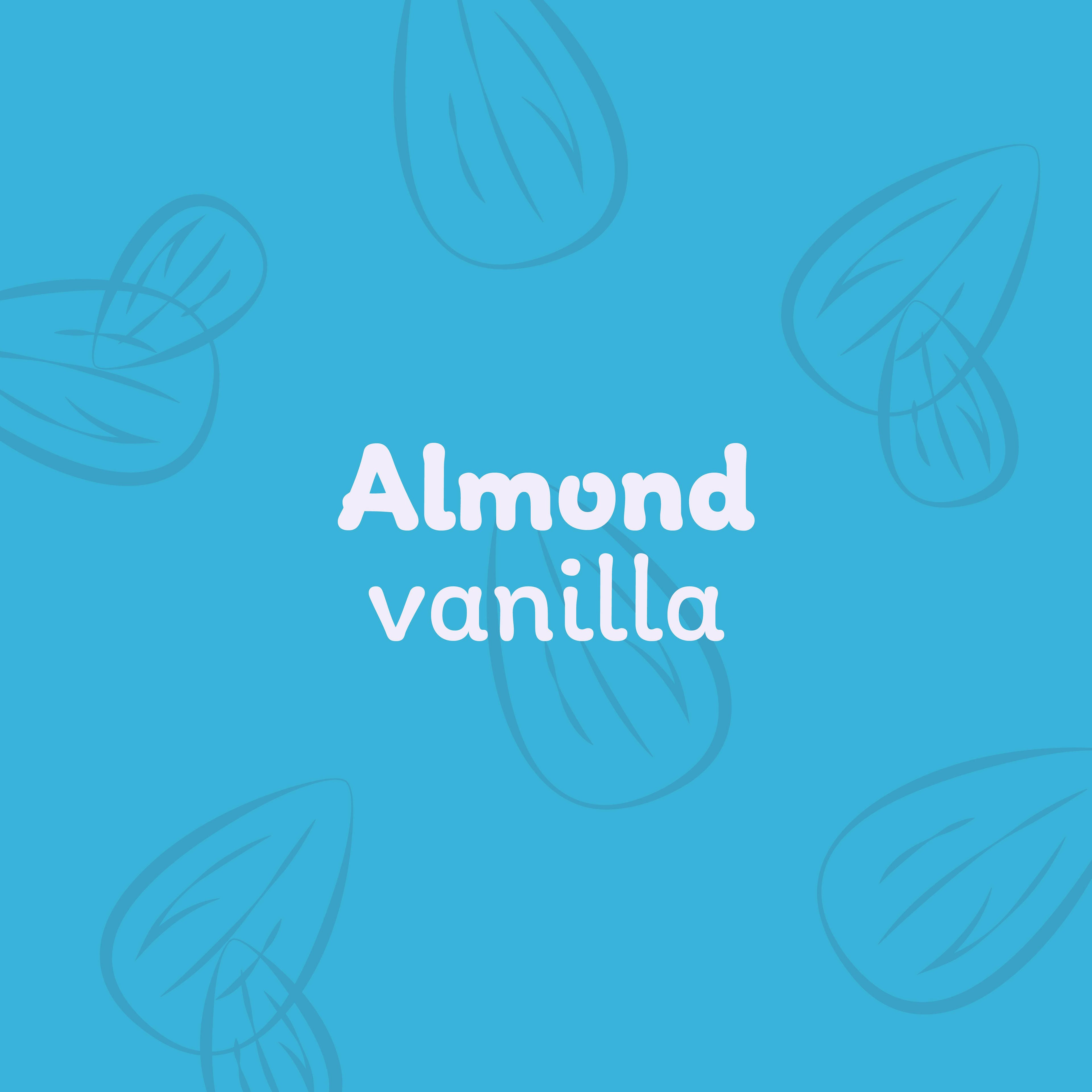
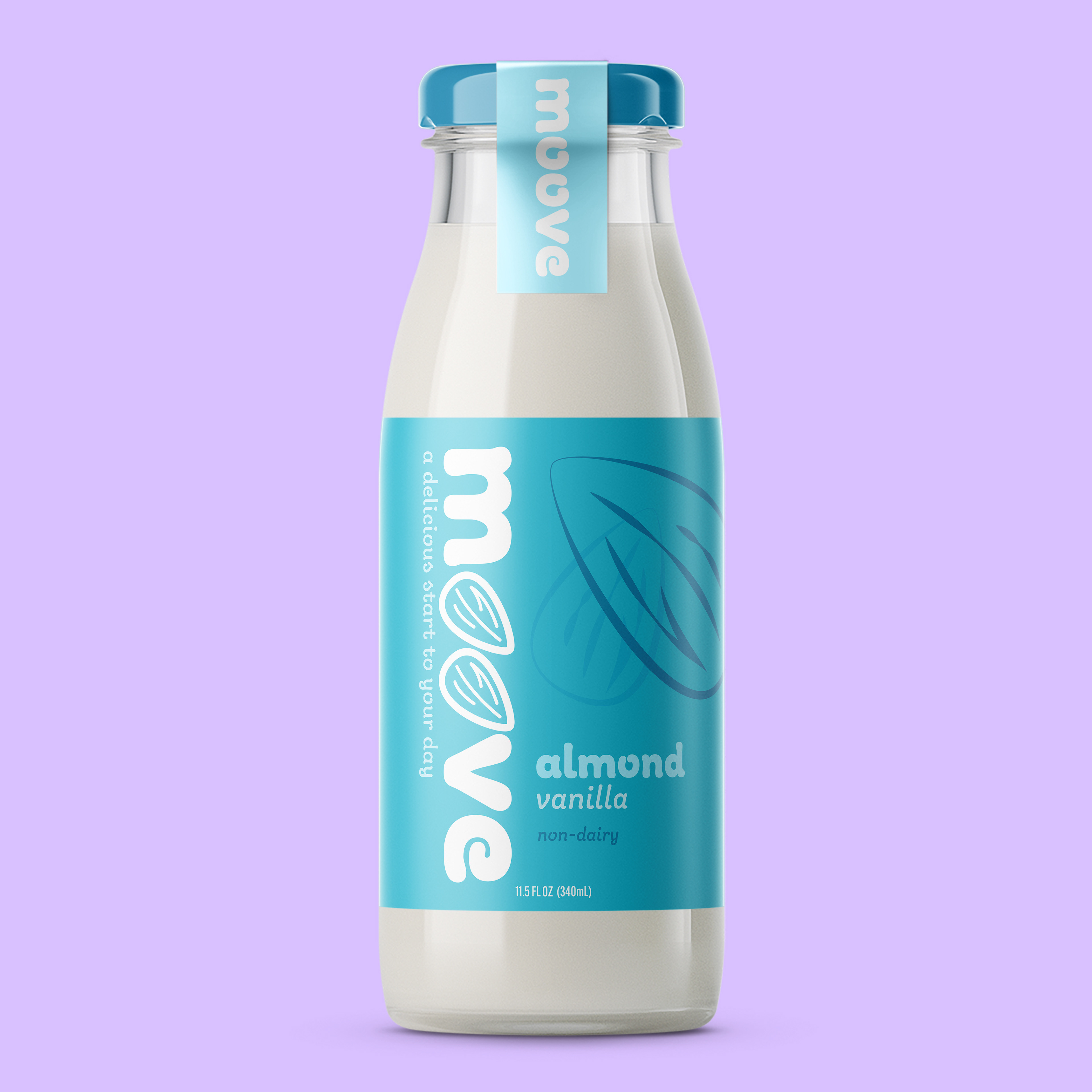
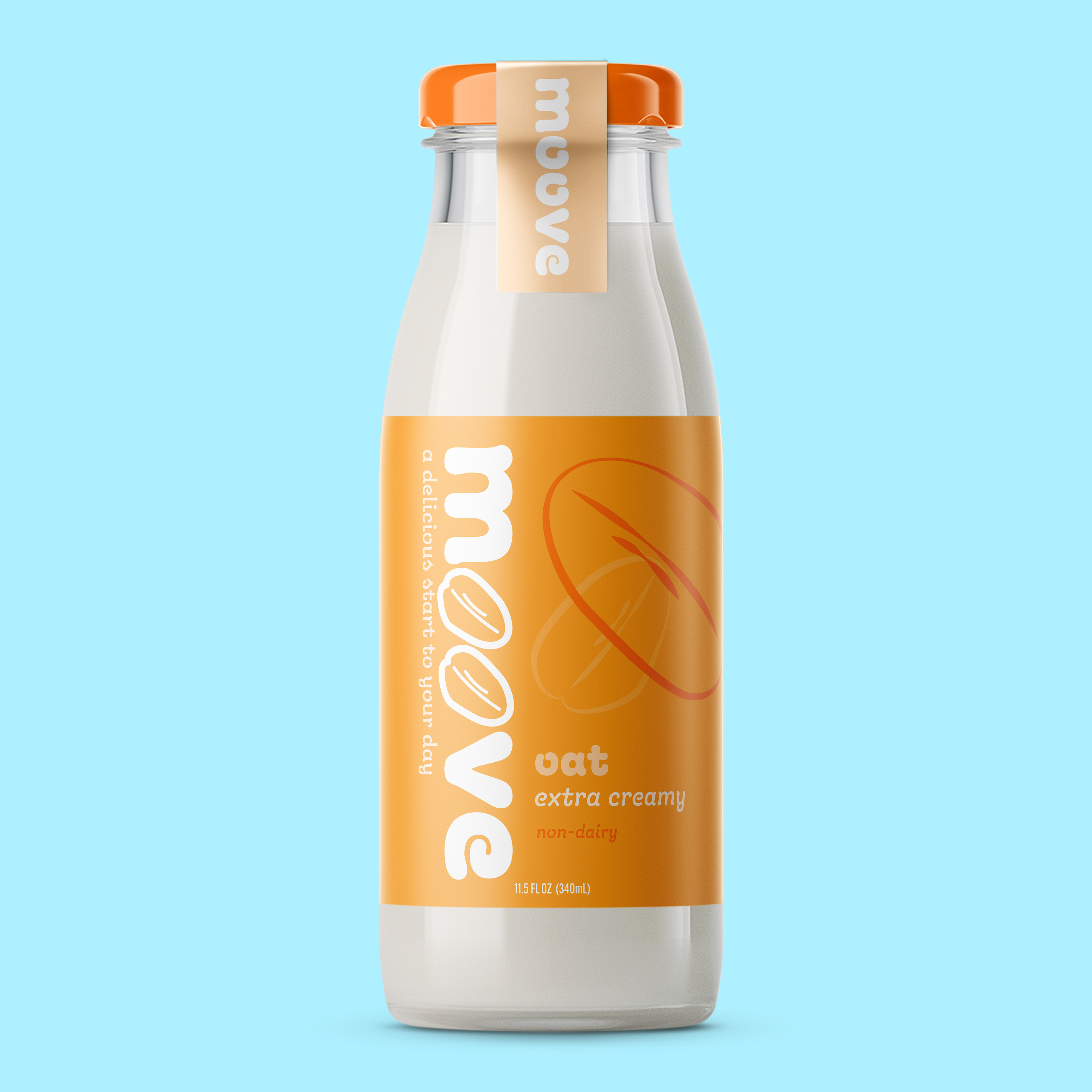

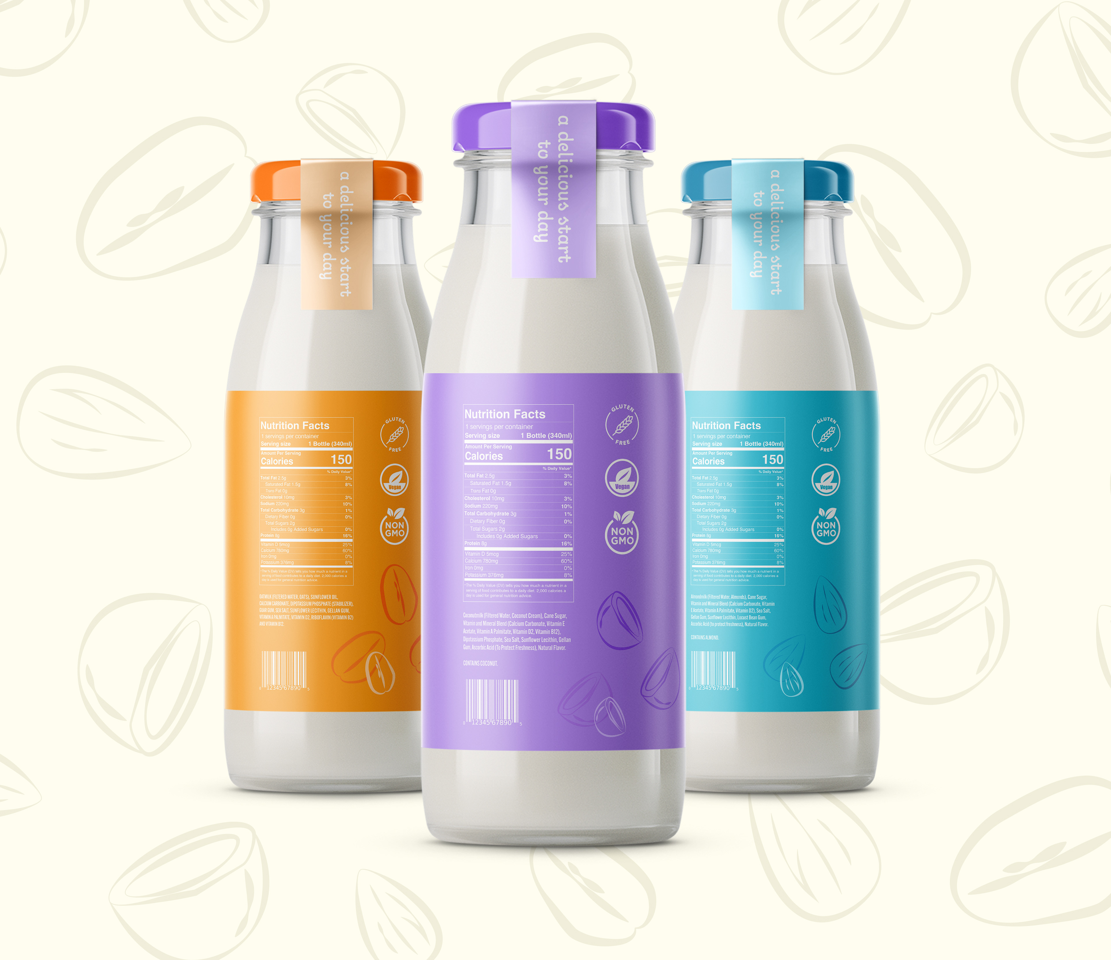
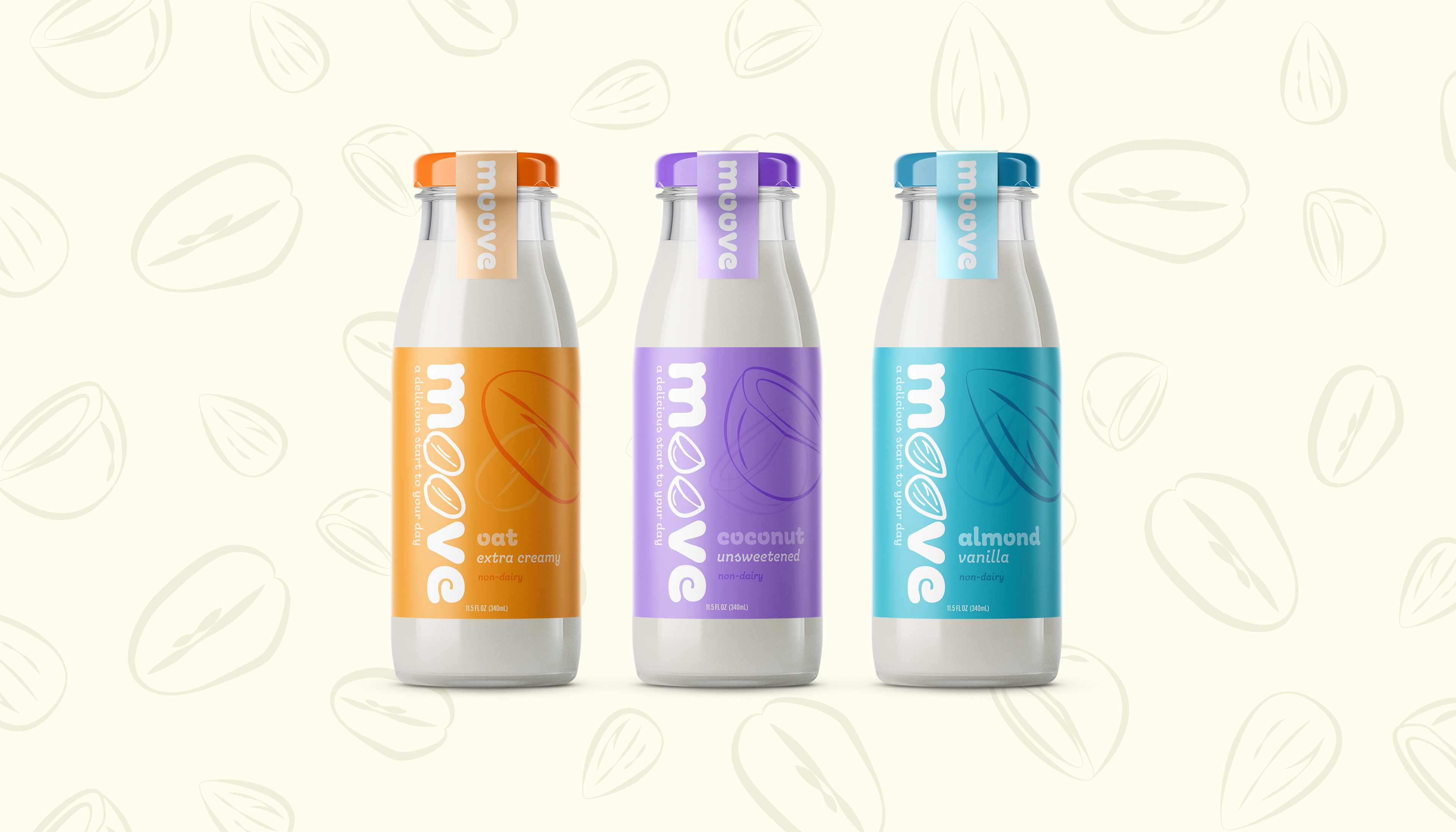
Each of the three flavors, oat, coconut, and almond, gets its own color, orange, purple, and teal, respectively, making it easy to grab exactly what you need without having to read a word.
The main ingredient illustration is prominently displayed on each label, functioning less as a decorative detail and more as an immediate visual cue for the flavor. Color-matched lids reinforce the system and make the bottles feel cohesive as a set while still being clearly distinct from one another.
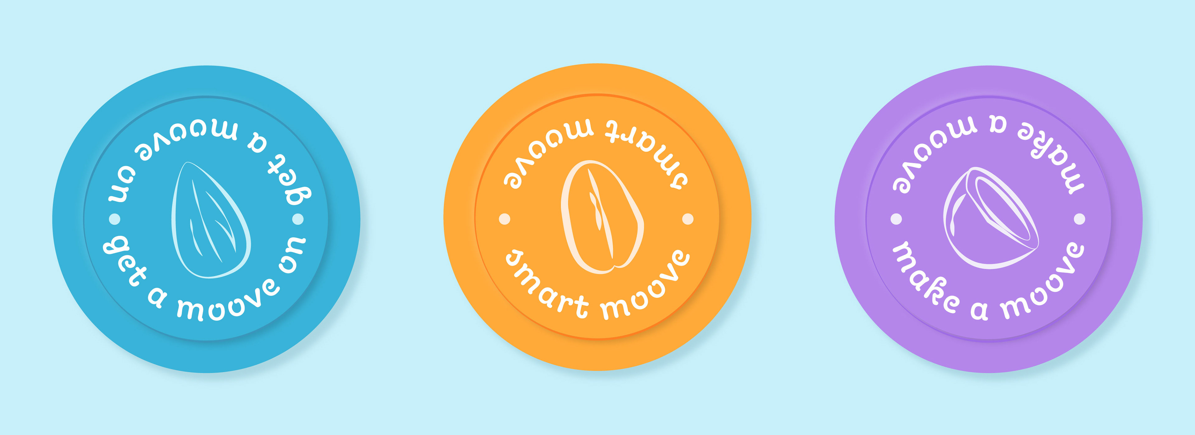
The playful energy of the brand shows up across every surface of the label. The round, almost bouncy quality of the typeface keeps things light and fun, and the oversized ingredient illustrations give each flavor its own personality without straying from the system. Even the lids get in on it, each one printed with its own "moove" pun, "smart moove," "make a moove," and "get a moove on," the kind of small detail that makes someone smile on their morning commute