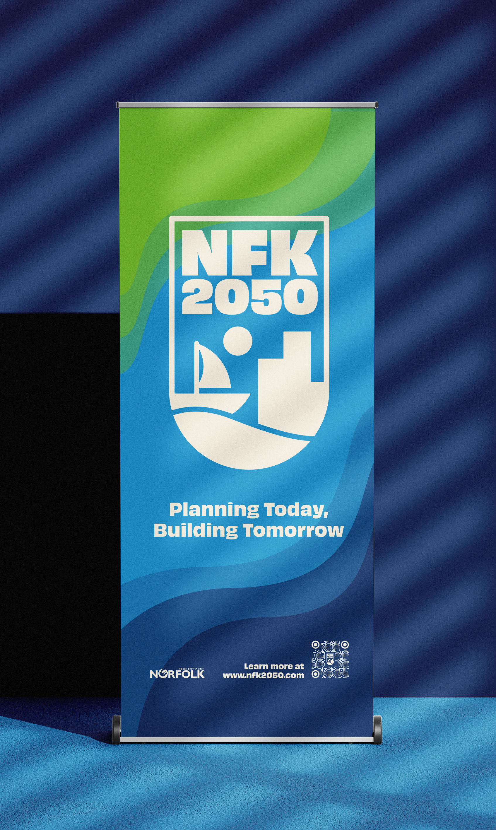
NFK2050
A Comprehensive Plan for the City of Norfolk, Virginia
brand strategy, visual identity, layout, storytelling, community engagement, art direction
Designing a brand for a citywide planning initiative comes with a unique set of constraints. The NFK2050 brand needed to feel genuinely connected to Norfolk and its residents, rooted in the city’s identity in a way that the community could see themselves in. At the same time, the client requested that the brand complement the existing City of Norfolk visual identity without simply borrowing from it. NFK2050 had to feel like its own distinct initiative, with enough visual independence to stand on its own across a wide range of deliverables.
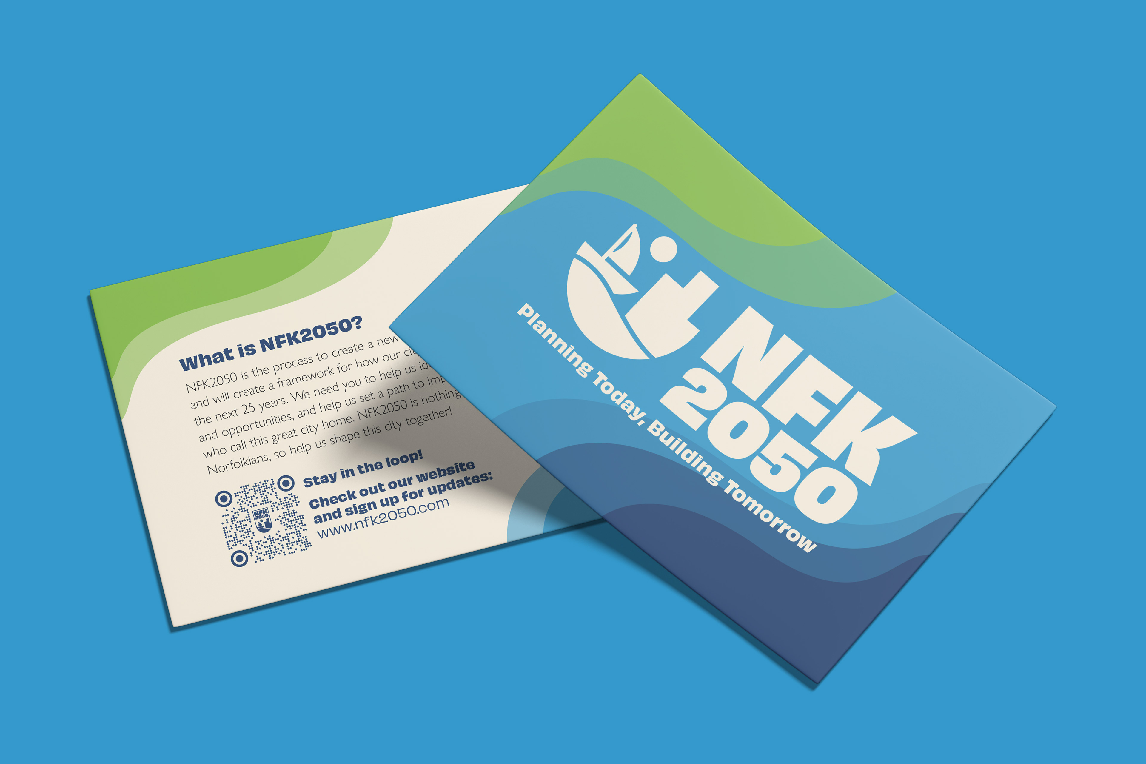
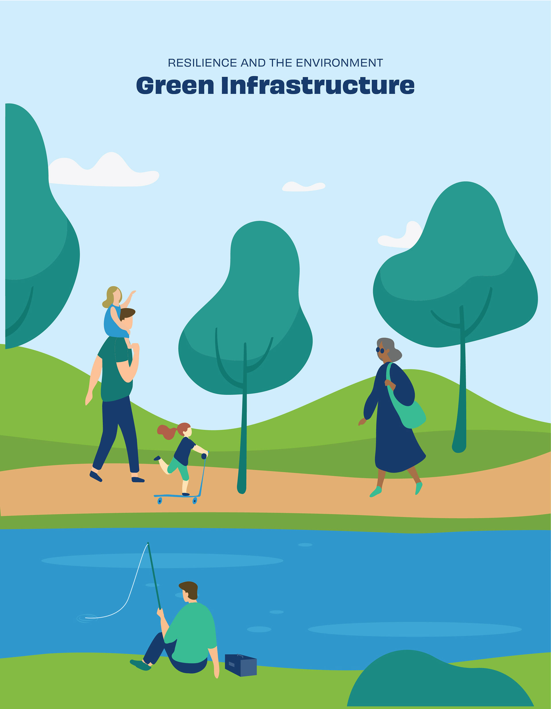
The answer was found in Norfolk’s geography. A coastal color palette moving through greens, teals, and blues, paired with a flowing wave motif, gave the brand a strong sense of place that felt native to Norfolk without directly mirroring the city’s existing brand. The result is an identity that feels like a natural extension of the city while making clear that NFK2050 is something new, a community-driven vision for what Norfolk wants to become.
From Play to Plan:
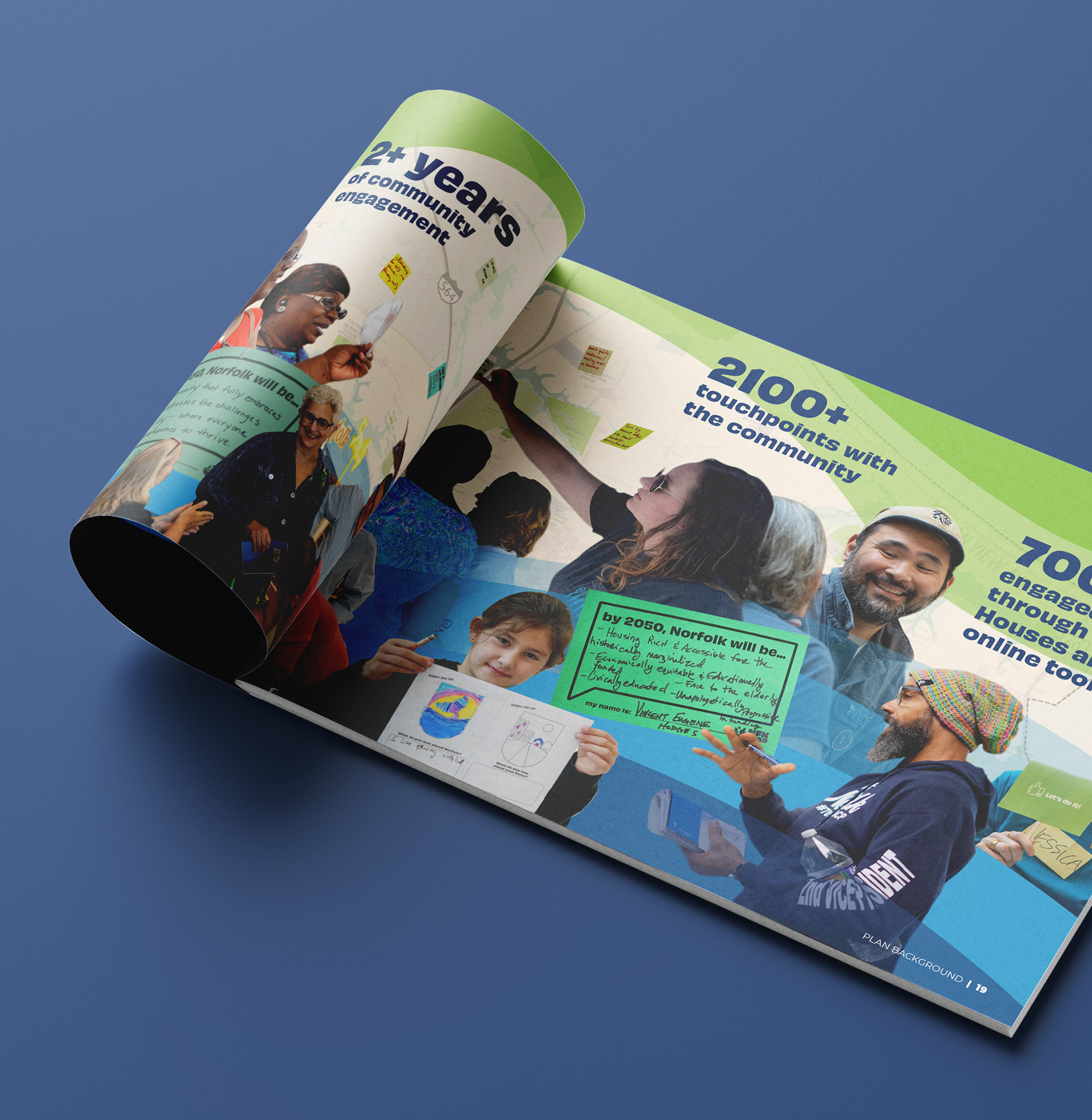
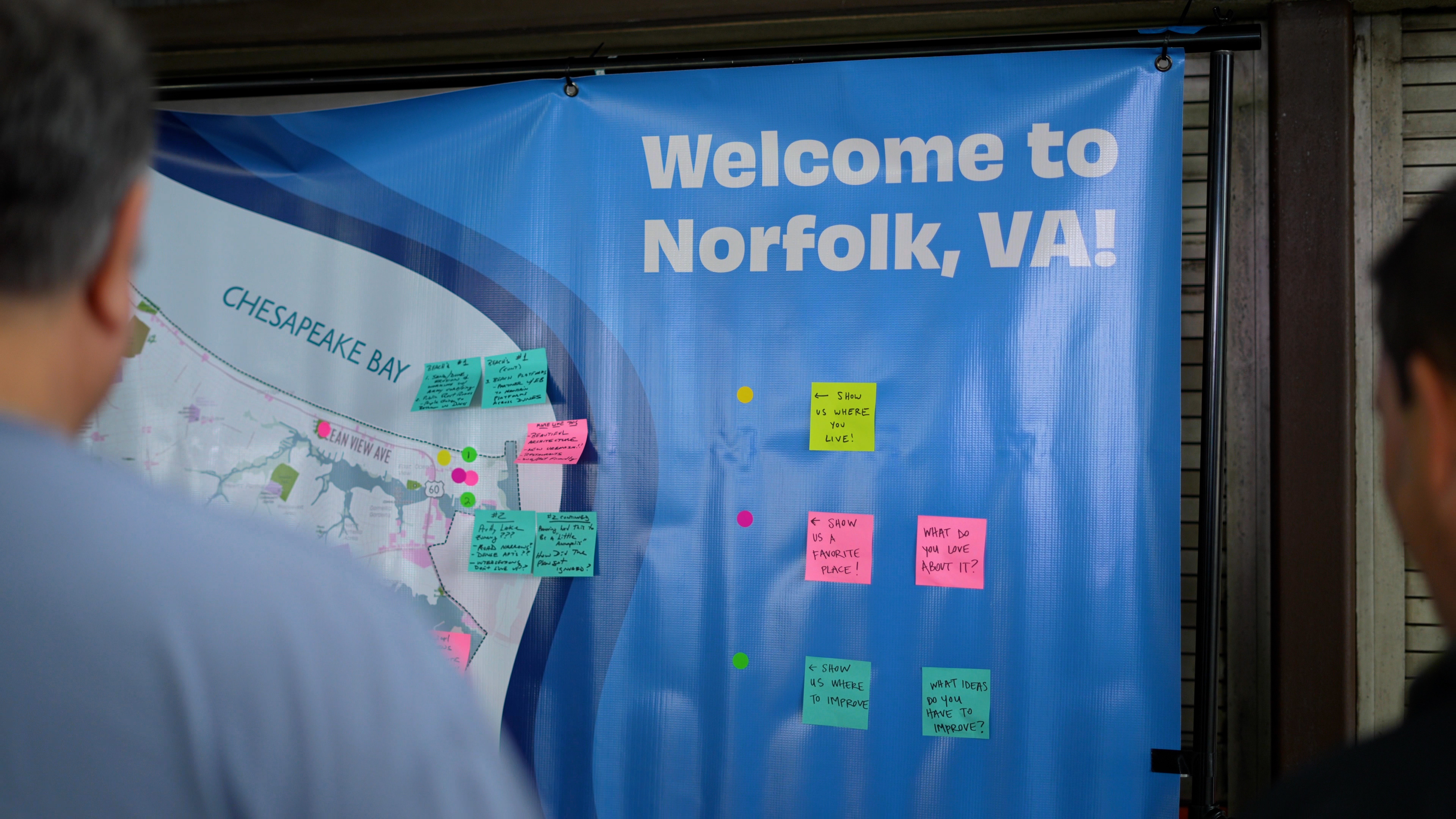
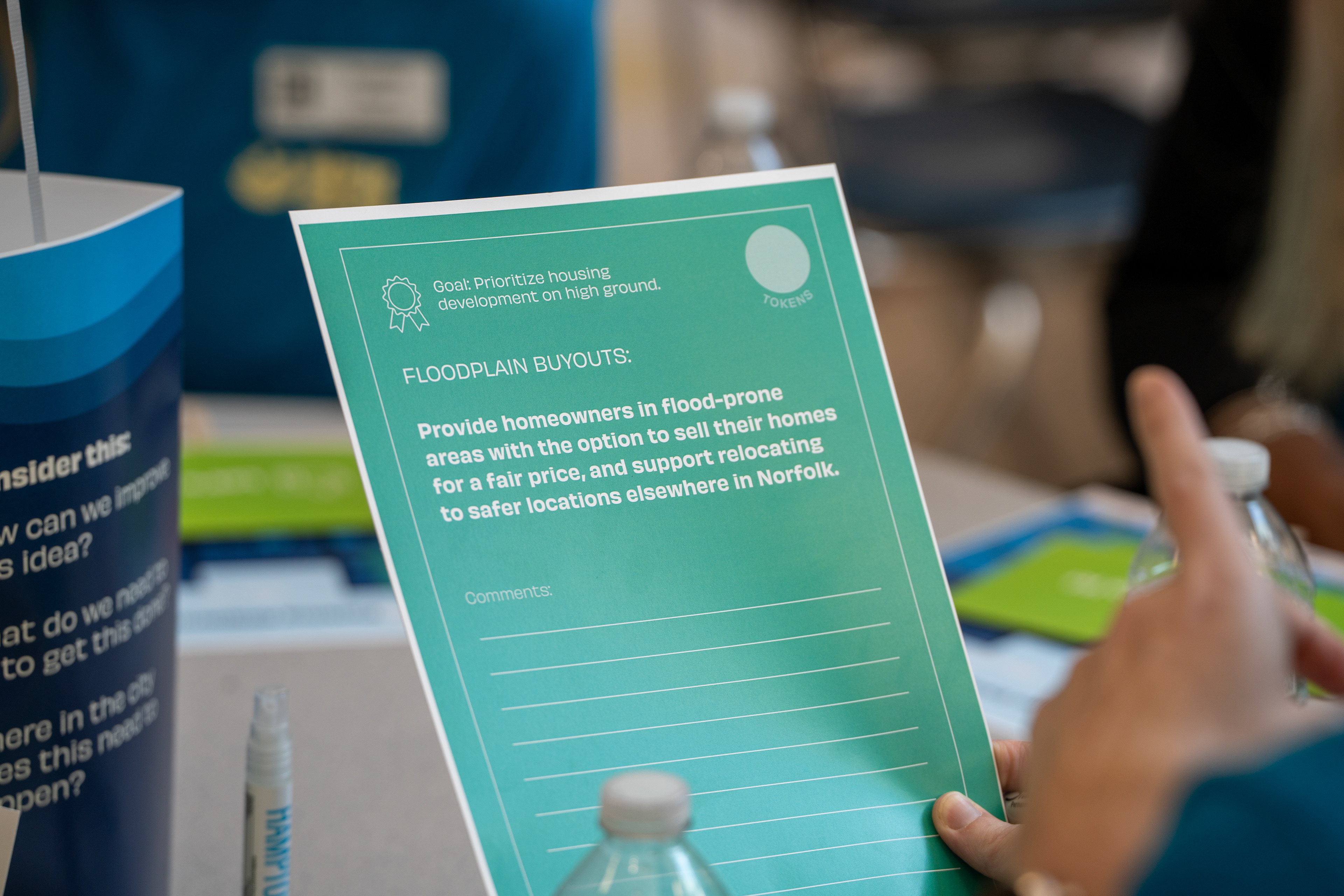
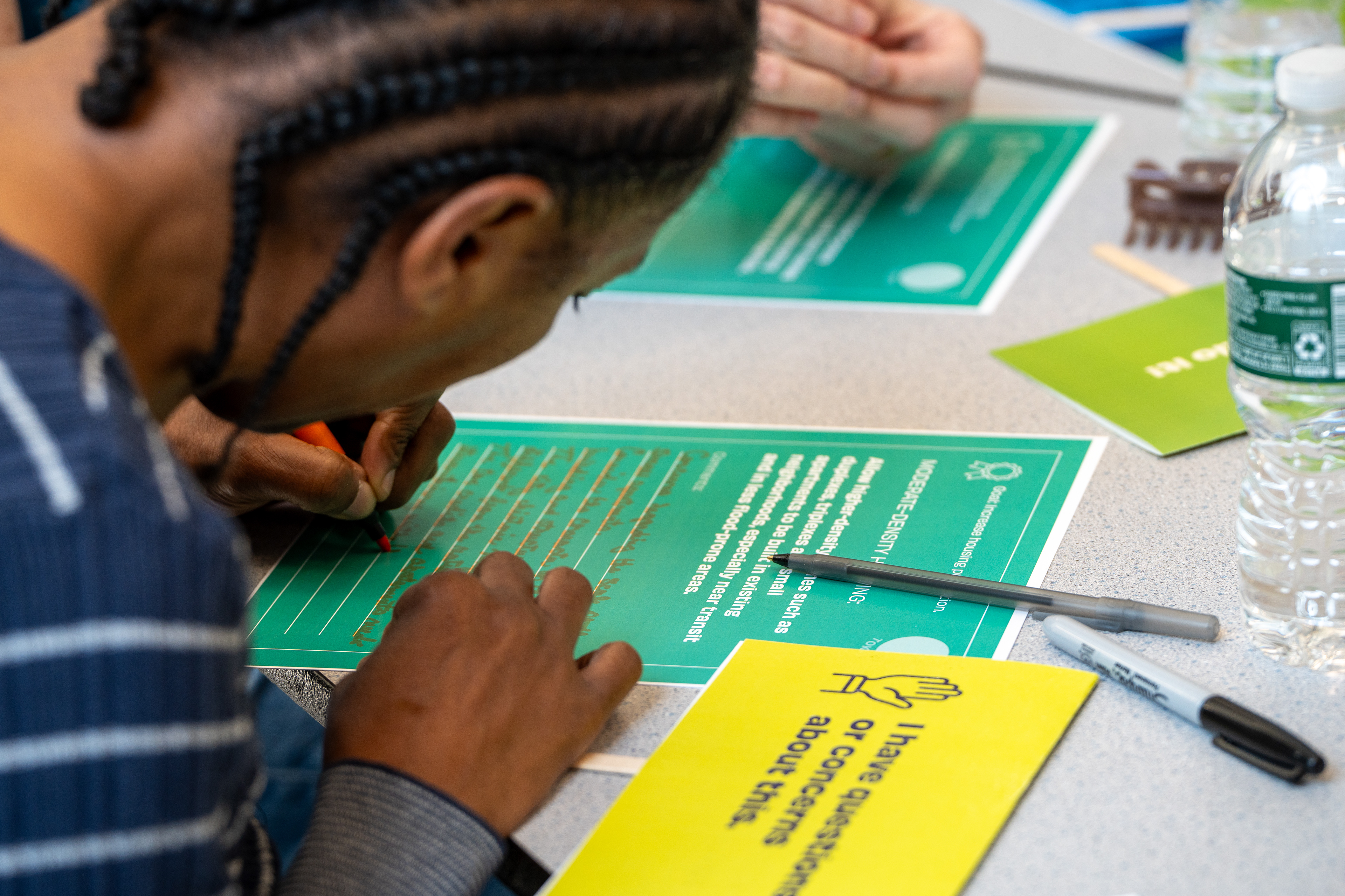
It can be hard to gather high-quality feedback from residents, especially if they're uninterested in certain topics or nervous about making suggestions. That's why we gamified the discussion at an NFK2050 summer open house. Residents were divided into smaller groups where they used cards and tokens to discuss important plan topics such as housing, environment, and mobility.
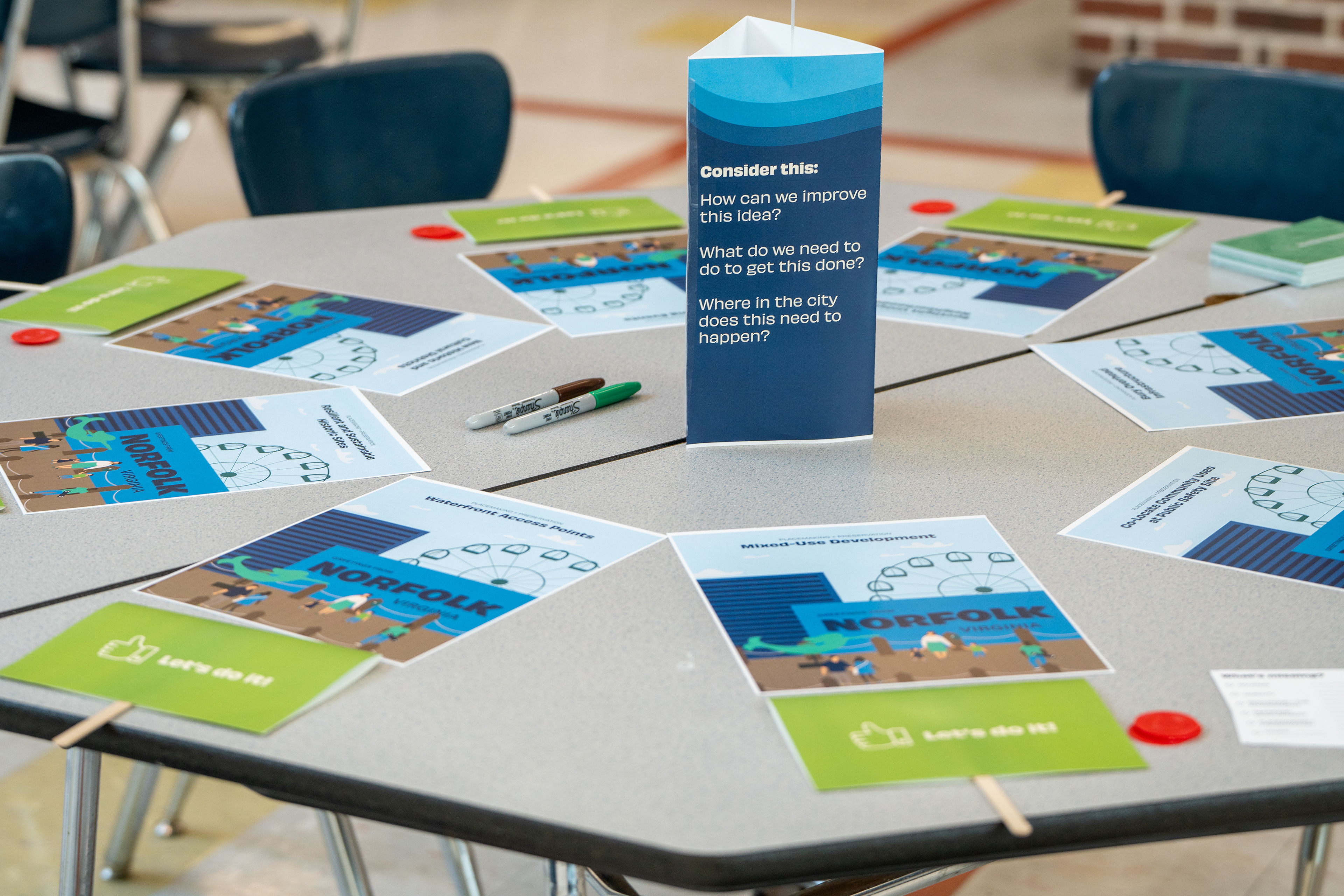


Residents took turns reading aloud the action on the back of their card, and then they used their "vote" card to approve the action or raise a question or concern. Following the vote, residents discussed changes to the action that would secure approval from the entire group.
The card game provided valuable qualitative feedback on the plan's actions and revealed what actions residents valued most.

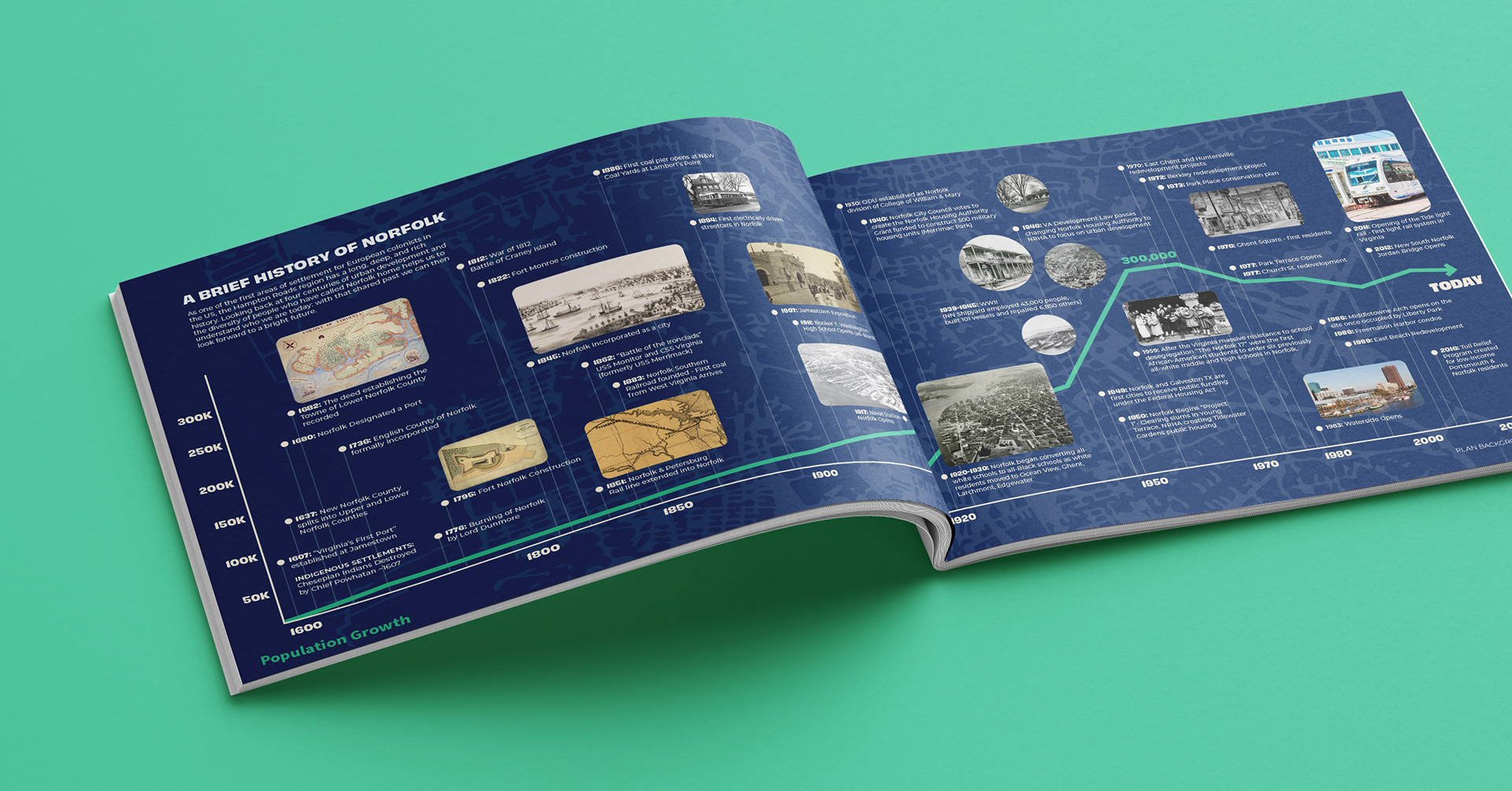
Perfecting the Plan:
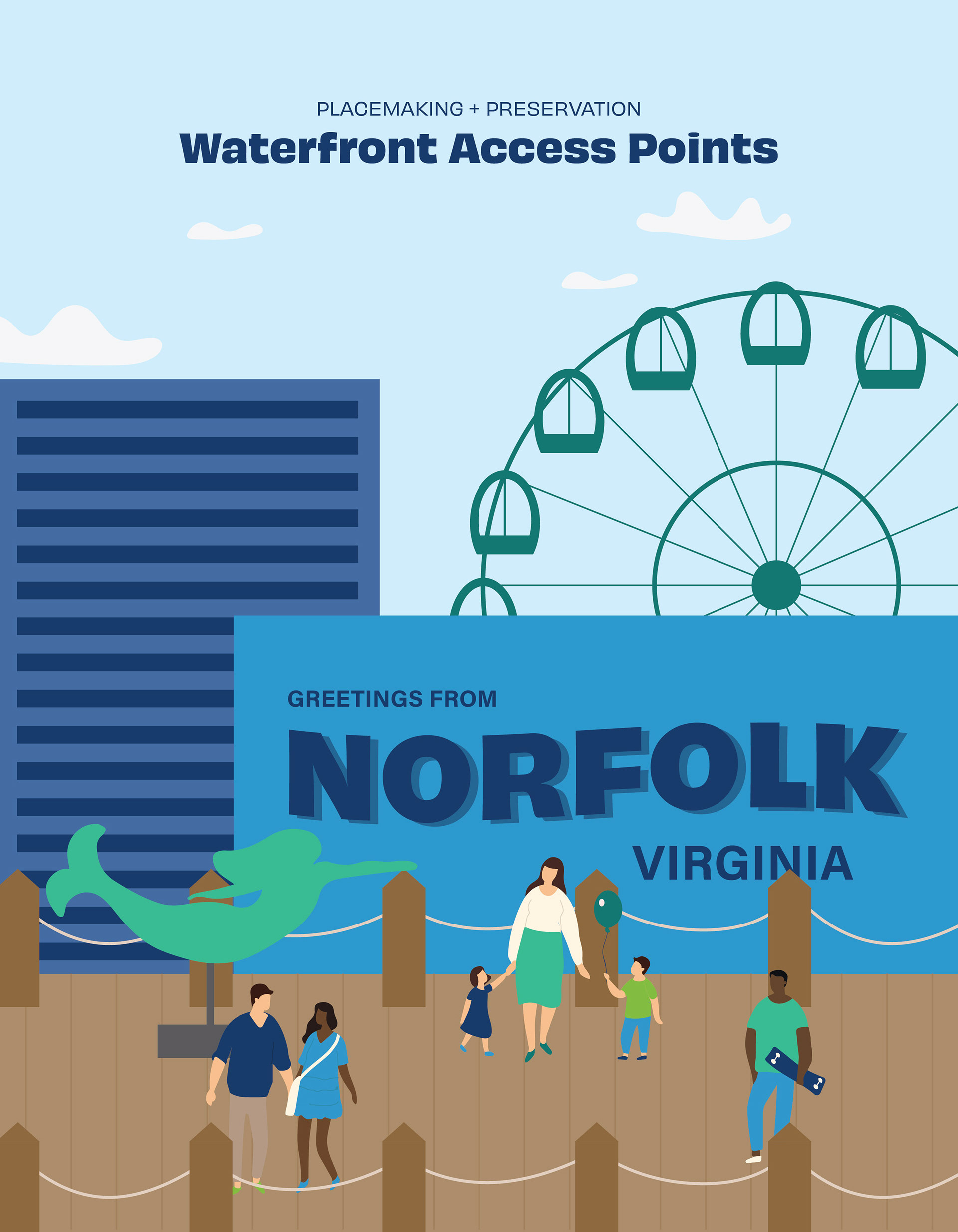
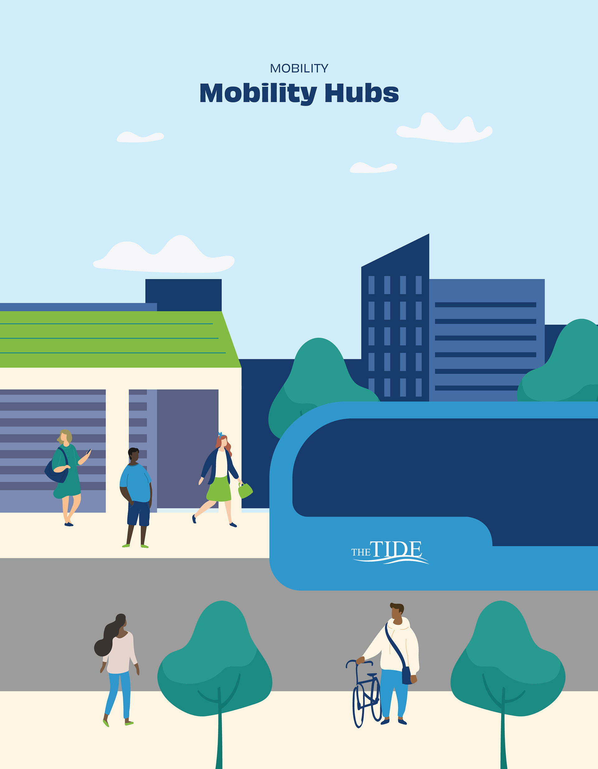
At 294 pages, the plan document was no small feat. Maps, infographics, case studies, pull quotes, and tables all had to coexist in the same document, each with its own layout and hierarchy needs. Keeping everything feeling cohesive was a challenge.
I chose variable typefaces with several weights that could add variety and flexibility to the text styles. The monochrome color system was also a key player, keeping everything feeling unified without the document ever becoming repetitive or cookie-cutter.