
What is Moove?
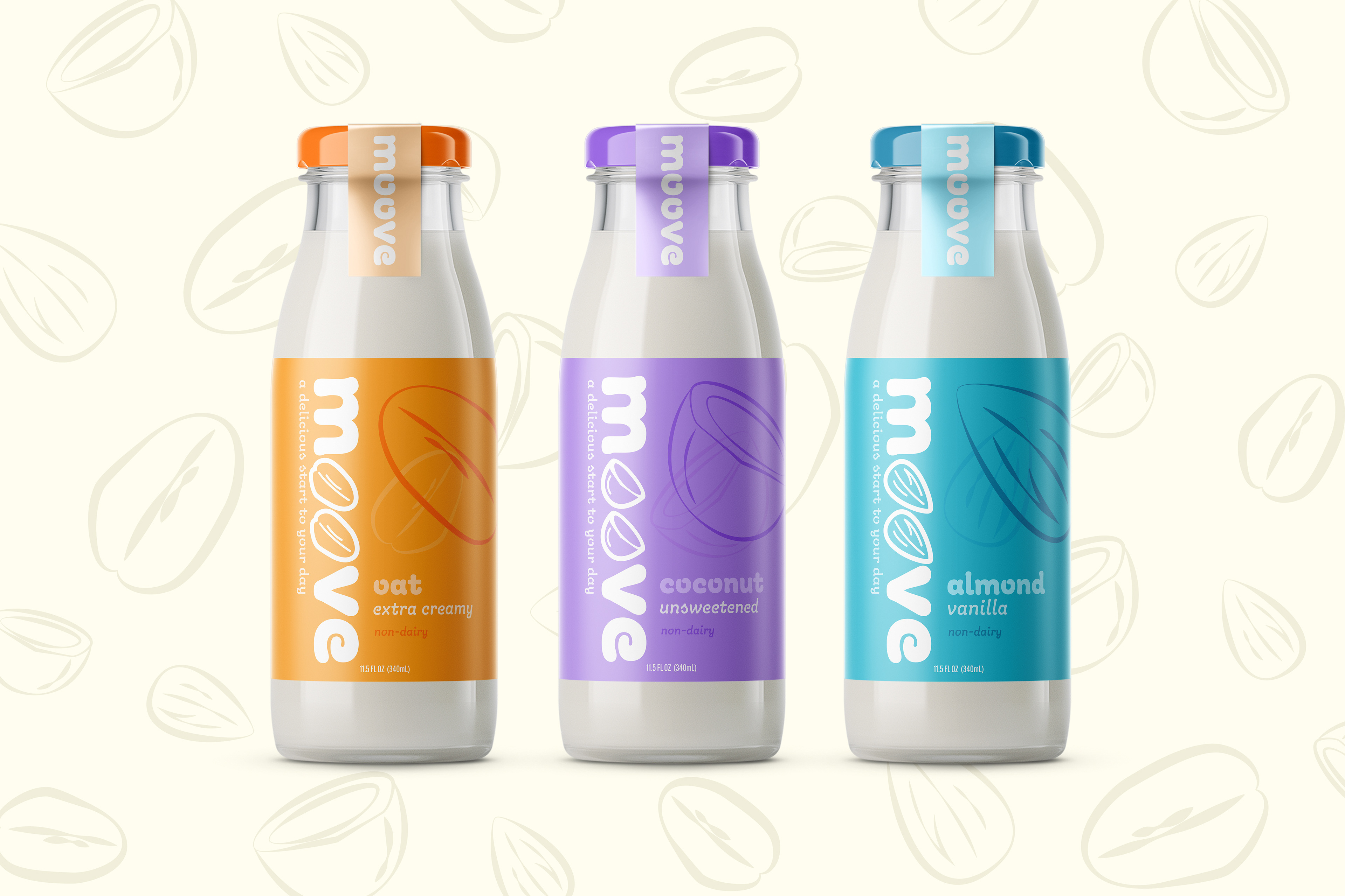
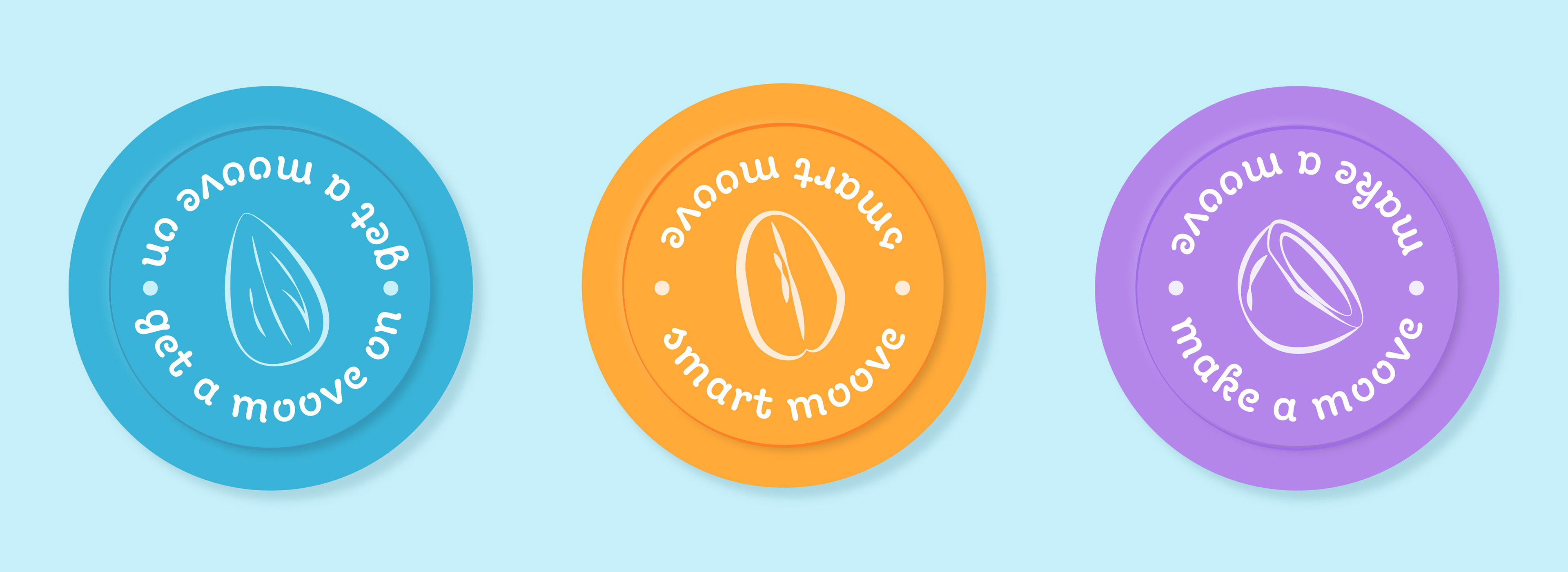
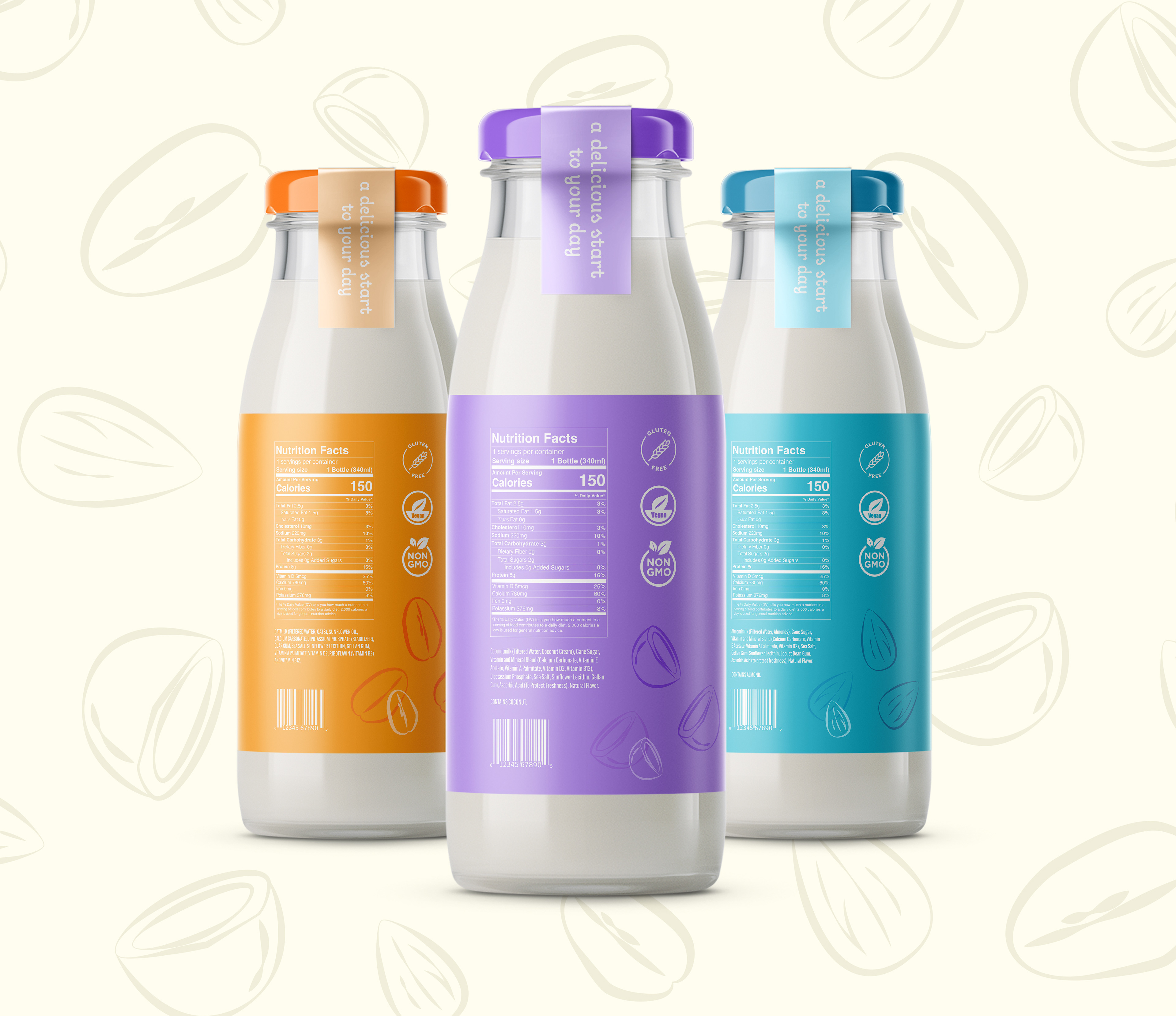
Moove is a new non-dairy milk brand designed with the suburban commuter in mind. The suburban commuter has a busy day and they don’t have time to waste looking over labels. They need to make decisions quickly. That’s why for each of Moove’s three milk varieties there is a bold color-coded label and matching illustrations so that anyone can quickly recognize the bottle they are looking for.
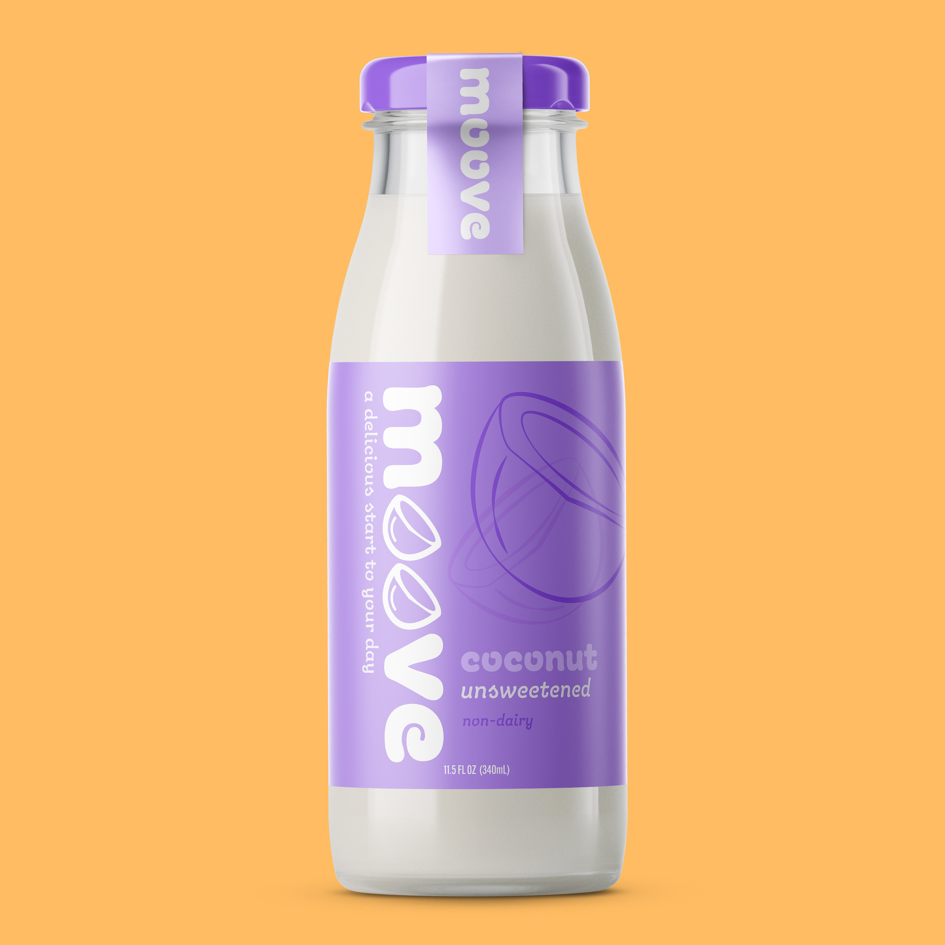
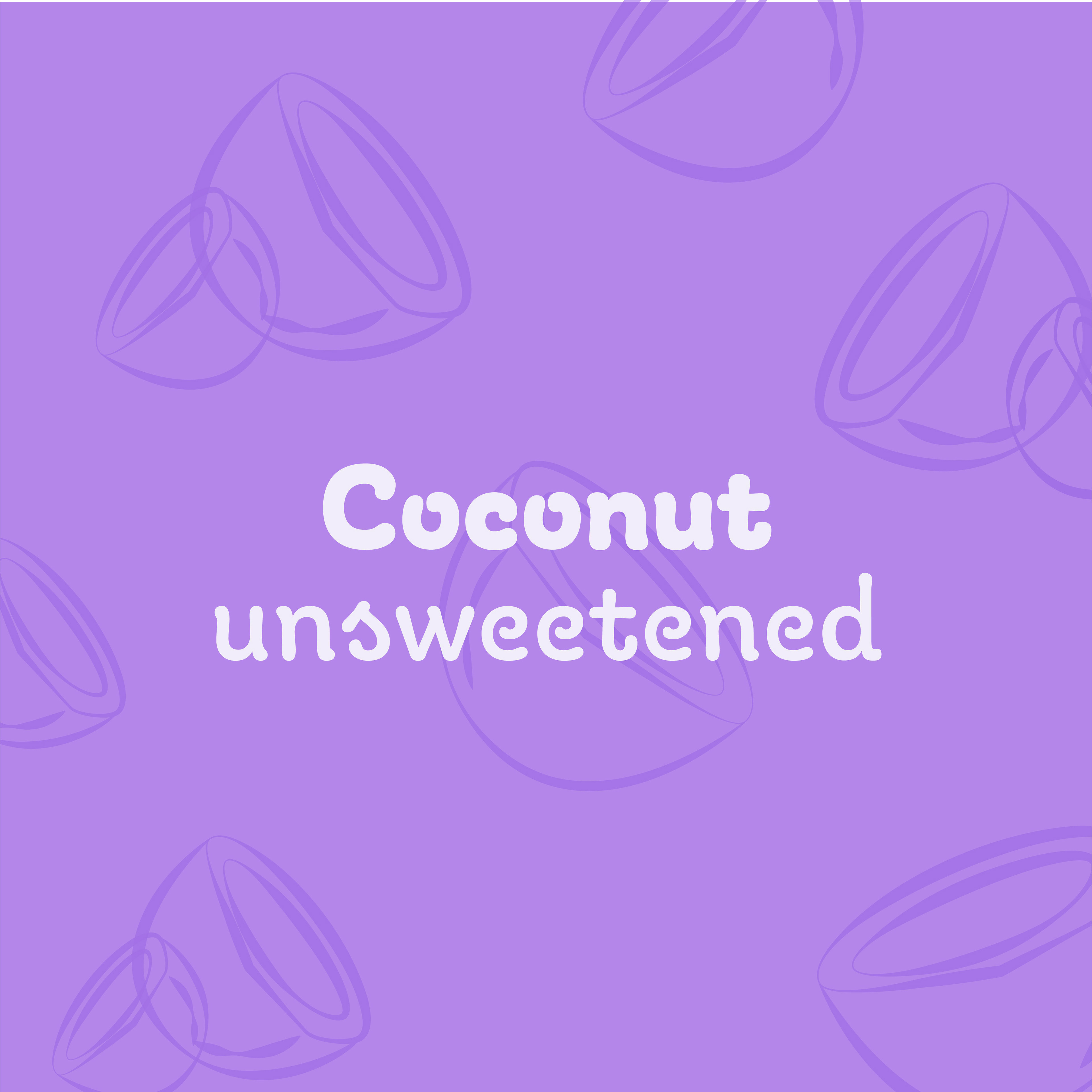
Coconut milk bottle
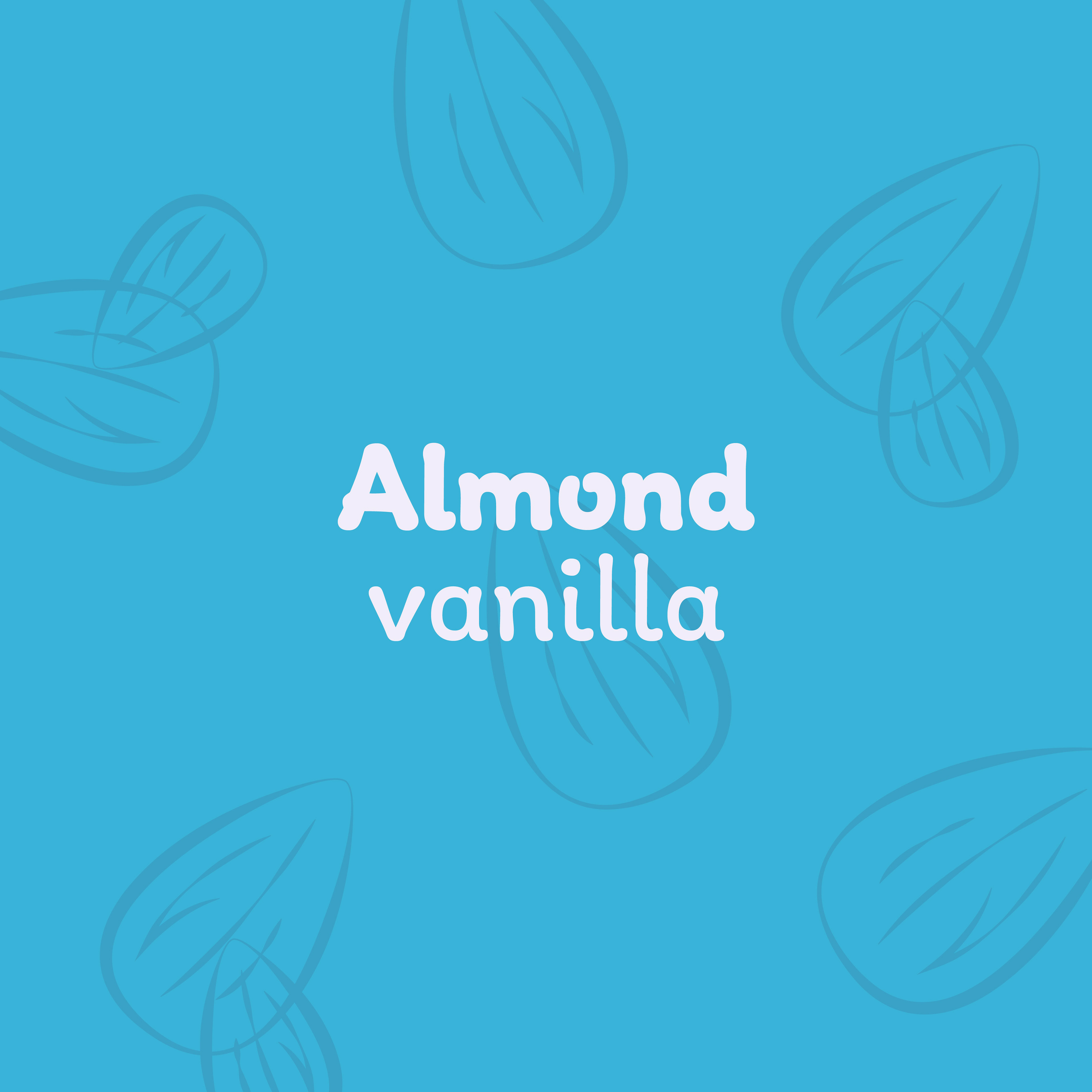
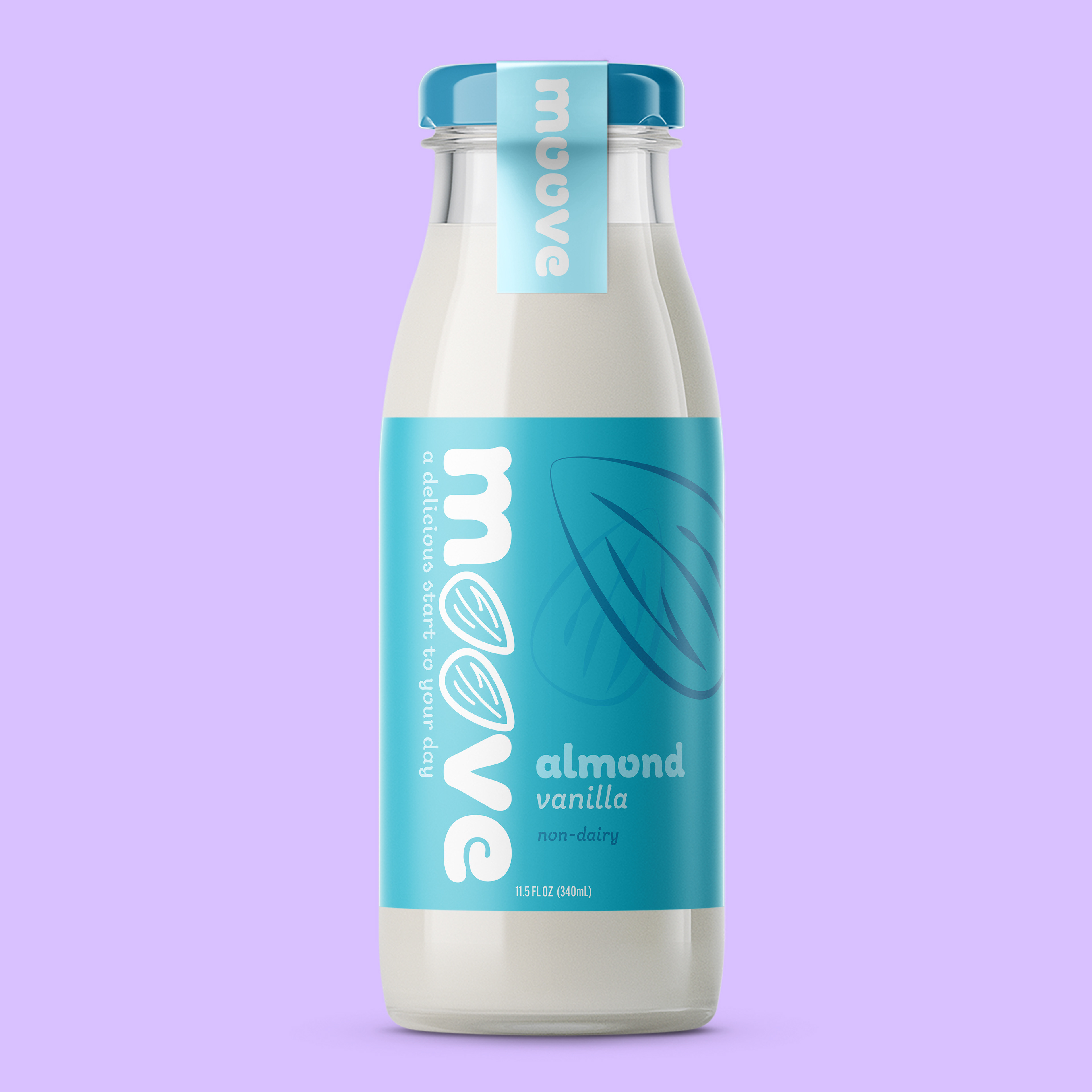
Almond milk bottle
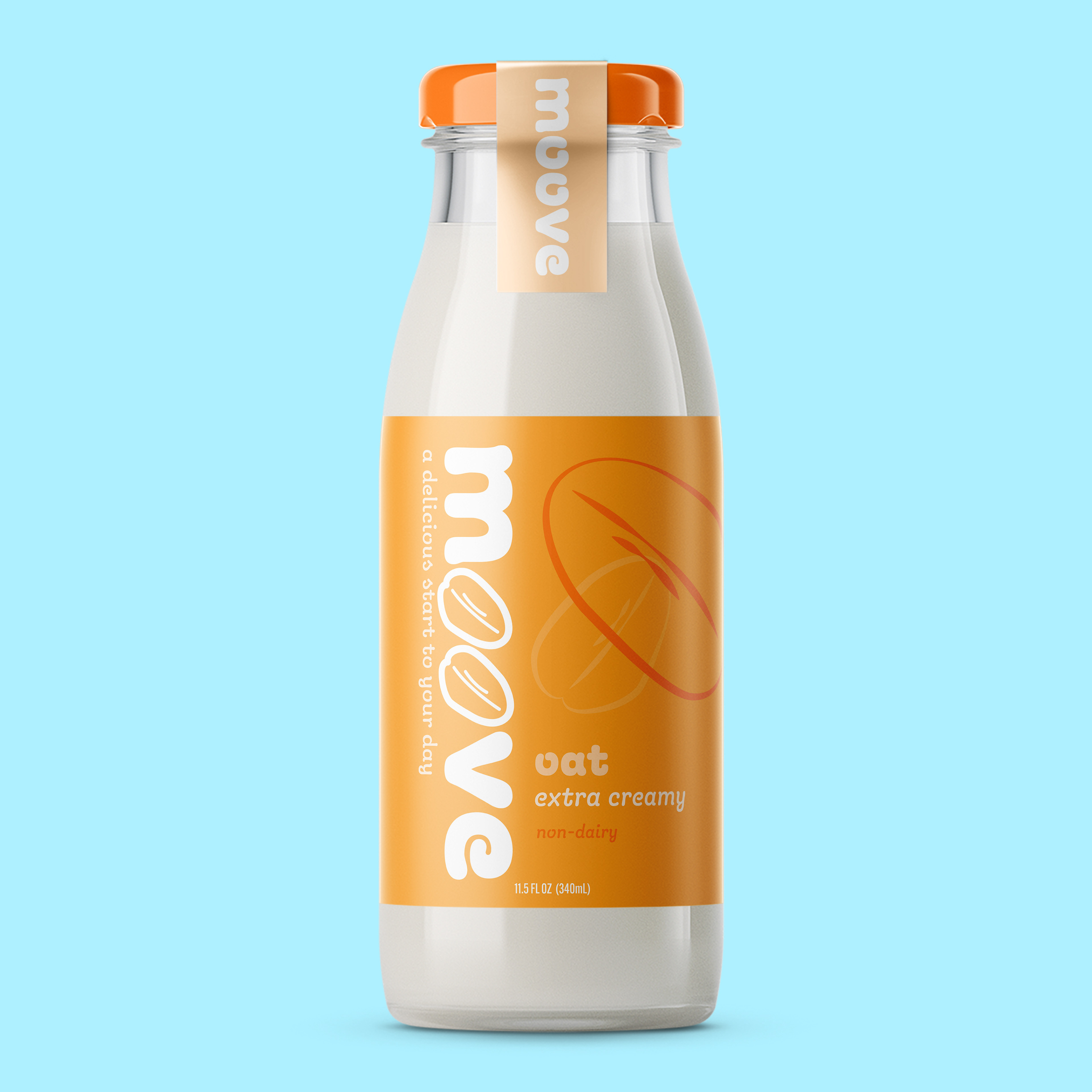
Oat milk bottle
Why M-o-o-v-e?
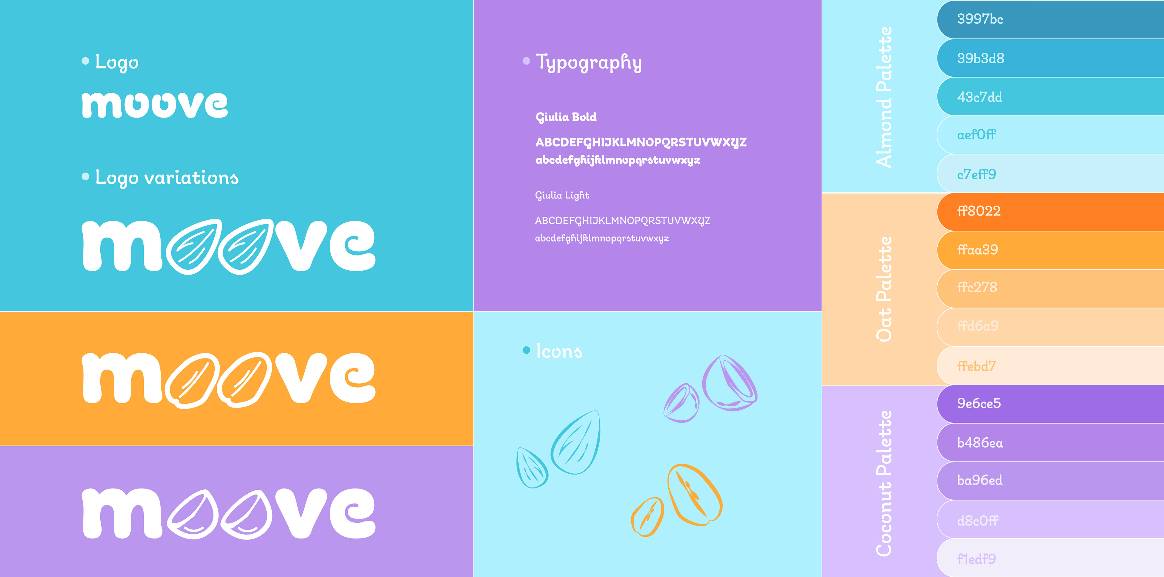
The name Moove comes from its target audience, the suburban commuter, who is always on the move. I added the extra ‘o’ so that Moove also included the word moo as a subtle reference to cows. Although it’s a non-dairy alternative the reference felt appropriate and playful for the brand and help establish the connection between the beverage and its audience.
The Design Process
I began by sketching different imagery for the brand. Almond characters with legs, and coconuts with faces, but these felt too childish for the audience I was designing for. I kept the visuals simple, the type playful, and the colors bold. For the Moove logotype, I chose the typeface Giulia, a thick and smooth sanserif. The way the letters round and pool at the ends reminds me of milk and made it perfect for the brand. The logo appears on the label in its standard form just below the cap and larger down the side of each bottle. The Os in the larger logo takes the shape of coconuts, almonds, or oats depending on the flavor of the milk in the bottle. Each flavor also has its own monochromatic color palette, blue for almond, orange for oat, and purple for coconut.

Nutrition Labels
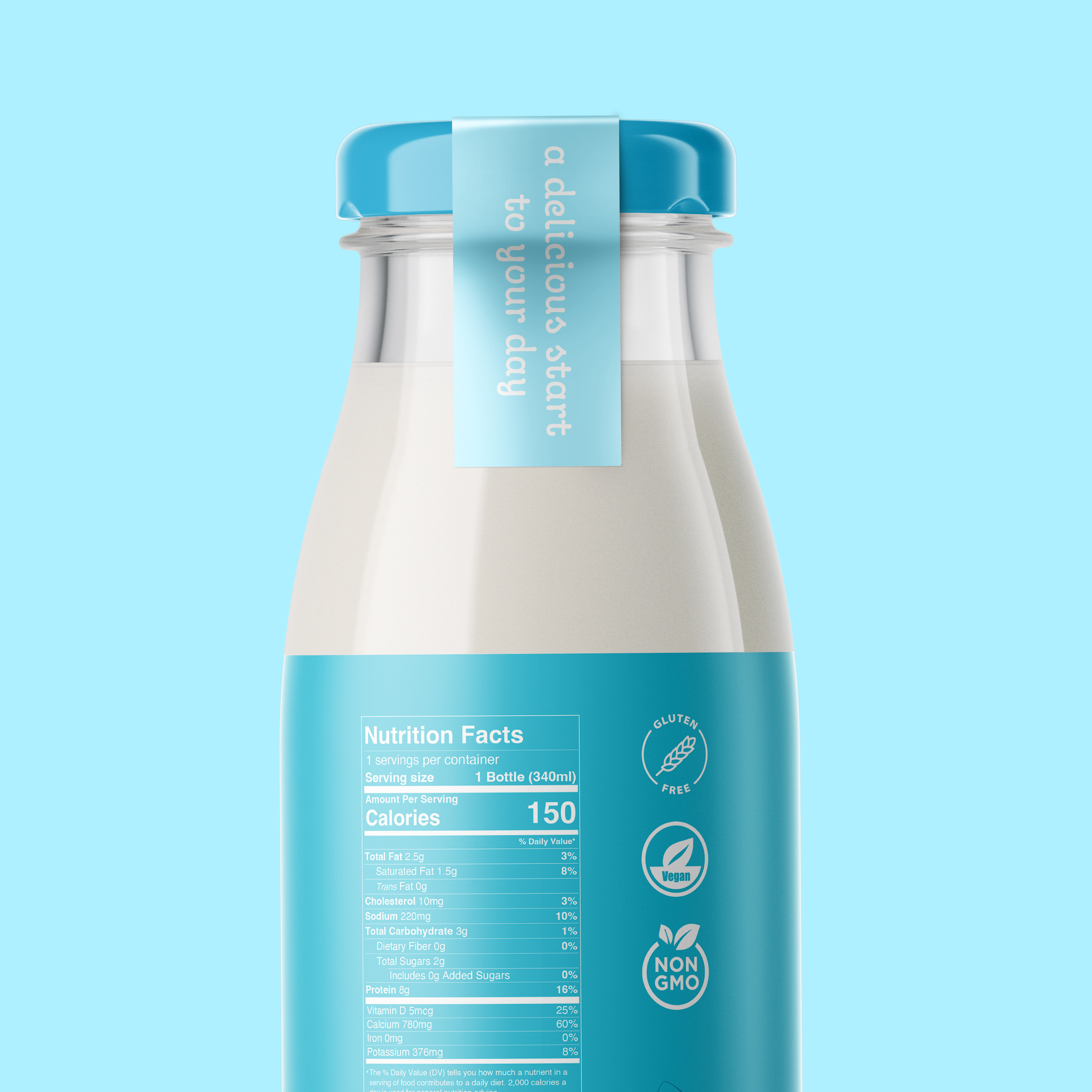
Almond Nutrition Label close-up
The Outcome
The logo variations and distinct color palettes help each flavor become easily recognizable for customers searching for a particular one. Each label is different enough to identify the type of milk quickly and easily but still feels like part of the same brand.
Instructor: Caleb Heisey