
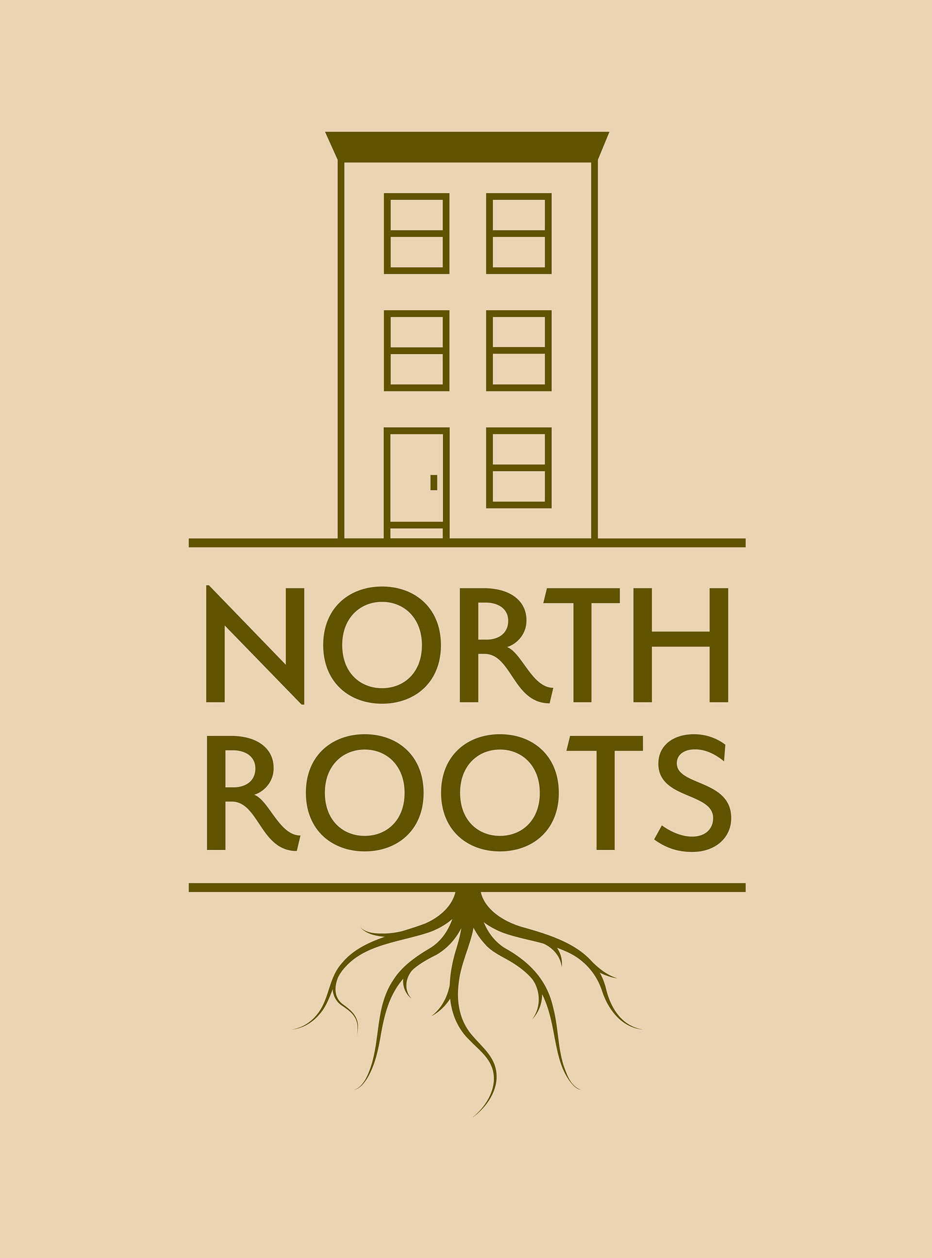
What is North Roots?
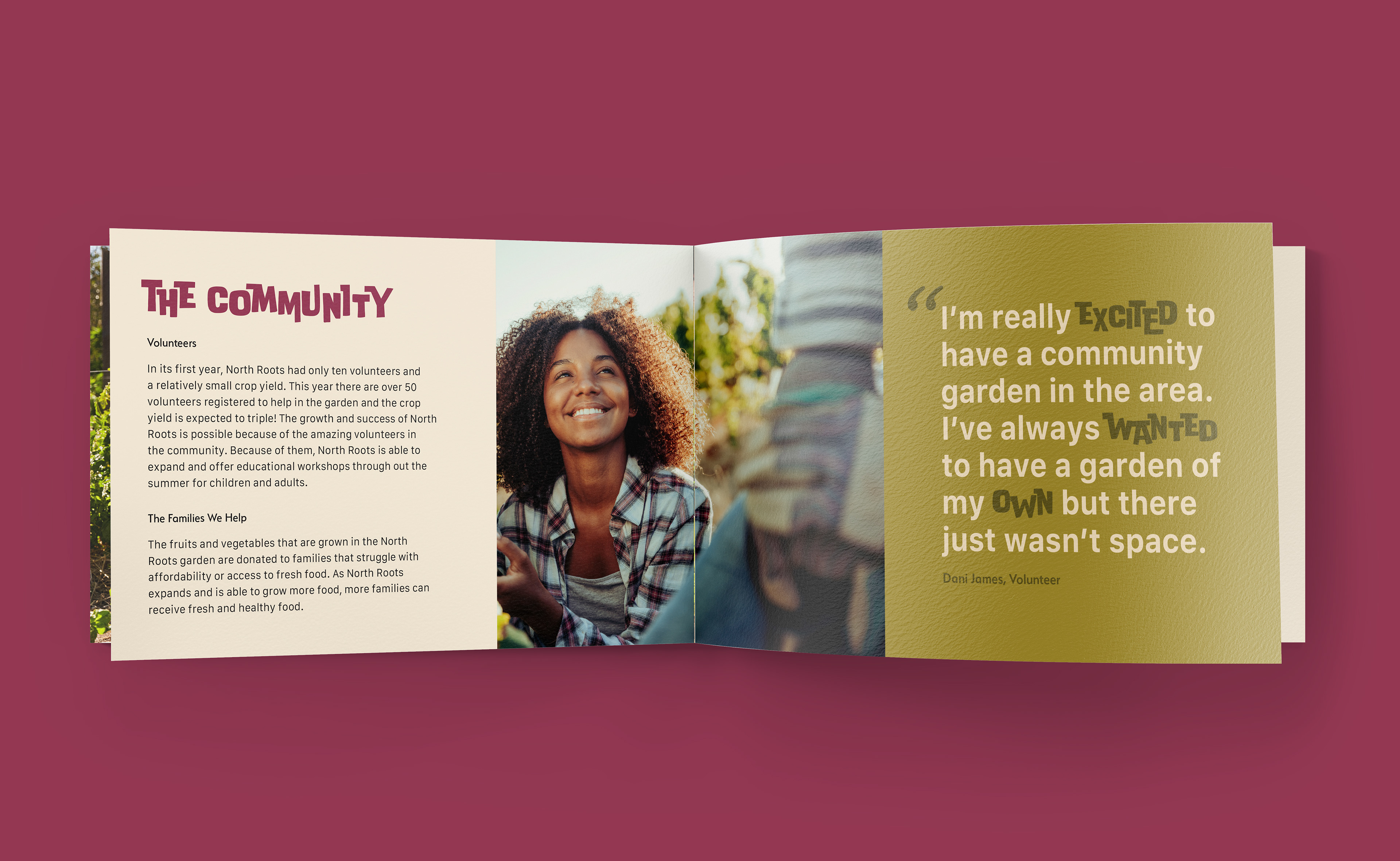
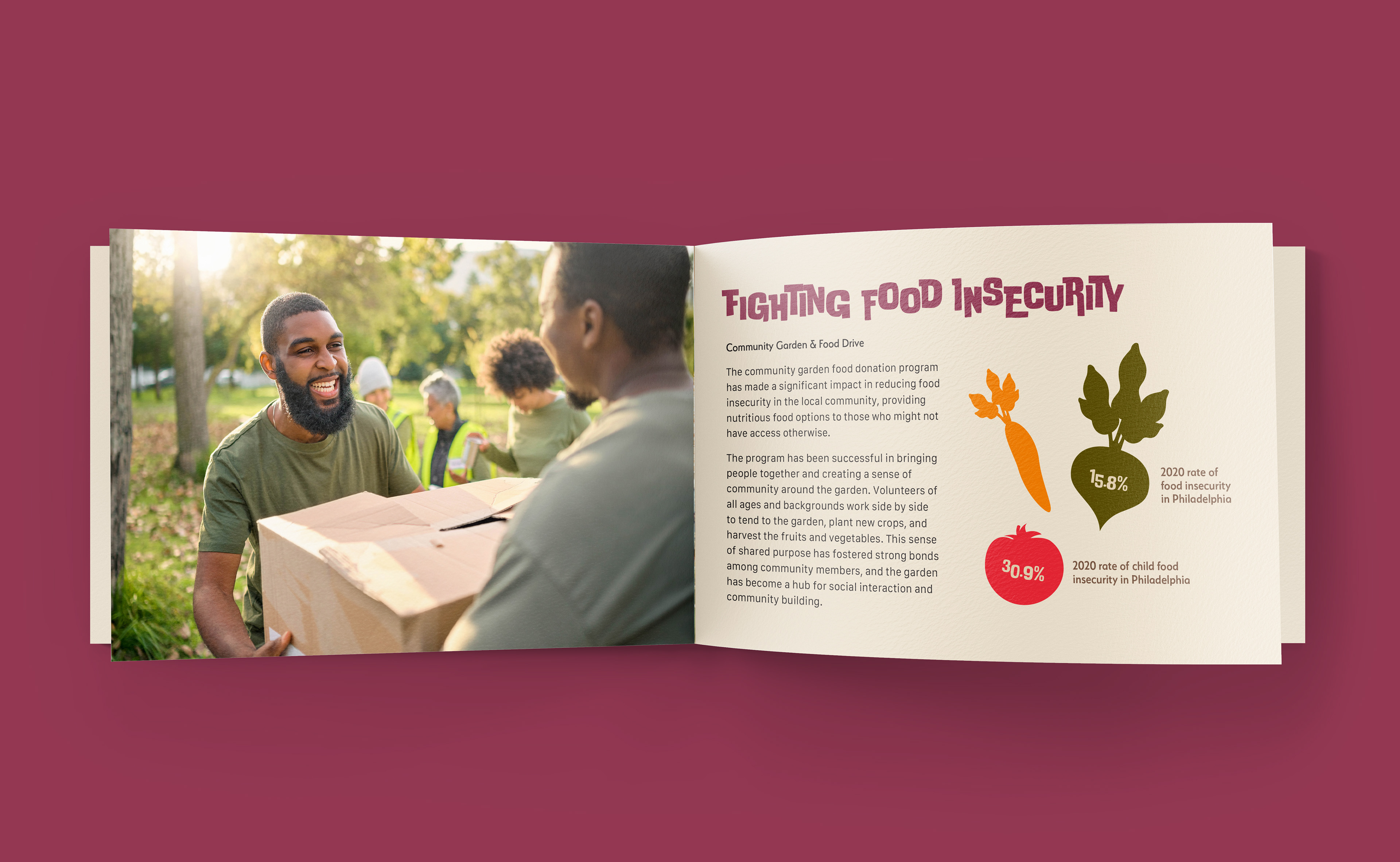
North Roots is a community garden based in North Philadelphia that aims to support, educate, and unite the community. North Philadelphia is considered a food desert, which is an area where residents have difficulty accessing nutritious and affordable food. Living in a food desert is just one factor that contributes to food insecurity. North Roots hopes to end food insecurity by providing fresh and healthy foods straight from the garden to local communities. Volunteers are at the heart of the organization, and as more people join and support North Roots, the closer they get to their goal.
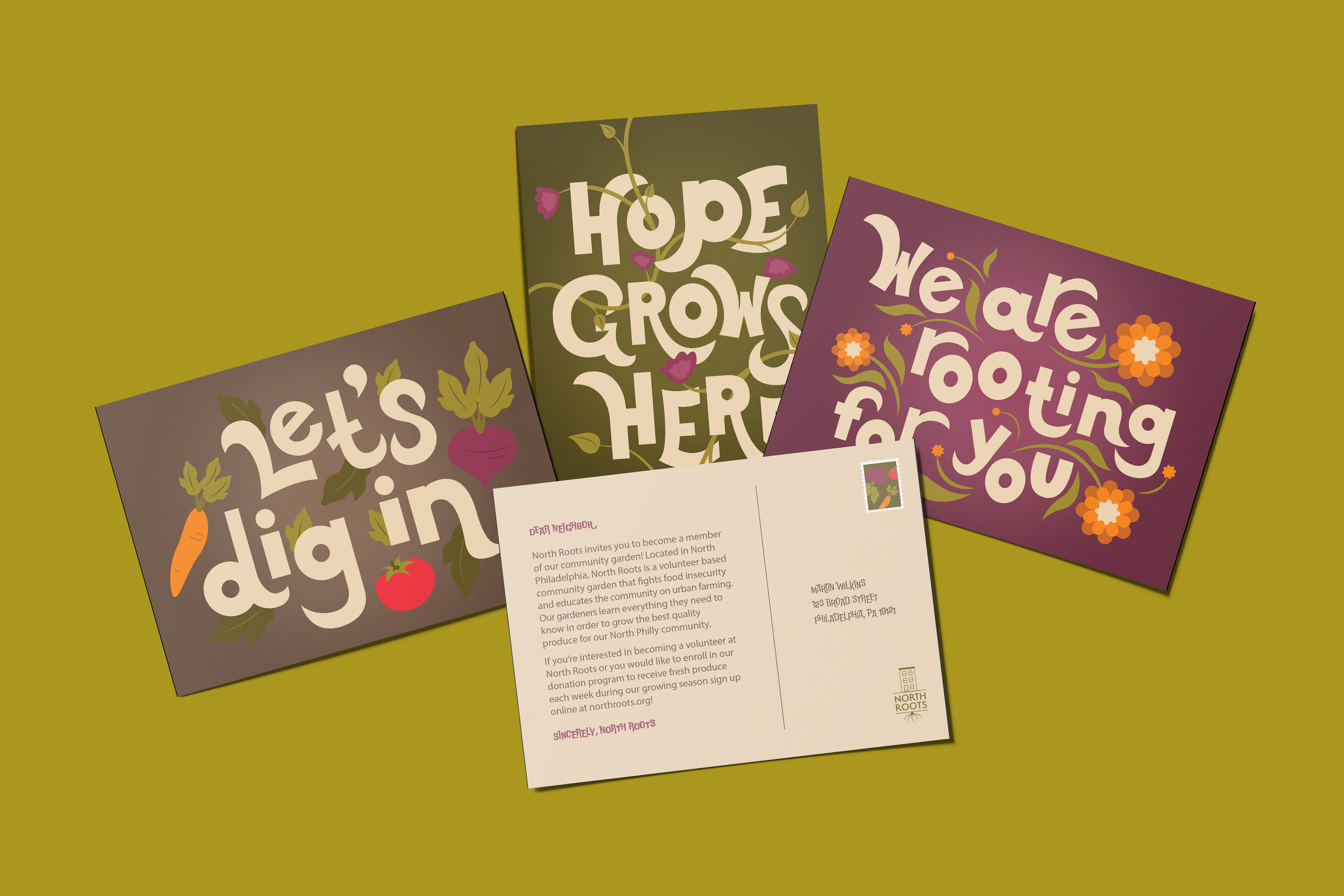
One of the most exciting promotional items for North Roots are the inspirational postcards. The front of the postcard features hand-done type with an inspiring message, and the back includes a note to the recipient encouraging them to get involved with the garden. There is also a custom stamp on all postcards mailed out to community members. In addition to mailing, postcards can be found in public spaces like libraries and coffee shops to help spread the word about North Roots.
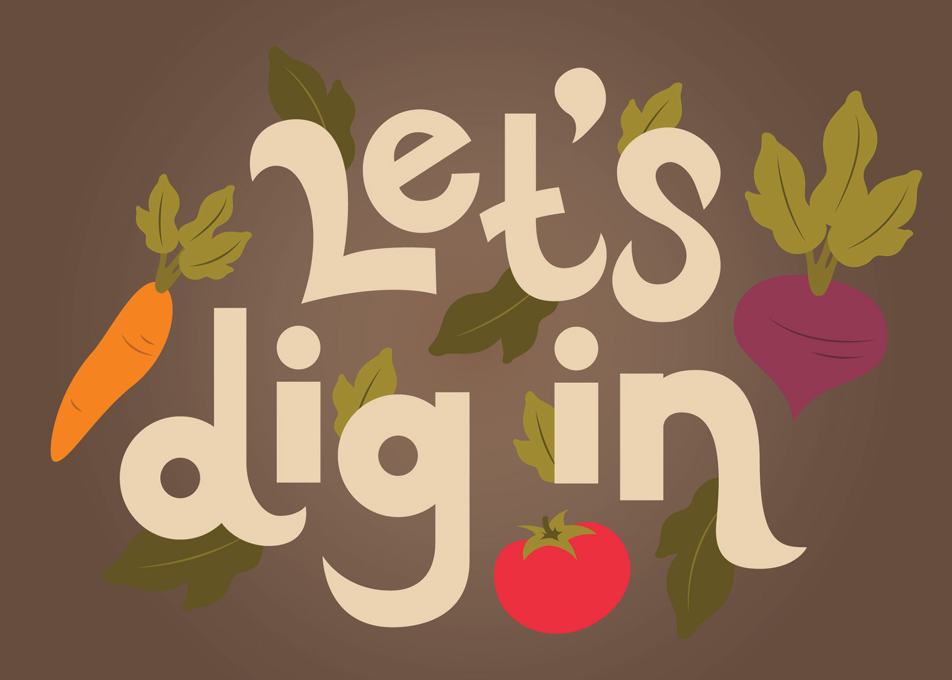
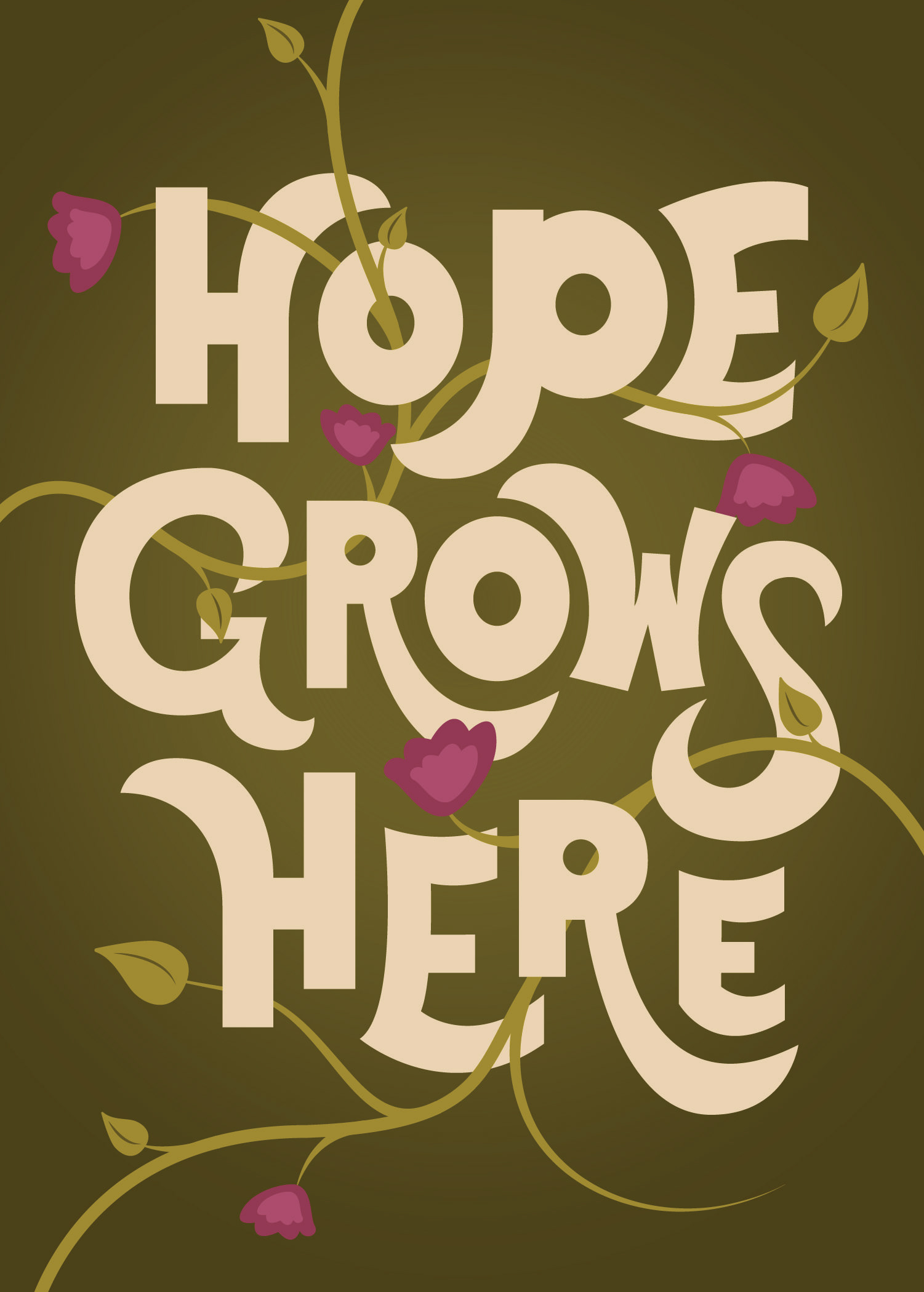
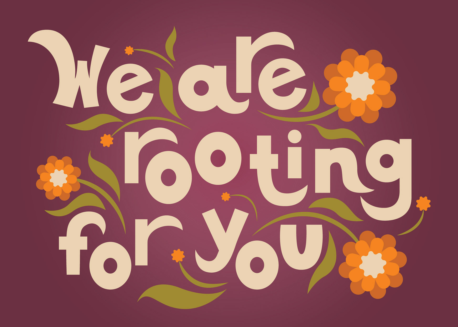
Hand-done type is not something I work with often, but I was excited by the idea of creating three different hand-done type designs for these postcards. Giving each one its own personality while keeping the same style was a welcomed challenge. Hope Grows Here is the tagline for North Roots so it was an obvious choice to include in one of the postcards. I spent a lot of time brainstorming and developing copy for the other postcards, as well as the rest of the deliverables, that felt playful and fit with the garden theme.
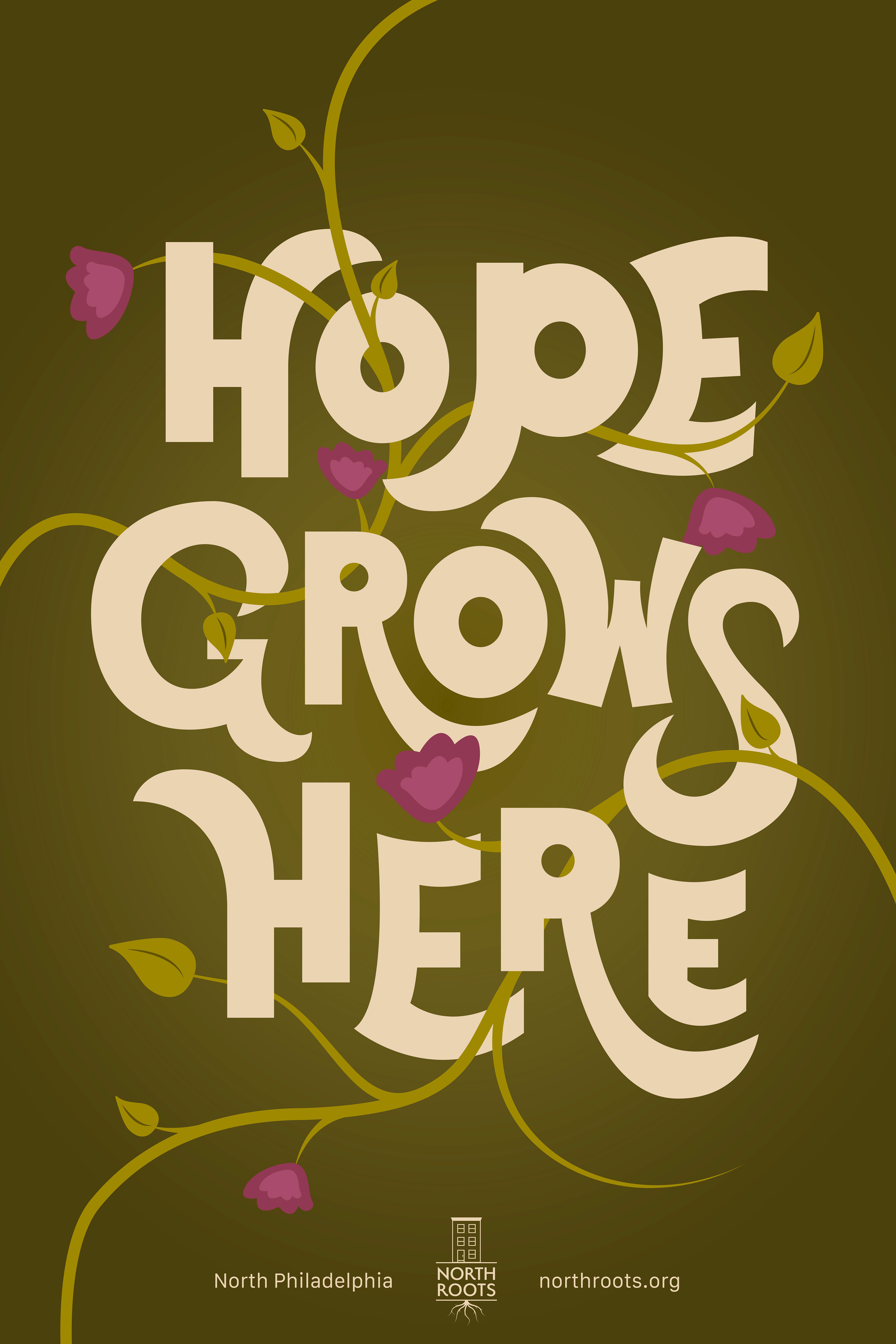
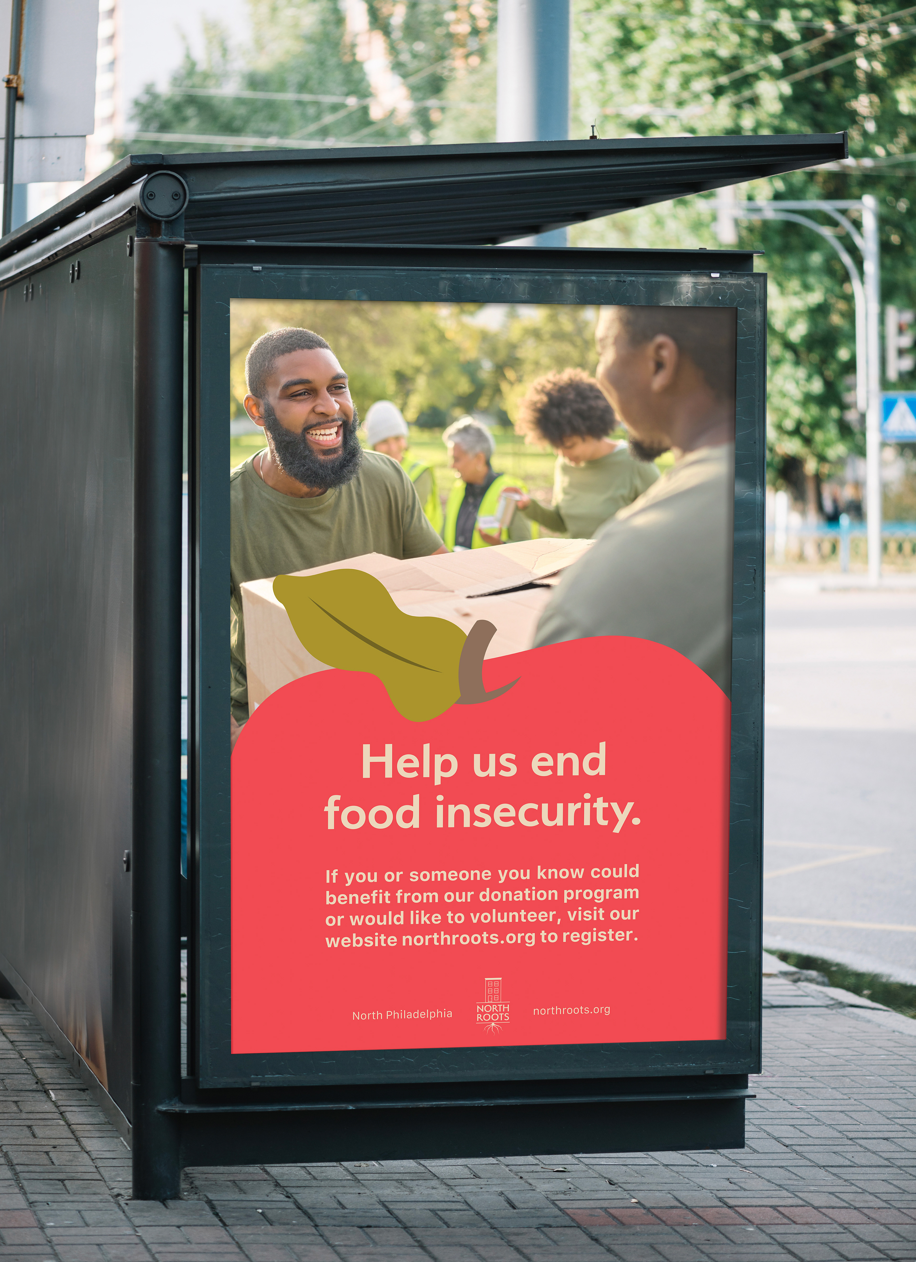
Bus stop ads are also used to promote the garden and attract more volunteers and participants. Repurposing one of the postcard designs with the garden's tagline, Hope Grows Here, was one way to tie in the different style that the postcards introduced to the brand. Balancing illustration, typography, and photo-based ads that felt like they were all part of the same brand was a bit of a challenge, but consistency with color and illustration style kept the brand strong and cohesive.
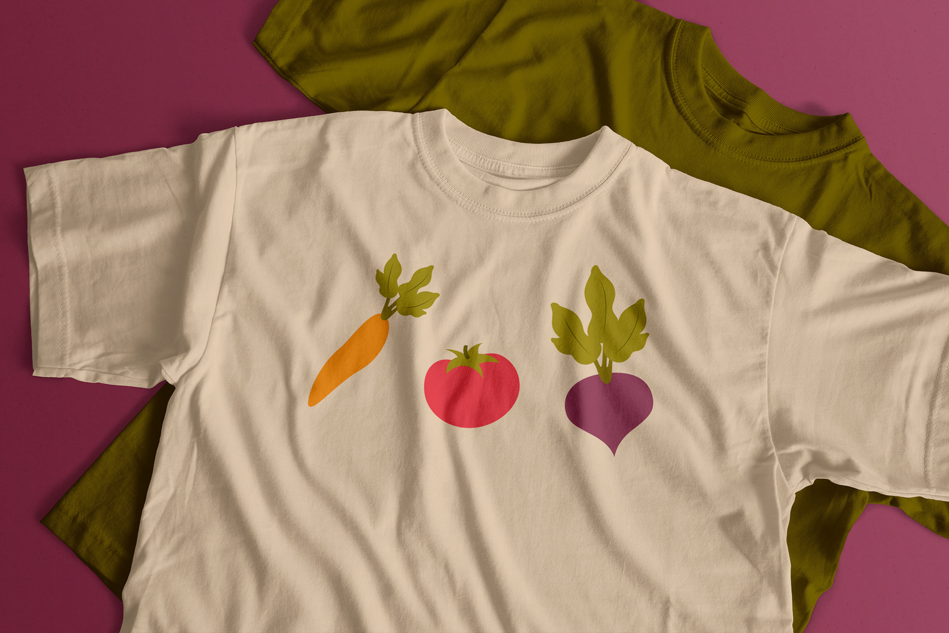
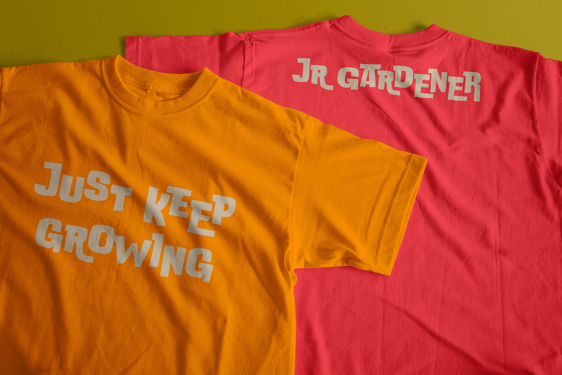
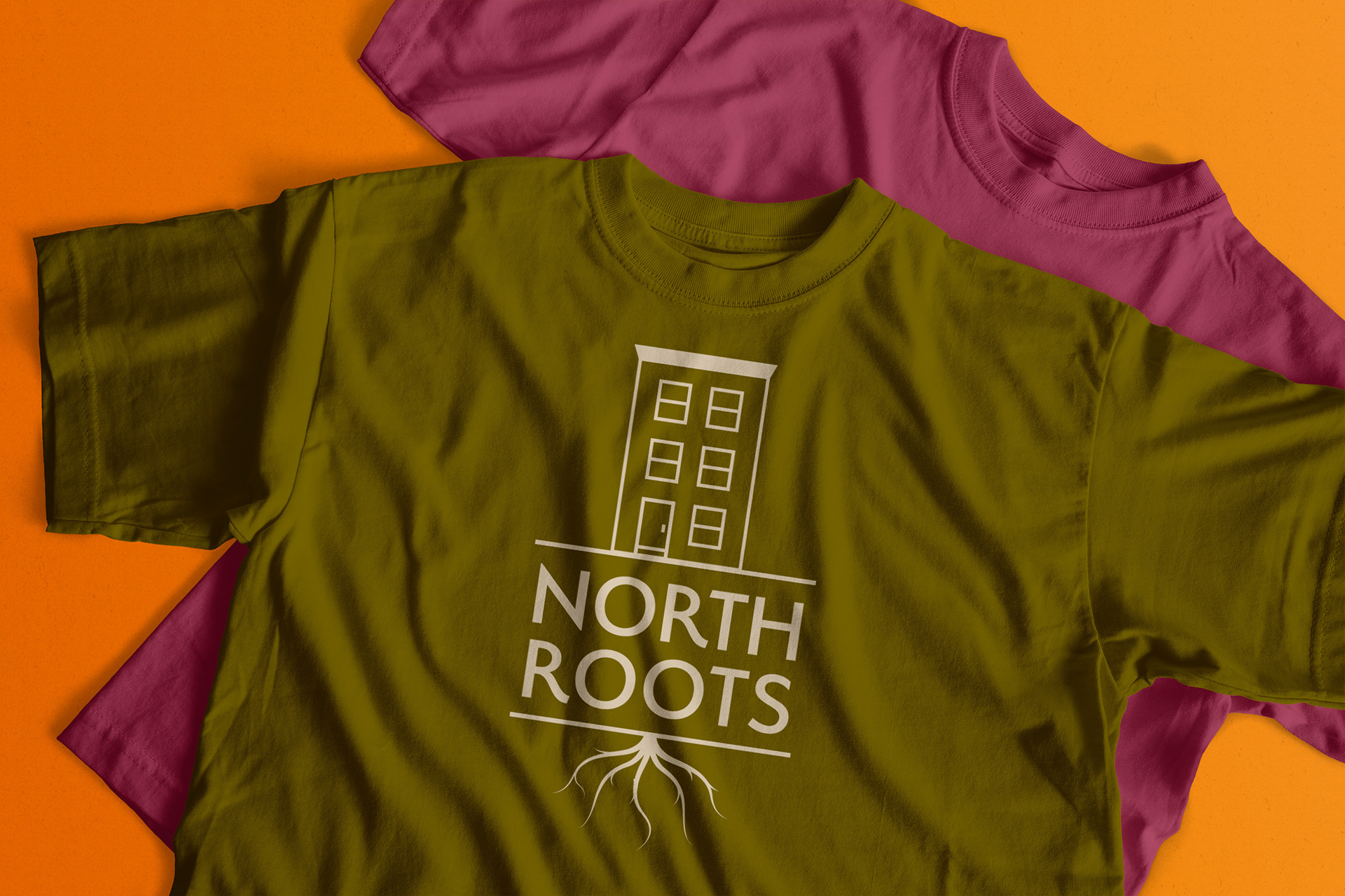
Volunteers are an essential part of the success of North Roots, and they are rewarded for sharing their time and hard work with the garden. Each volunteer receives a t-shirt along with other branded merchandise when they register. In addition to volunteers, kids can also get t-shirts when they sign up for a free camp session during the summer. The kid's tees use brighter colors from the palette like orange and red, while the adult tees use deeper green and purple colors. I chose to make this distinction because it can make it easy to identify who is working in the garden at any point in time. This could be helpful for any safety or work-related situations.
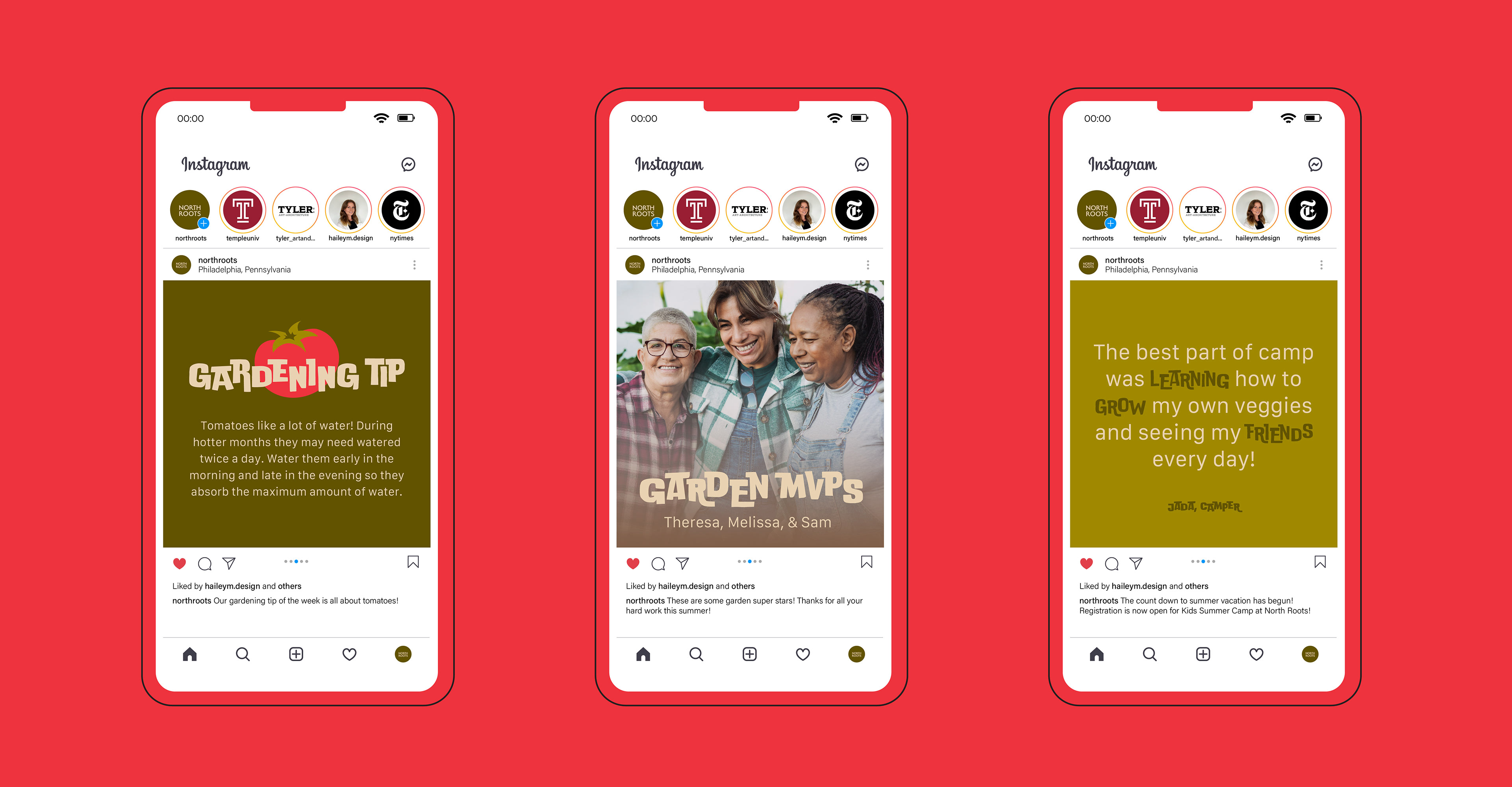
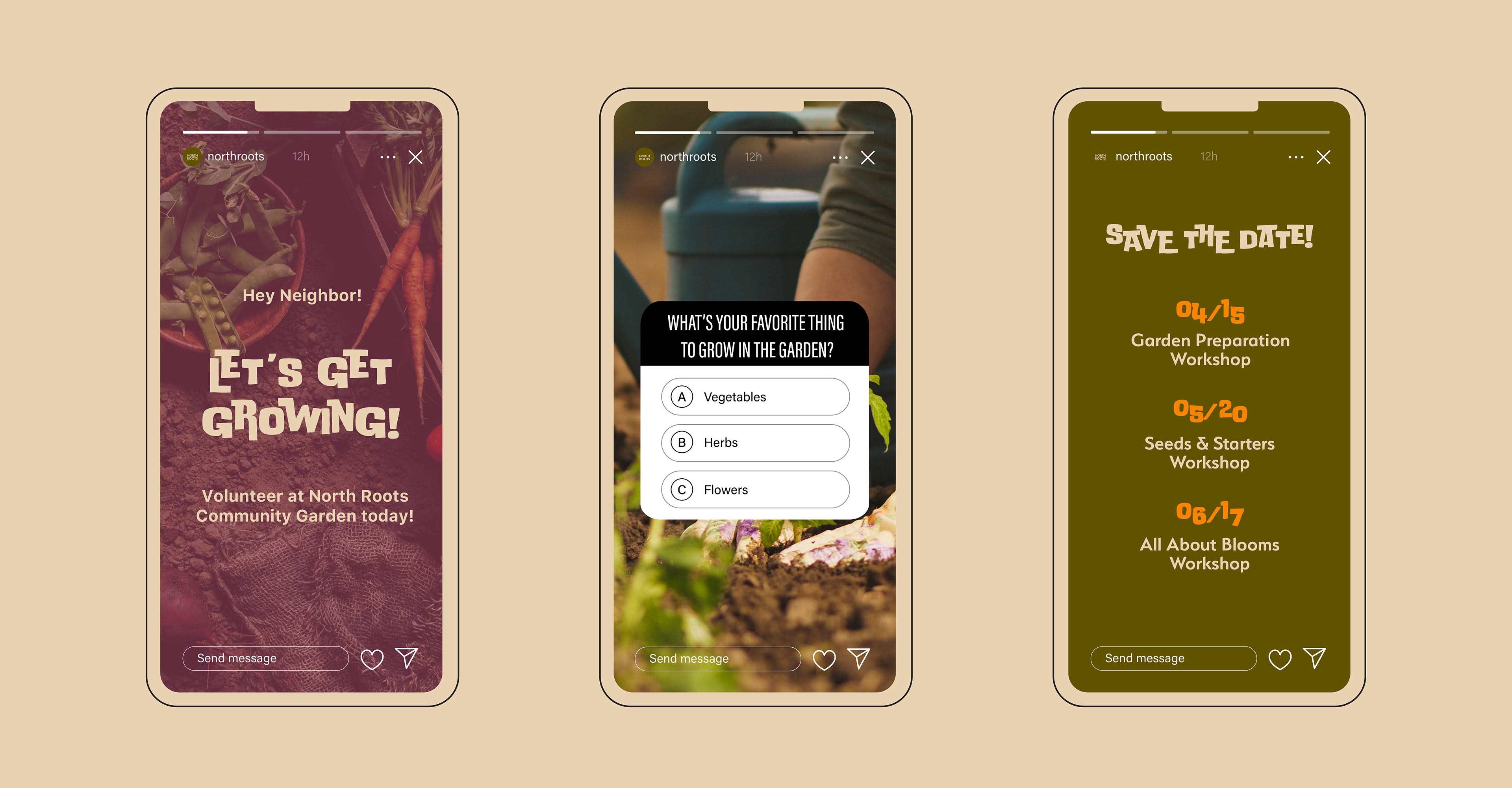
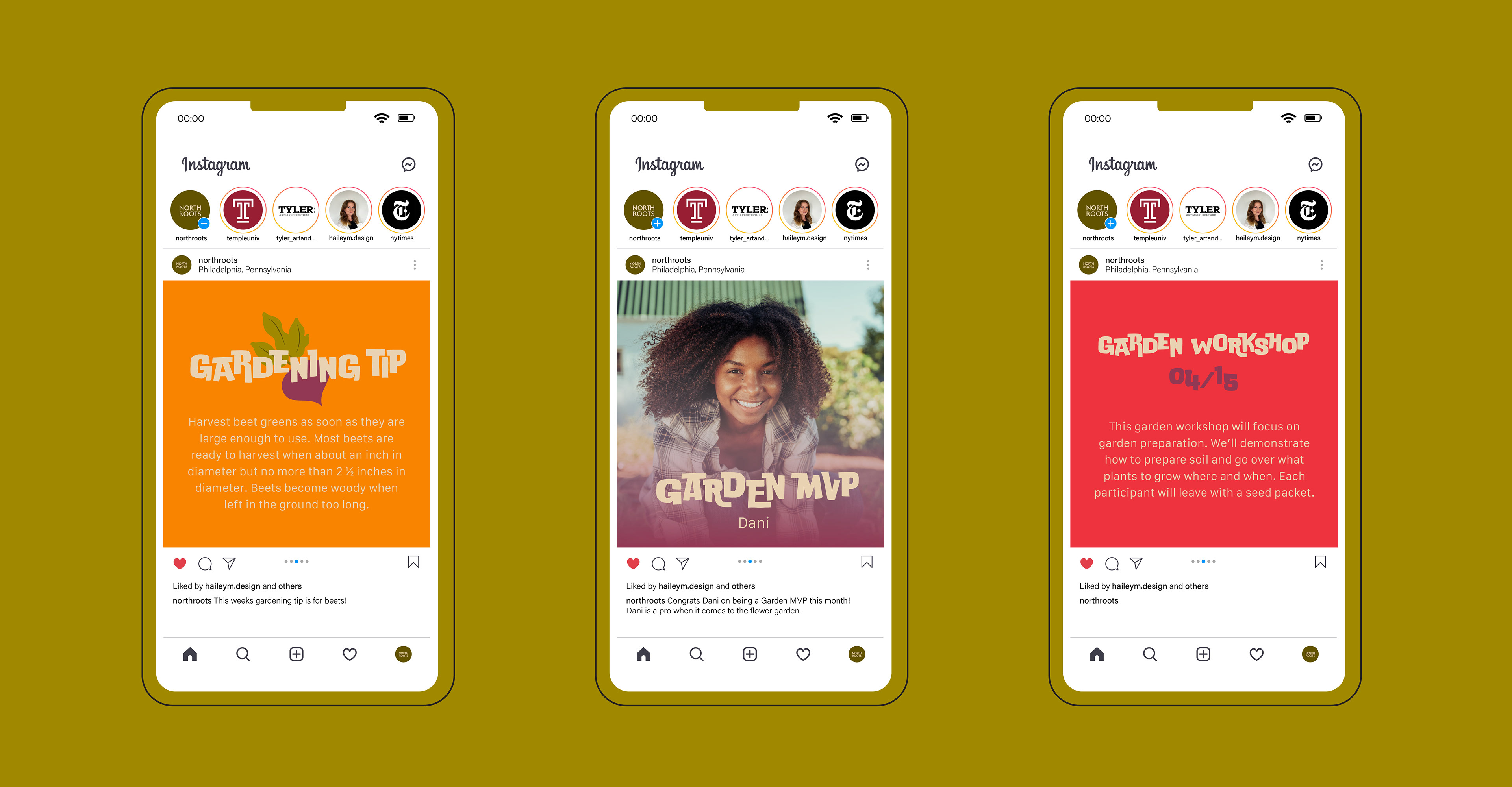
Social media is also an important tool for North Roots. It can reach a broader audience than some print materials might and also keeps current participants and volunteers up to date on garden news. Posts include weekly garden tips, garden MVPs, and important announcements.
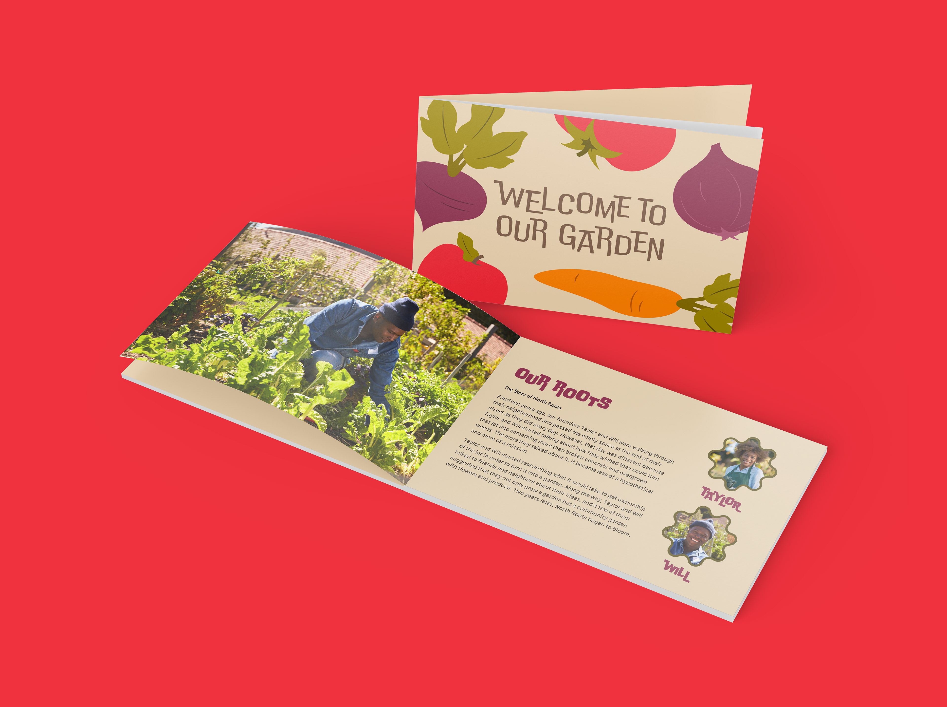
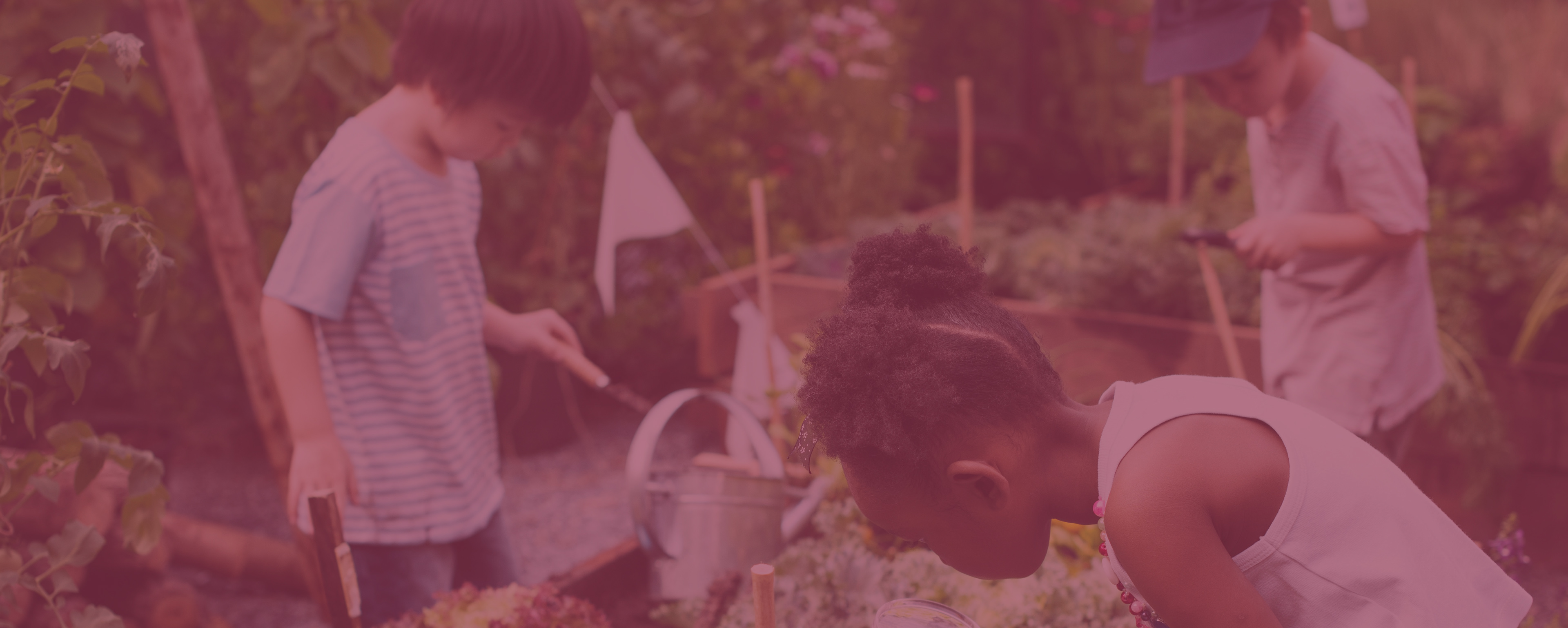
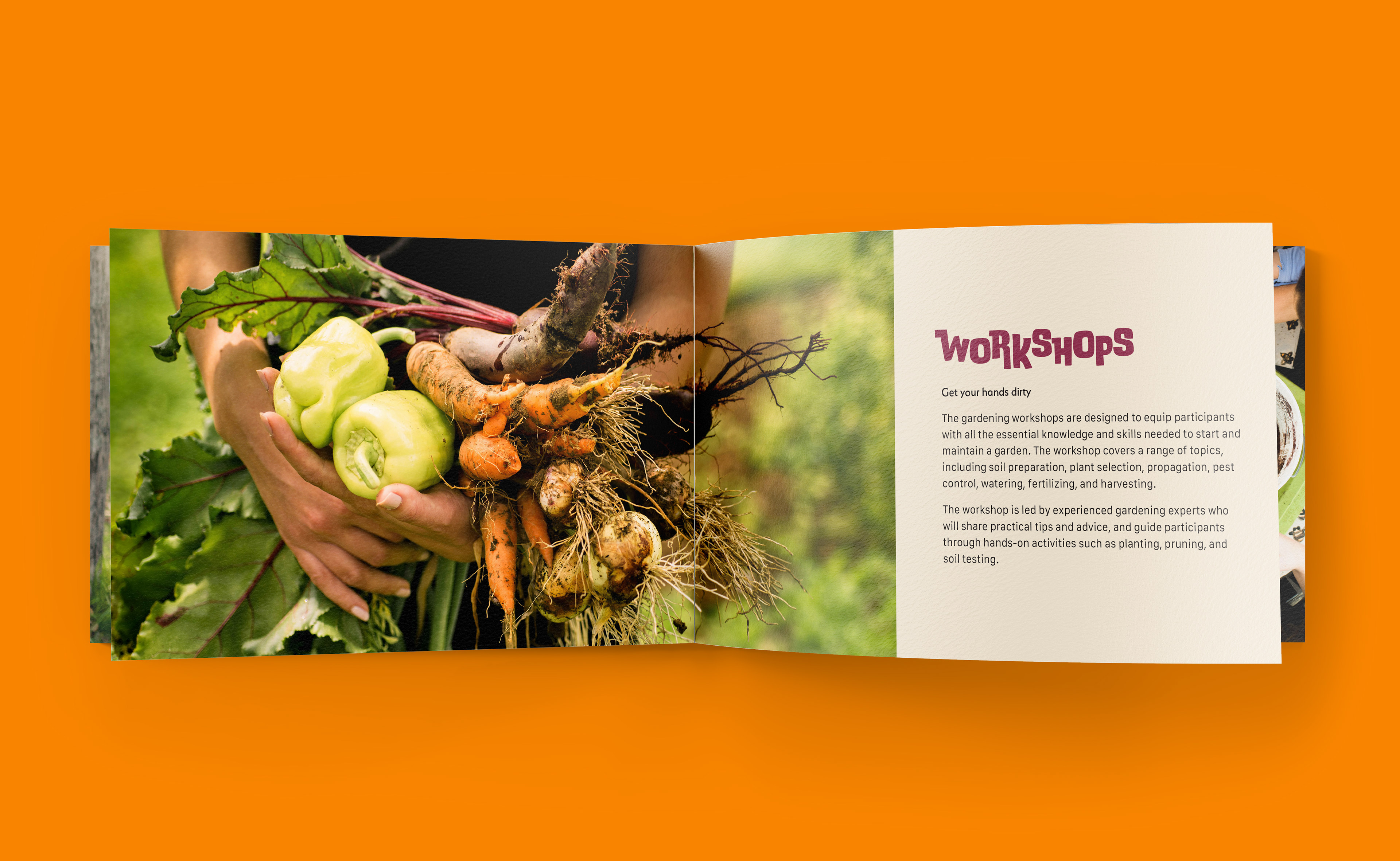
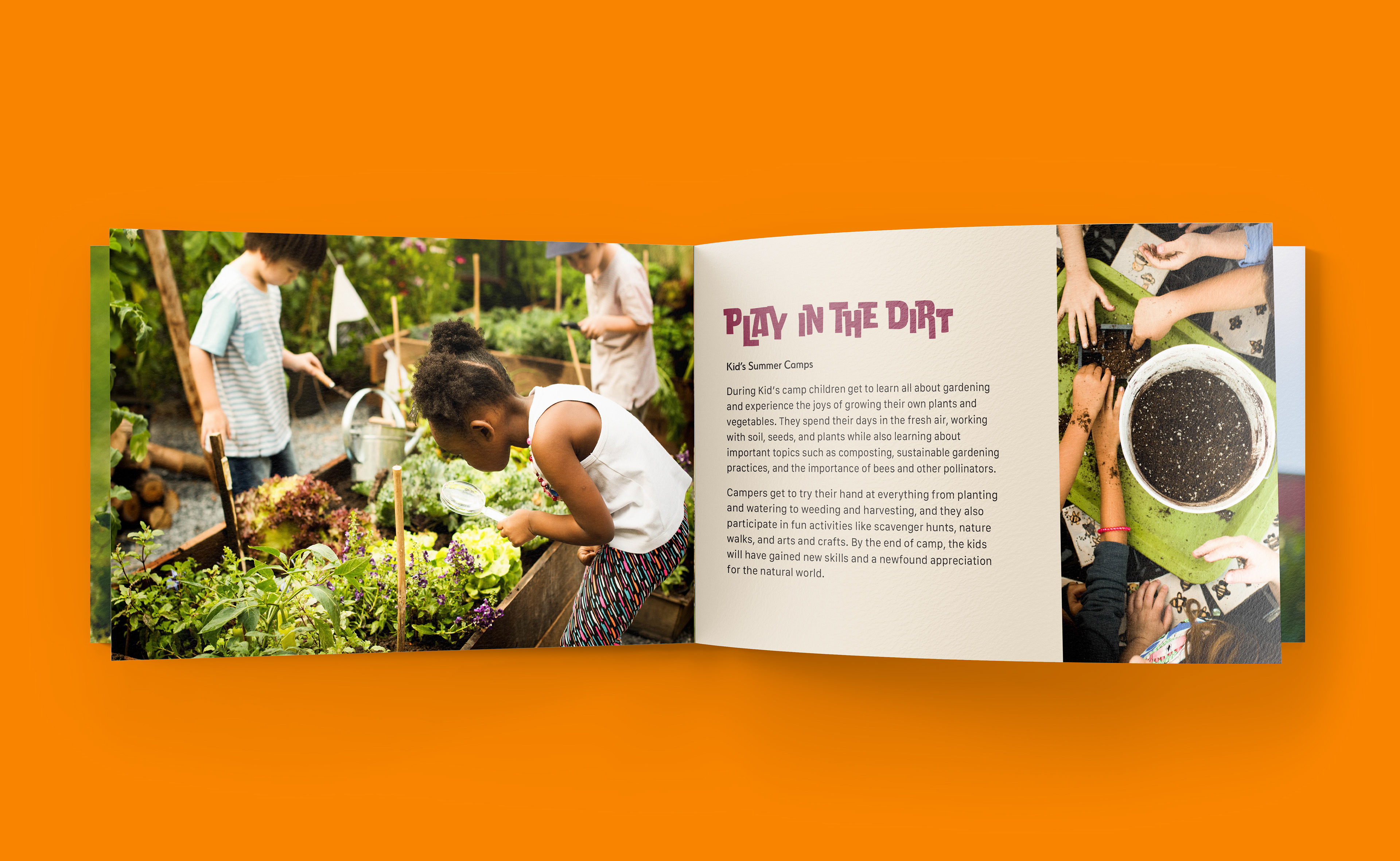
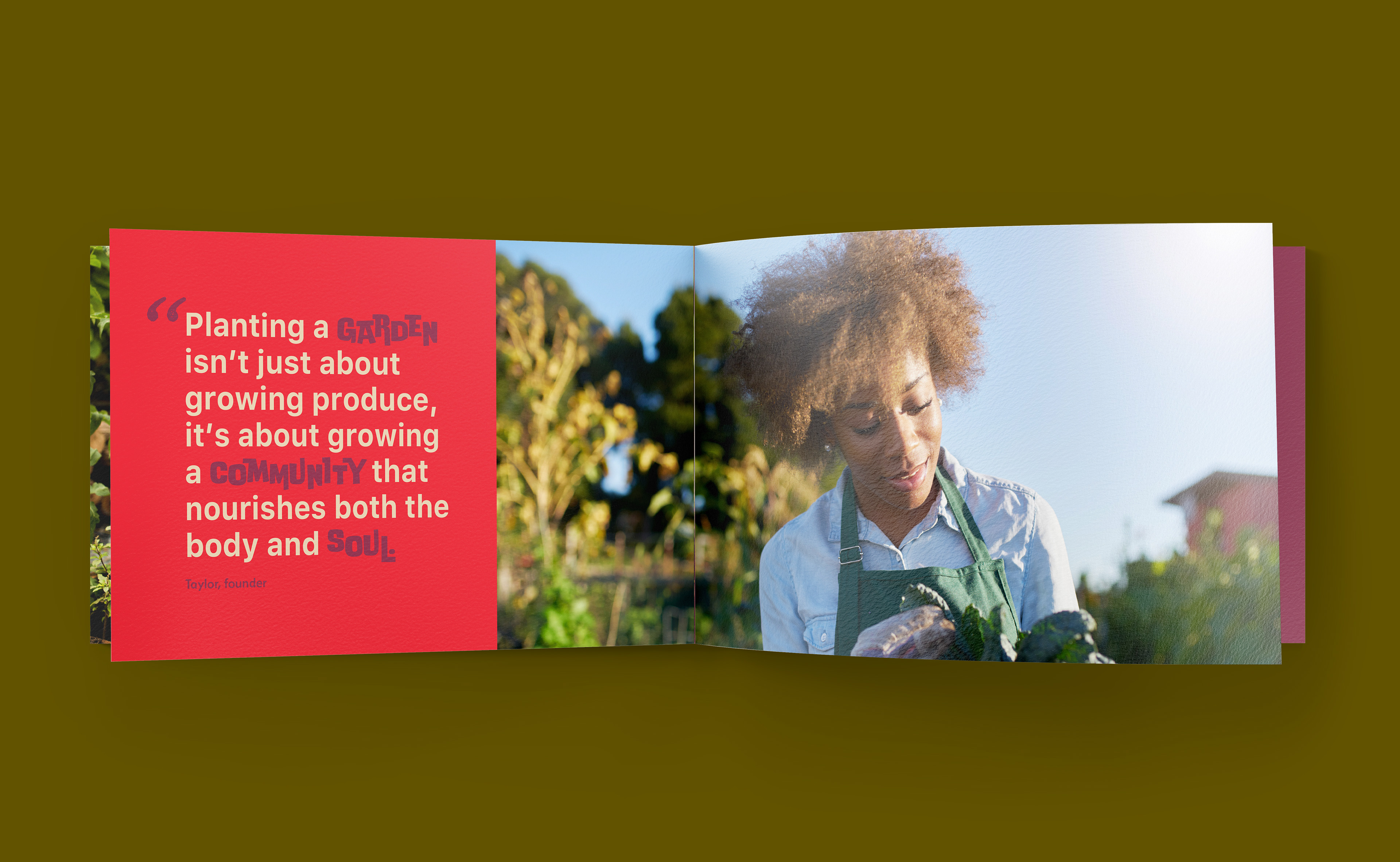
Anyone involved with North Roots will receive a short info booklet that talks about how North Roots got its start and how the garden operates. There is also information on the different activities hosted by the garden along with beautiful imagery of the garden and its volunteers.
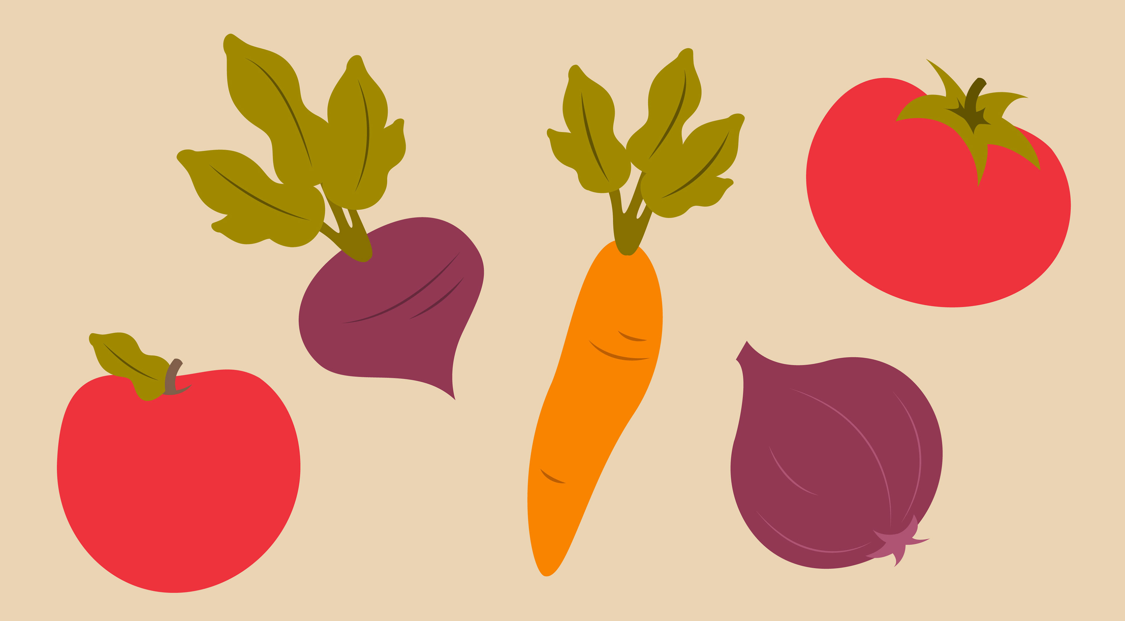
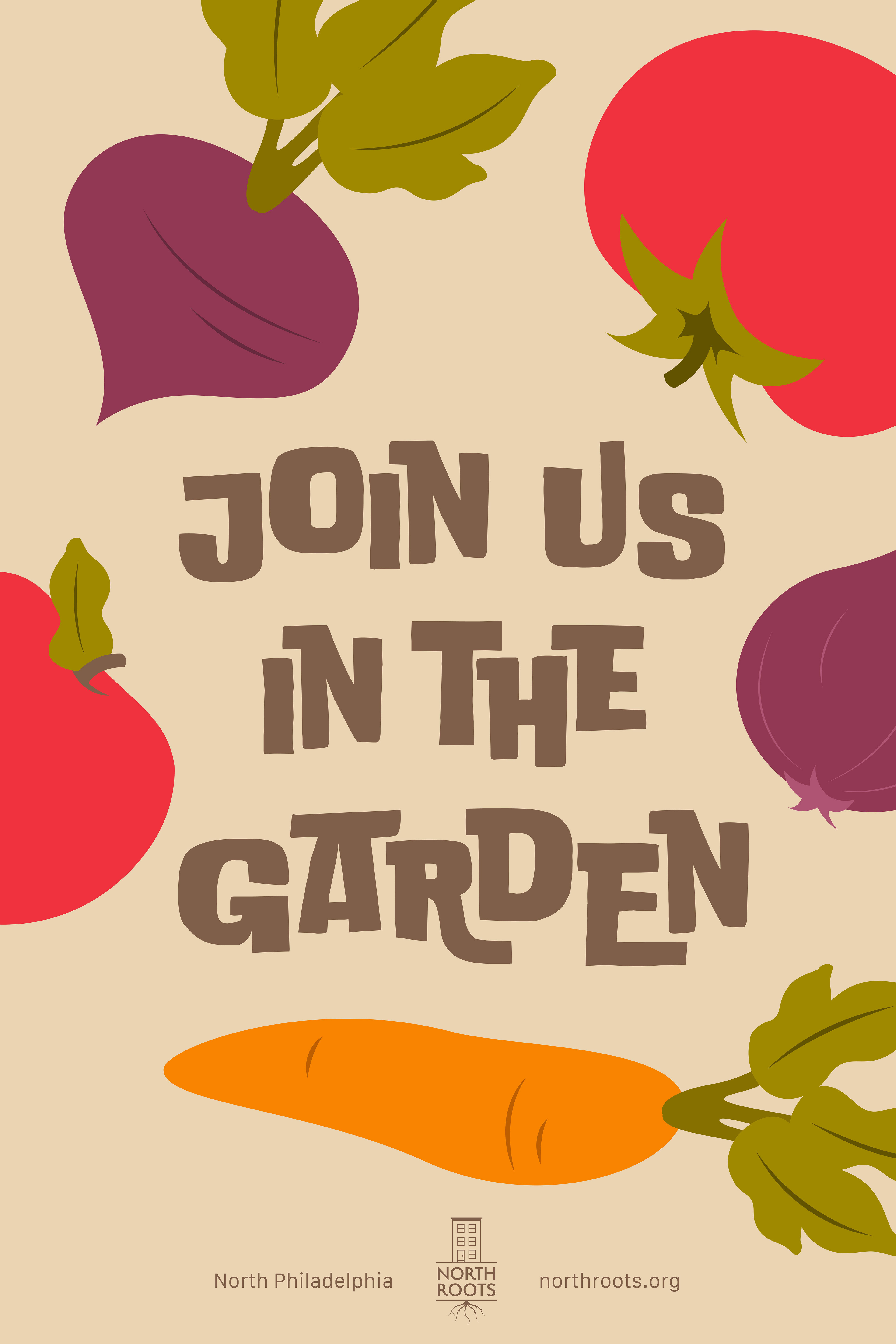
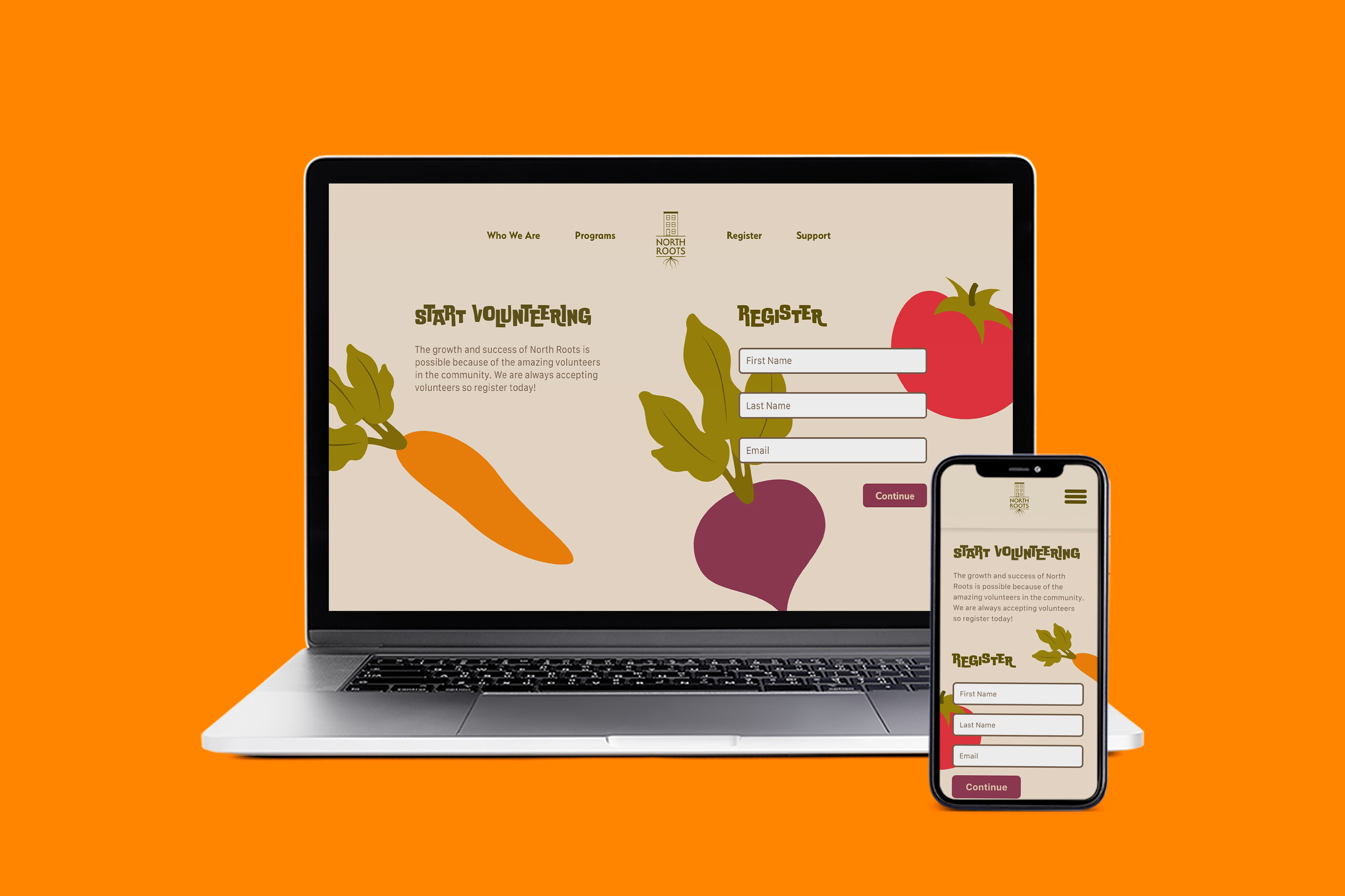
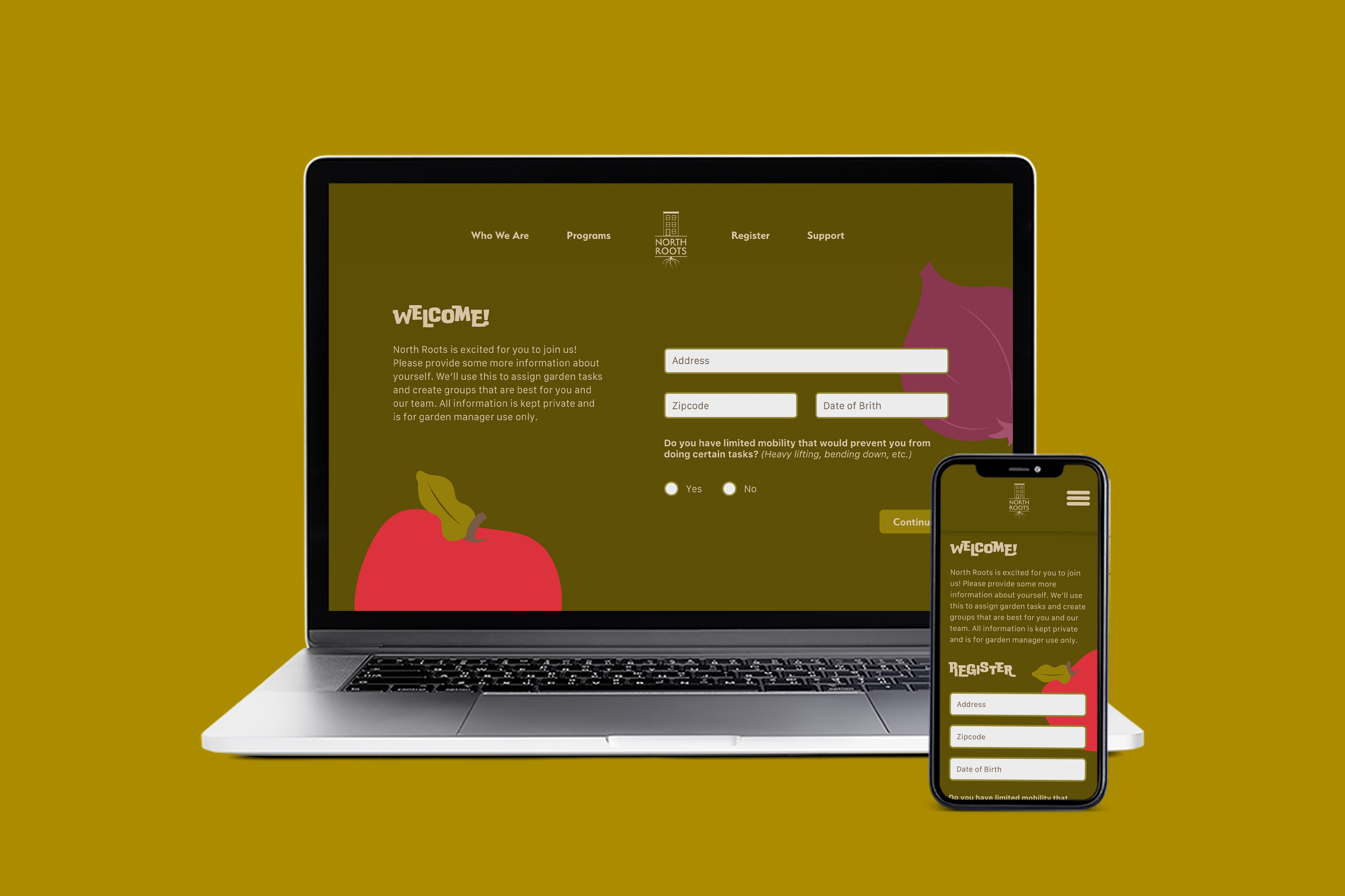
North Roots also has a website where users can register to become volunteers or sign up for different activities and workshops hosted by the garden. It was important to keep the registration process simple so users wouldn't become discouraged when trying to register online. The process is kept to only two pages with a few simple questions. Important information is easy to read with minimal use of the Doublebass typeface. I also chose to utilize the fruit and vegetable illustrations to liven up the page and keep it bright and playful while still keeping enough contrast for legibility.
Instructor: Jason Kernevich