
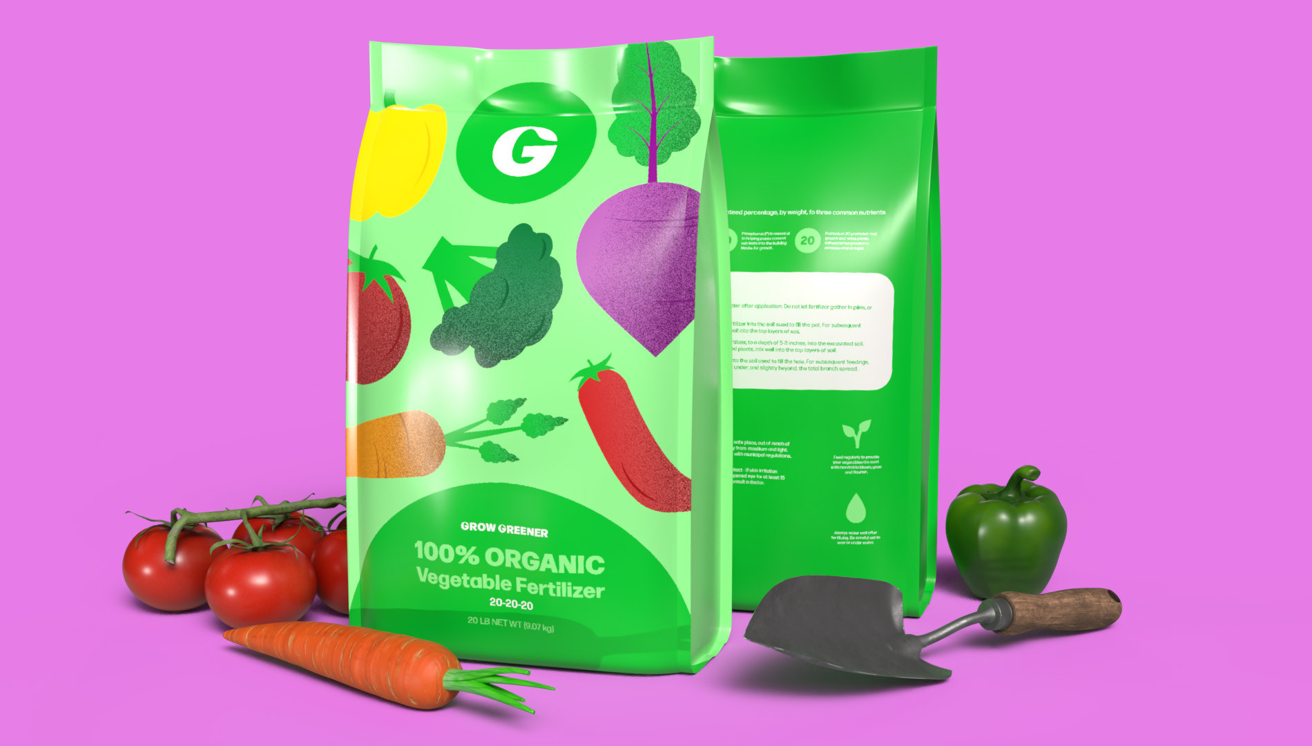
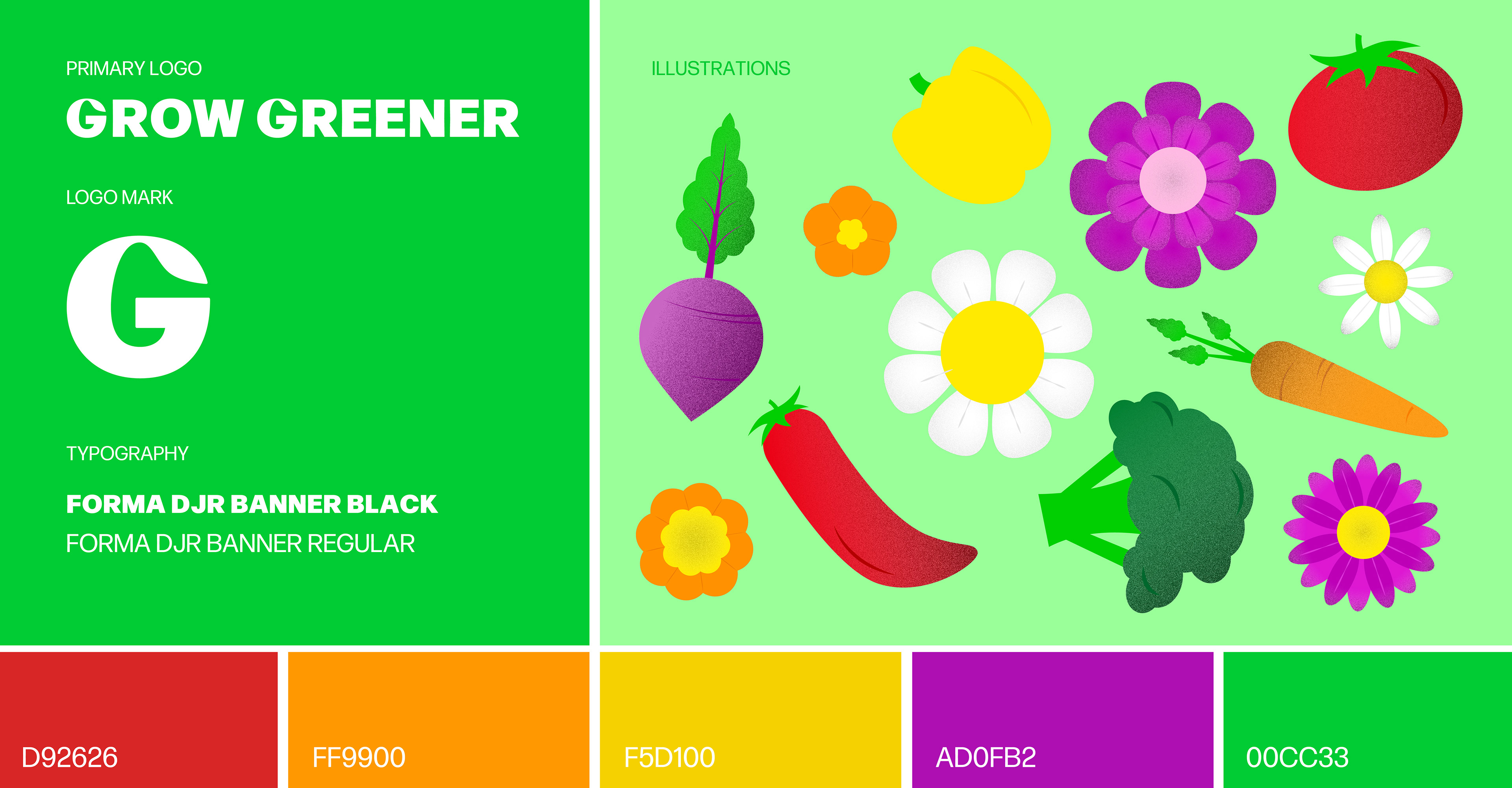
Grow Greener fertilizer is a new brand geared towards amateur gardeners. Unlike traditional, and let’s face it, boring fertilizer packaging, Grow Greener is bold and playful. The bright colors and illustrations grab customers' attention without overwhelming them with information. Other brands include lots of information on the packaging of their fertilizer, but this information doesn't mean anything to someone who doesn't know about gardening. Grow Greener keeps it simple and playful.
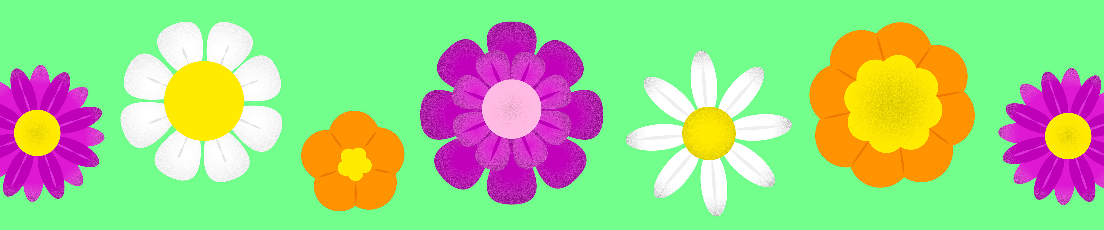
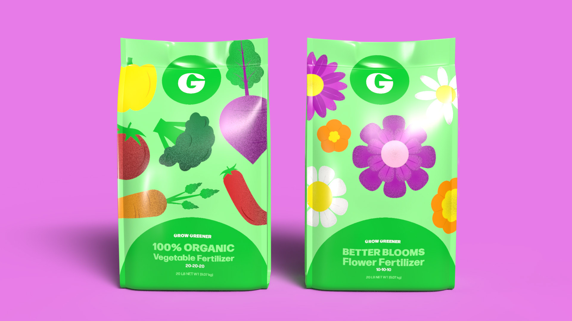
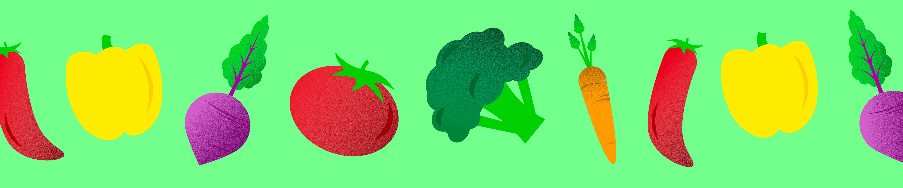
The Grow Greener logo uses the typeface Forma DJR Banner Black with the end of the G altered to look like a leaf. The G can stand on its own or be used in the full name. Grow Greener fertilizer comes in two varieties, Better Blooms for flower beds and Organic Vegetable for vegetable gardens. Each bag has its own set of illustrations but uses the same color palette to keep the brand consistent. The illustrations are primarily made up of simple geometric shapes tying into the brand’s simple and playful aesthetic. The color palette is bright to catch the customer’s eye from its spot on the store shelf and is inspired by colors you would find in a flower or vegetable garden.
Instructor: Caleb Heisey