
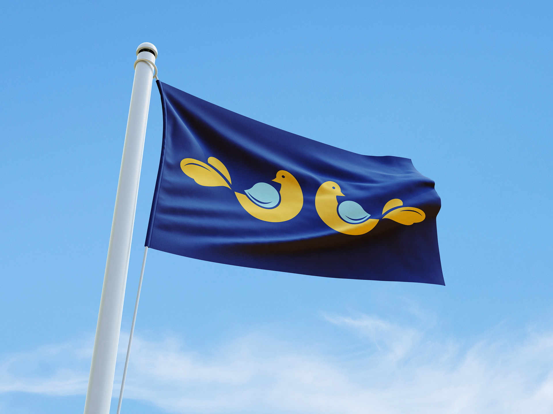
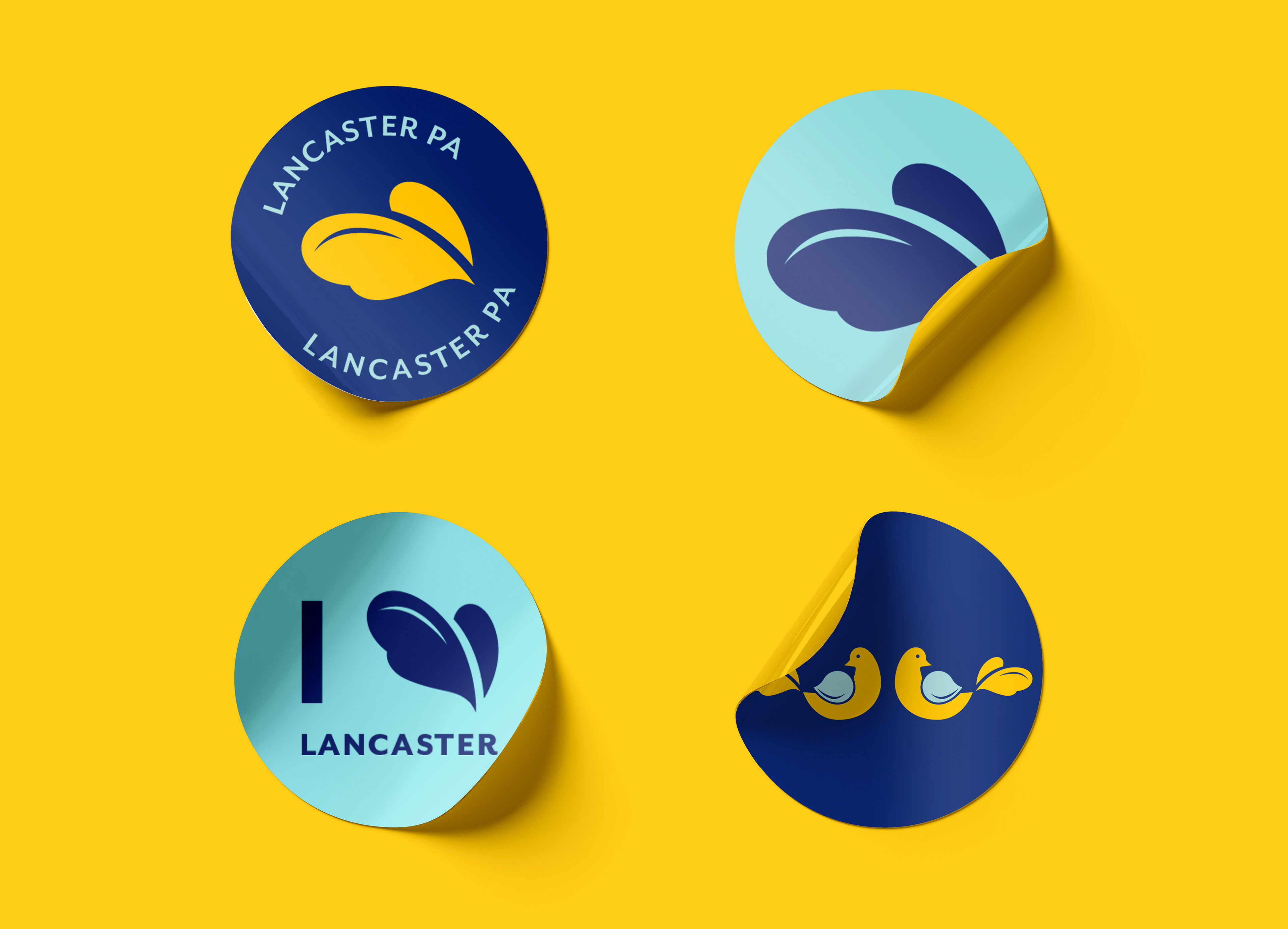
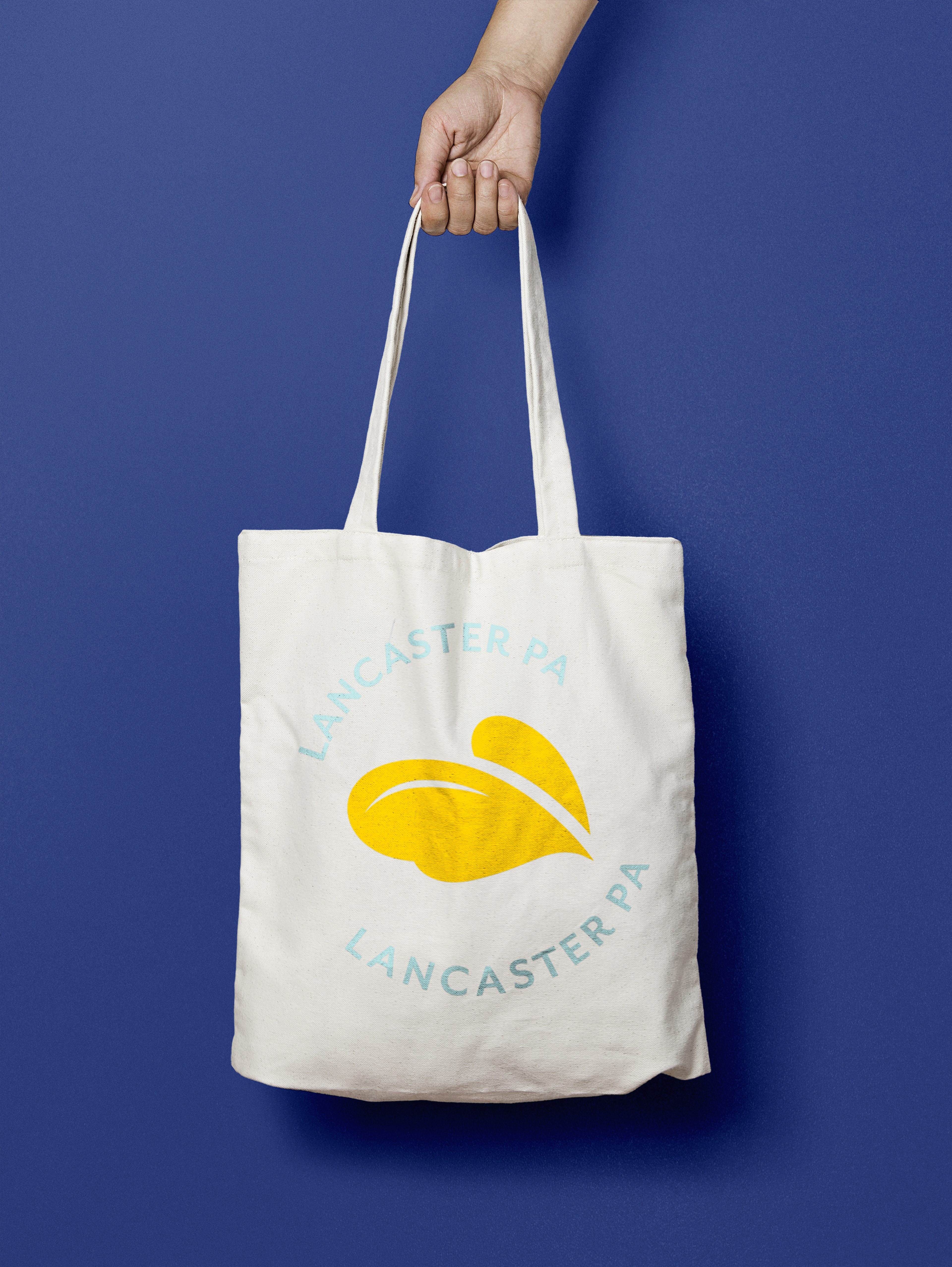
Do you know what your state flag looks like? How about the city flag? Flags can serve as important symbols but are often poorly designed. The city of Lancaster’s flag is representative of its history, but the design is difficult to decipher because of the low contrast of the color palette and the complexity of the overall design. My redesign incorporates the traditional Pennsylvania dutch design style with a slightly more modern look. Also included in the rebrand are merchandise, stationery, and social media post examples.


Branded Beanie
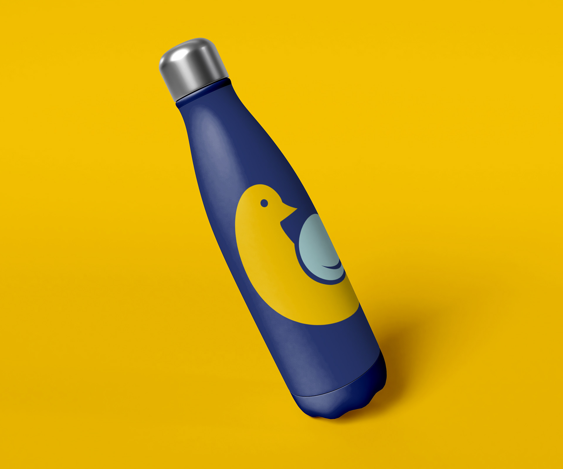
Branded Water Bottle
I chose a bird as a symbol because they are frequently depicted in Pennsylvania dutch designs and because birds commonly symbolize things such as freedom, grace, strength, longevity, happiness, and love. The simplified dutch bird pays tribute to Lancaster’s history and PA Dutch community with a refreshed look fit for new residents and tourists alike. I used the bird design on the flag as a foundation for a responsive logo. It can go from two birds to one, to just the tail feathers depending on the amount of space available.


Instructor: Caleb Heisey